Cores
A brand guaranteeing gas
and oil reserves
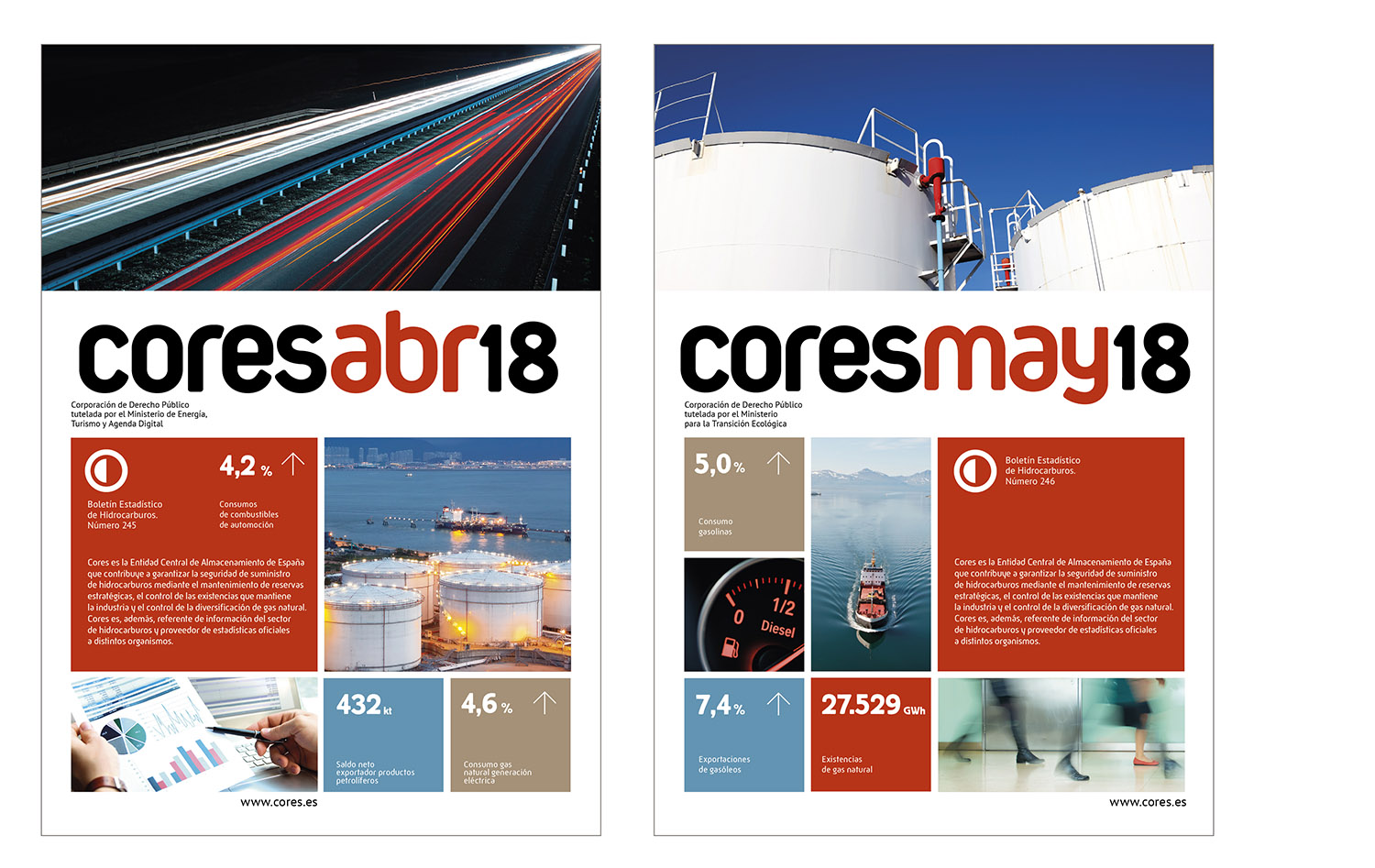
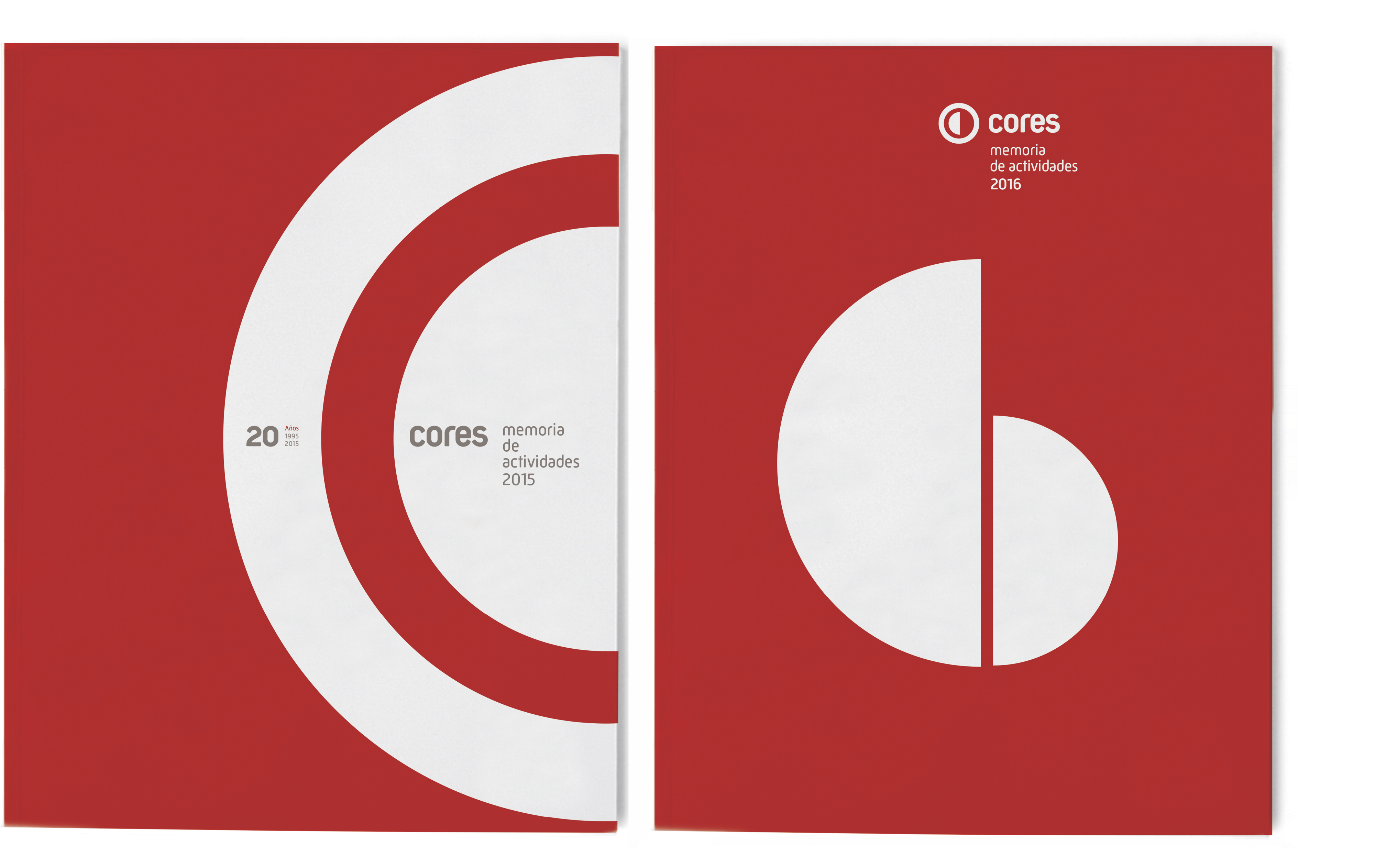
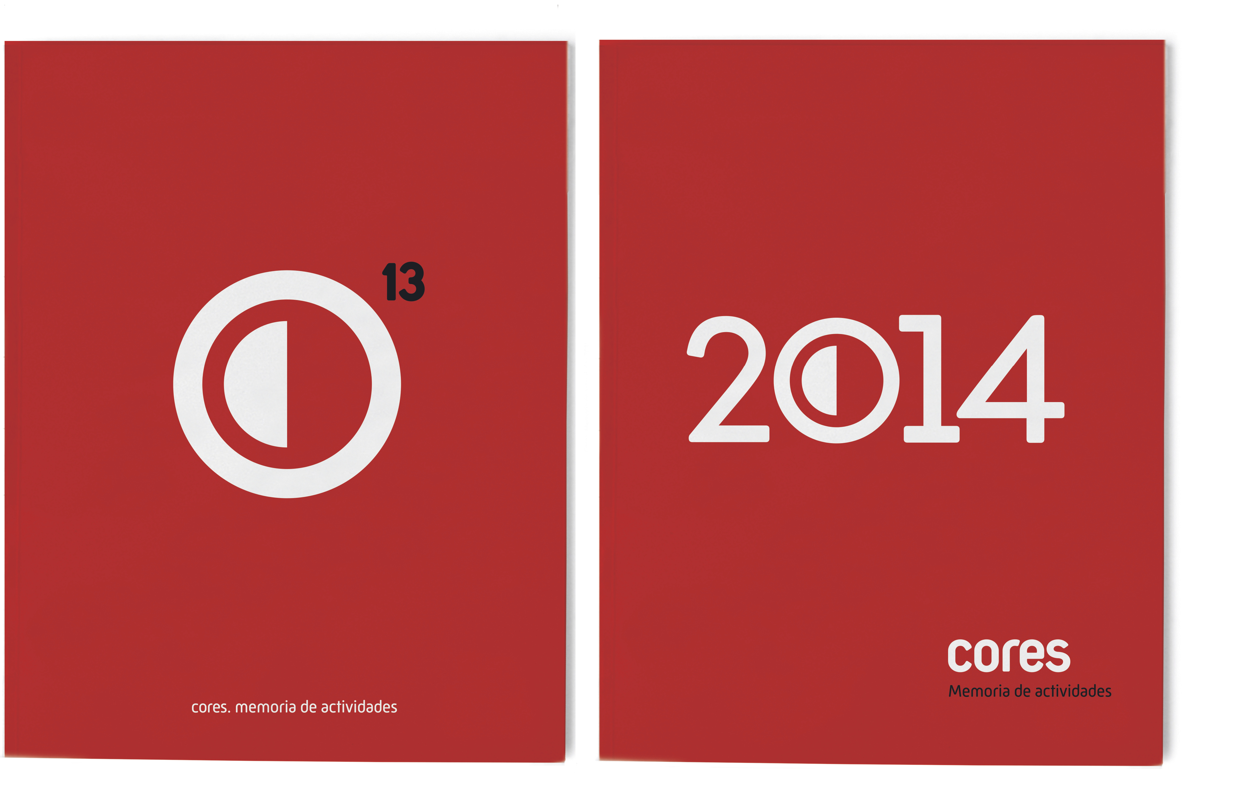
Cores’ image, designed by Estrada Design in 2013, expresses the values of a corporation tasked with guaranteeing the preservation of gas and oil reserves in Spain. The symbol consists of a bold red circle that contains and protects a permanently full half, which is, in turn, a letter “C”, the initial of the company’s name.


Estrada Design also designs the annual reports, the corporate website and the statistical reports on the Spanish power industry published by CORES, which is charged with preparing and disseminating all the information on oil and gas in Spain.


You might also like…


