by f8c898fb93 | Apr 5, 2024
2024. Good luck and good design
A Publication from the Studio
Each year, at the end of December, we wish each other happiness and prosperity
like a rite of passage for the new year. A single number differentiates the newborn year from the previous one.
But even though it hasn’t earned it, we entrust the new year with all our good-luck wishes.
We start using a new calendar, which marks solstices and equinoxes, holidays and workdays. A roadmap for the next 366 days.
At Estrada Design, we like to start the new year wishing everyone “Good Design”.
And we like to accompany this wish with a brief summary of what we designed the previous year.
by f8c898fb93 | Feb 16, 2023
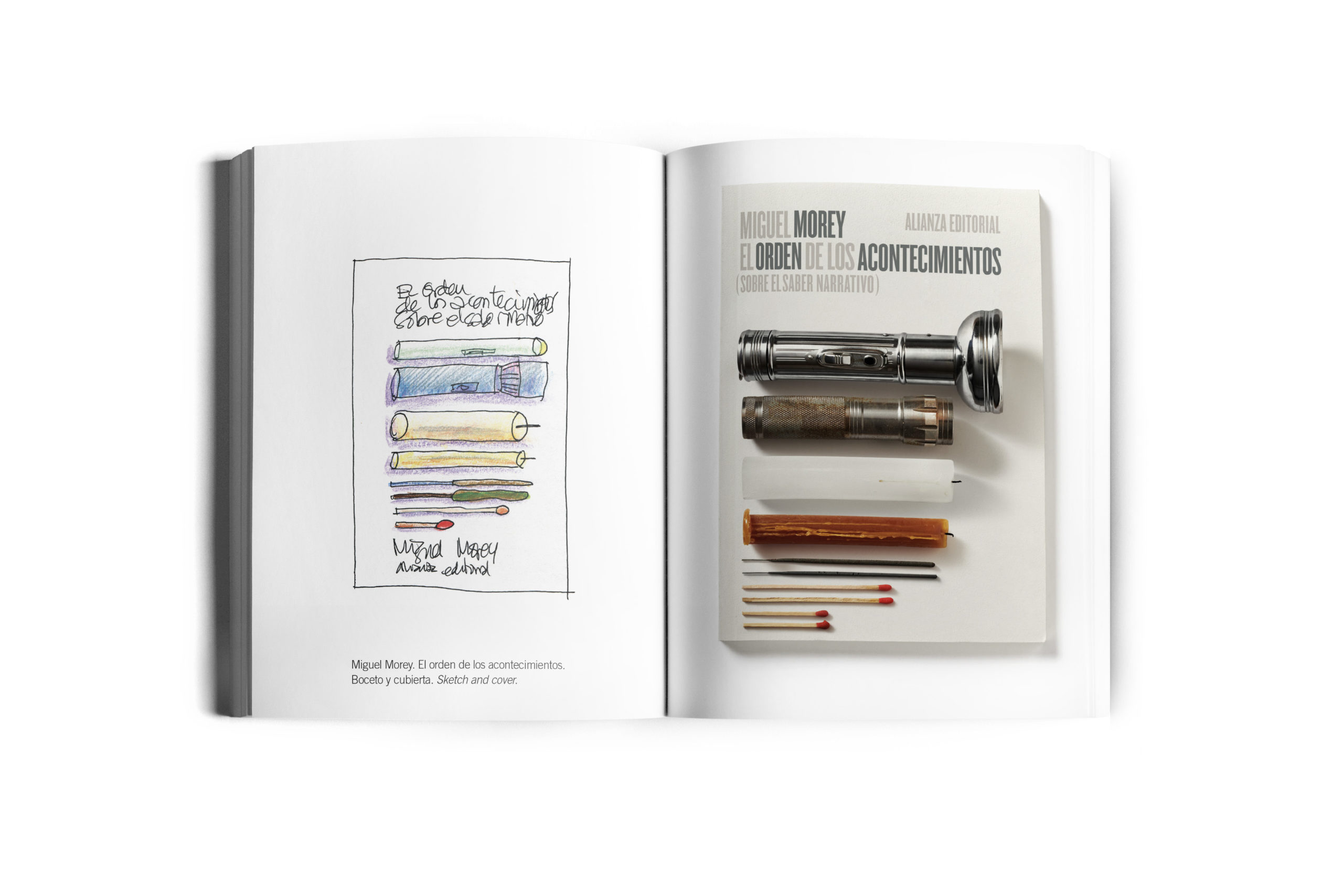
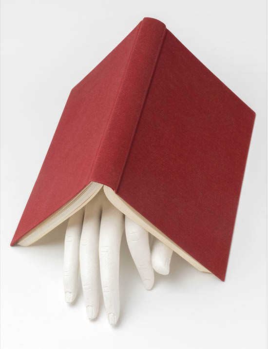
Read books, design covers
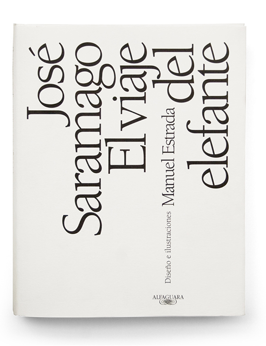
Good covers complete books. They say something about the quality of the edition and the professionalism of the publishers. Covers enhance a book. I believe, therefore, that people who value a book also care about the covers and they may sway them when choosing one edition or another.
But I believe covers are also something else. They are the doors and windows of books, they make our browsing of bookstore new release tables easier and more pleasant.
They help us choose books and turn them into more beautiful and desirable objects. When I began designing covers, I did not think it was necessary to read the books. Yet, after designing several hundred of them, I realized that, with a few exceptions, the best covers I have designed are for the books I know best, that have moved me, or whose contents have interested me most.
Manuel Estrada
by Cristina Rodrigo Romero | Oct 14, 2021
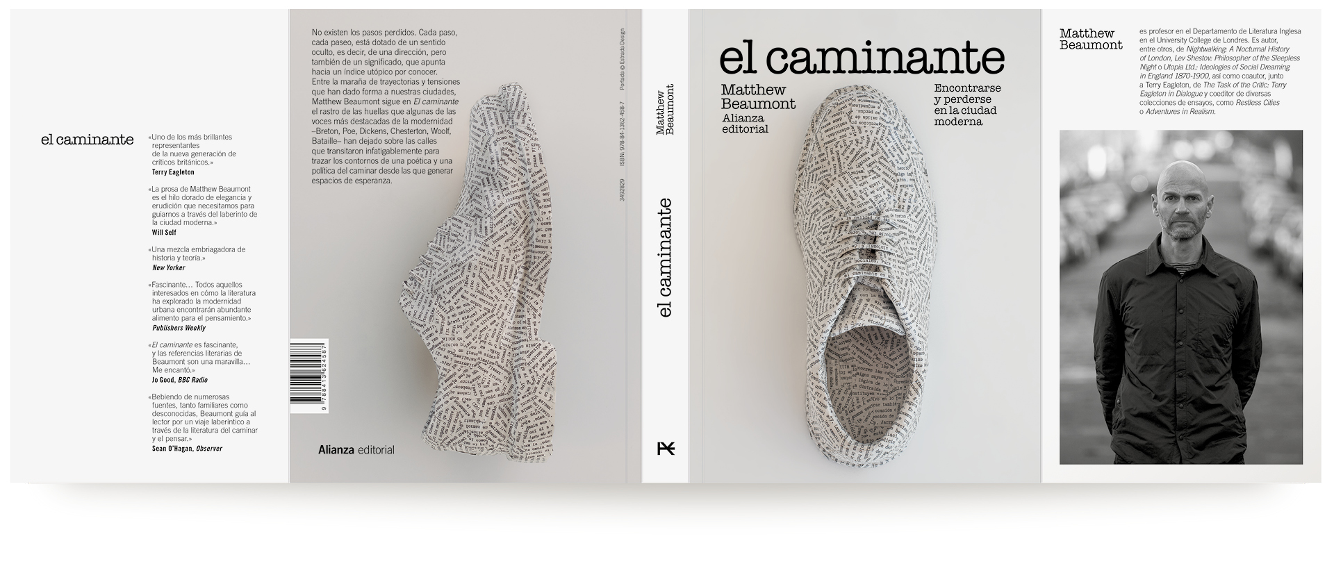
Designed by Estrada Design and edited by Alianza Editorial.
The Walker: On Losing and Finding Oneself in the Modern City (Verso, 2020), a series of chapters on writers including Chesterton, Dickens, Ford, Wells and Woolf, all of whom have placed the experience of walking in the metropolis at the centre of their attempts to understand and represent modernity…
by Cristina Rodrigo Romero | Apr 26, 2021
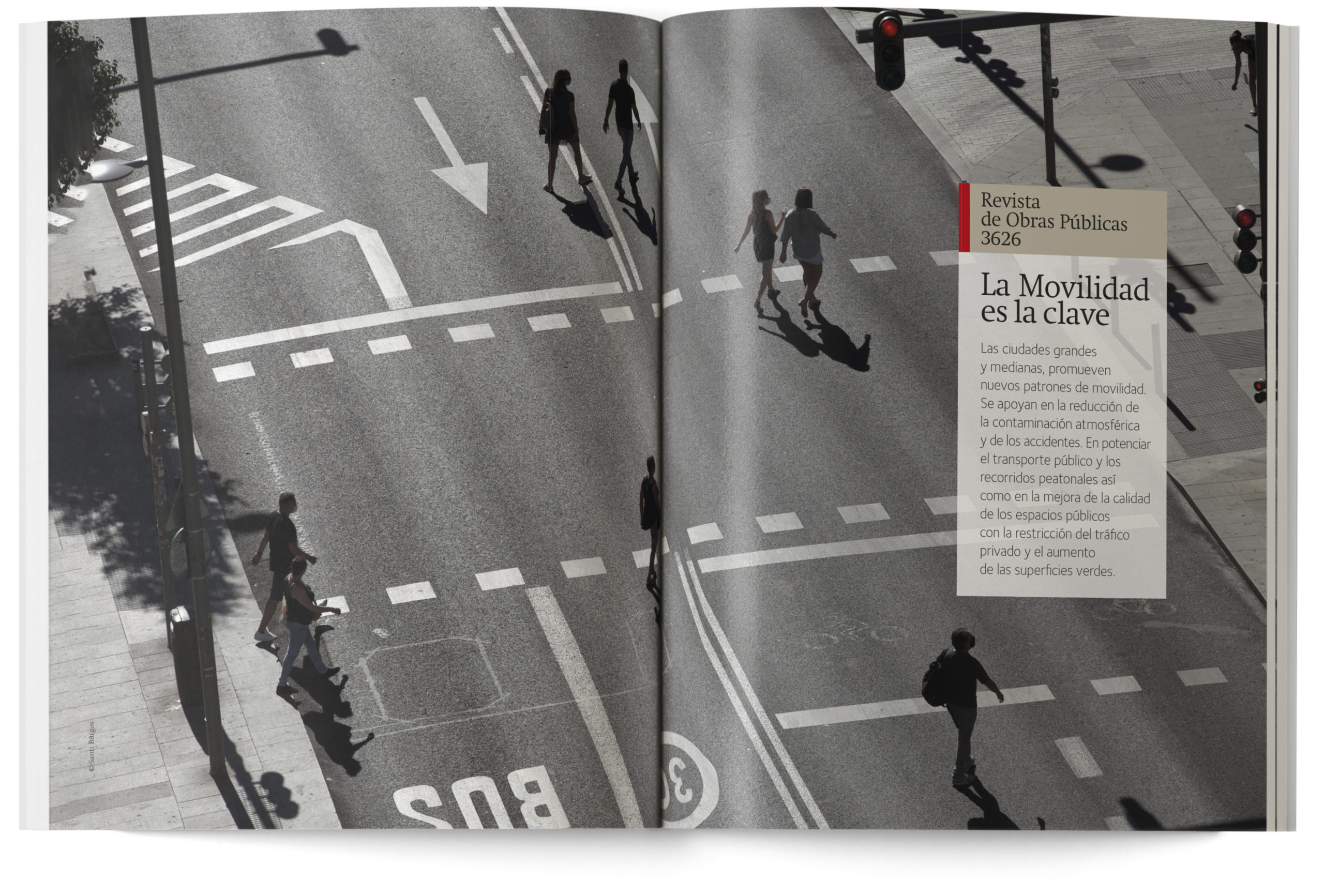
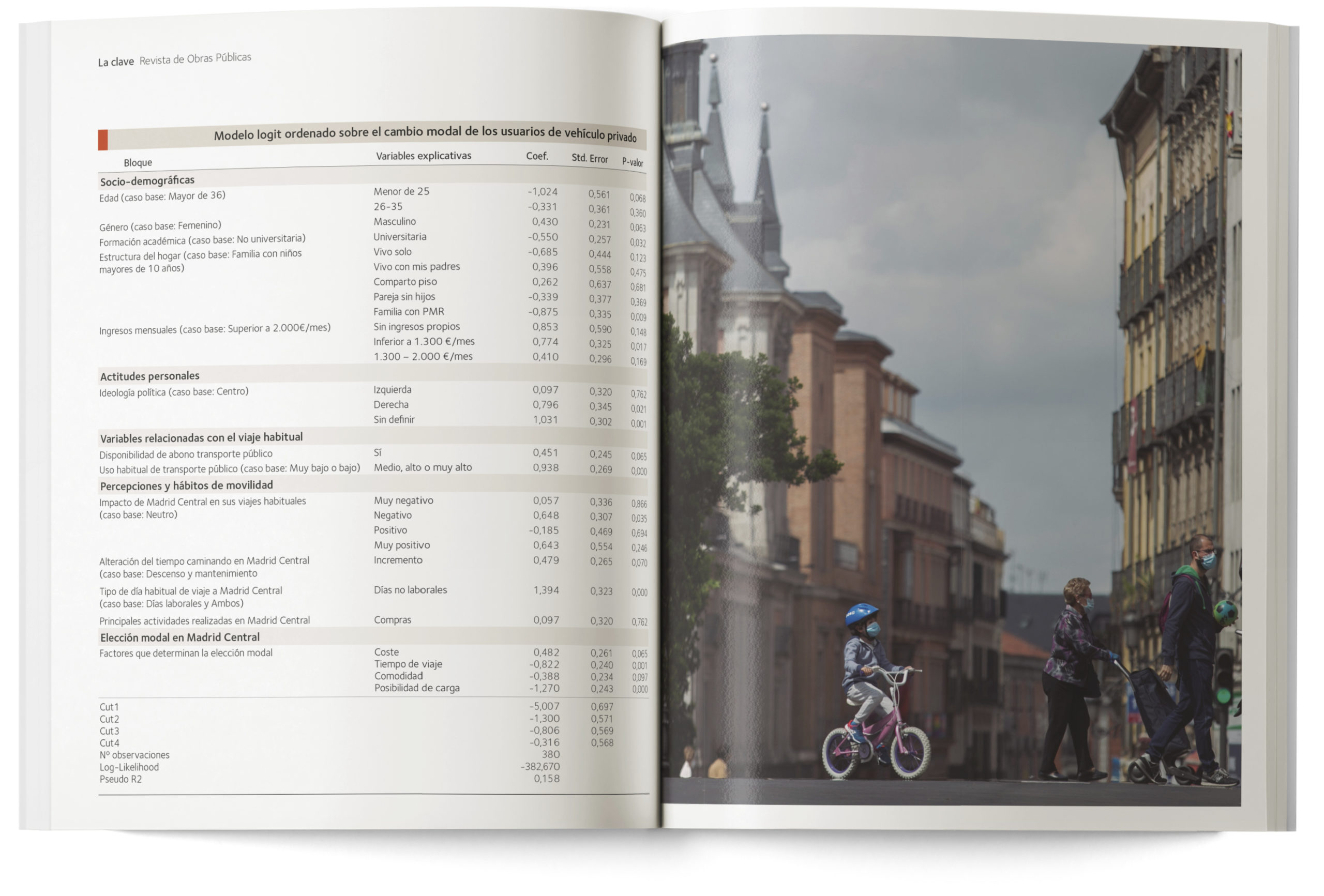
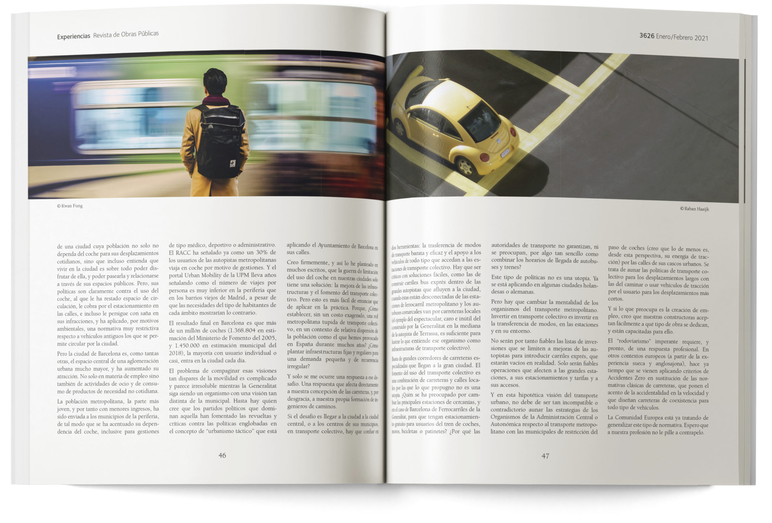
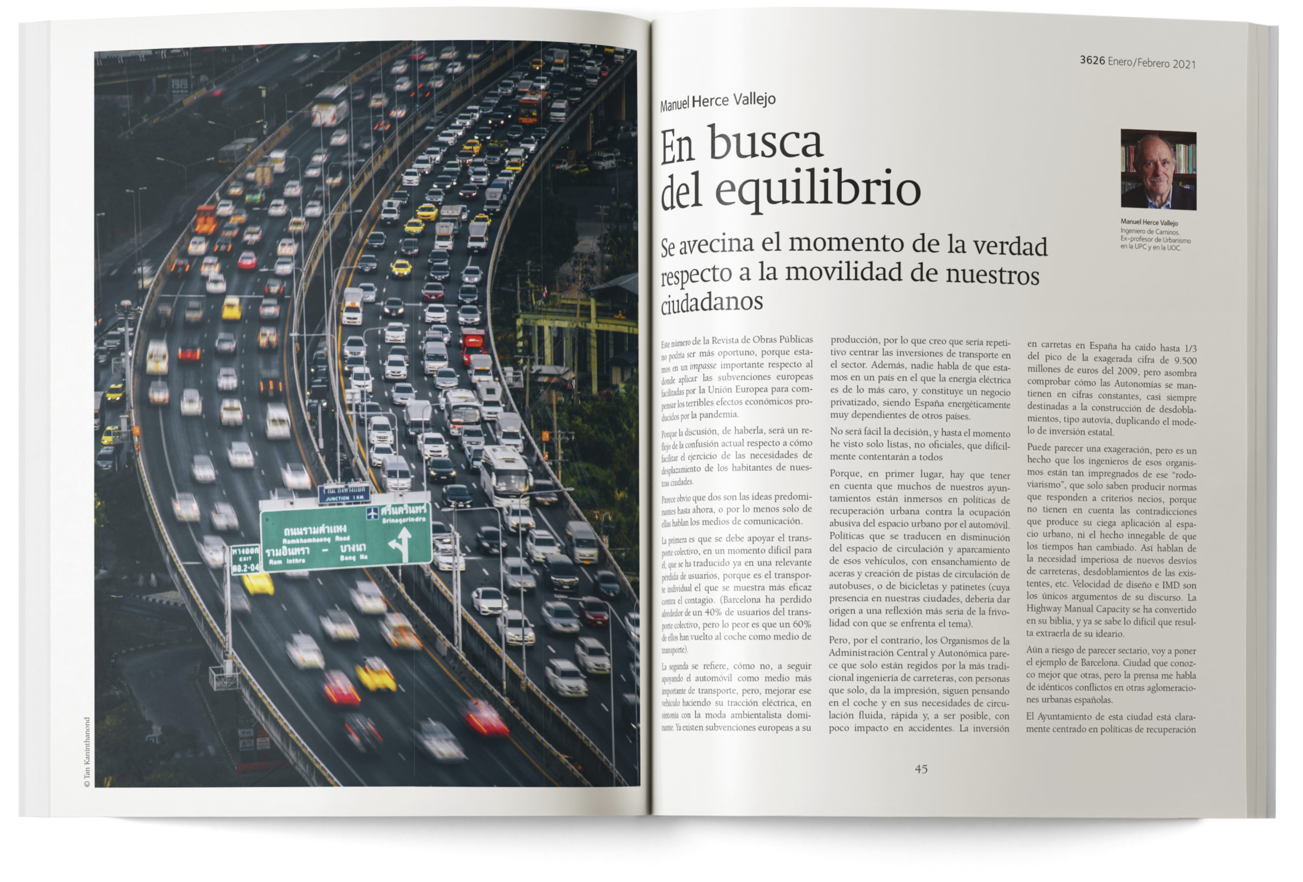
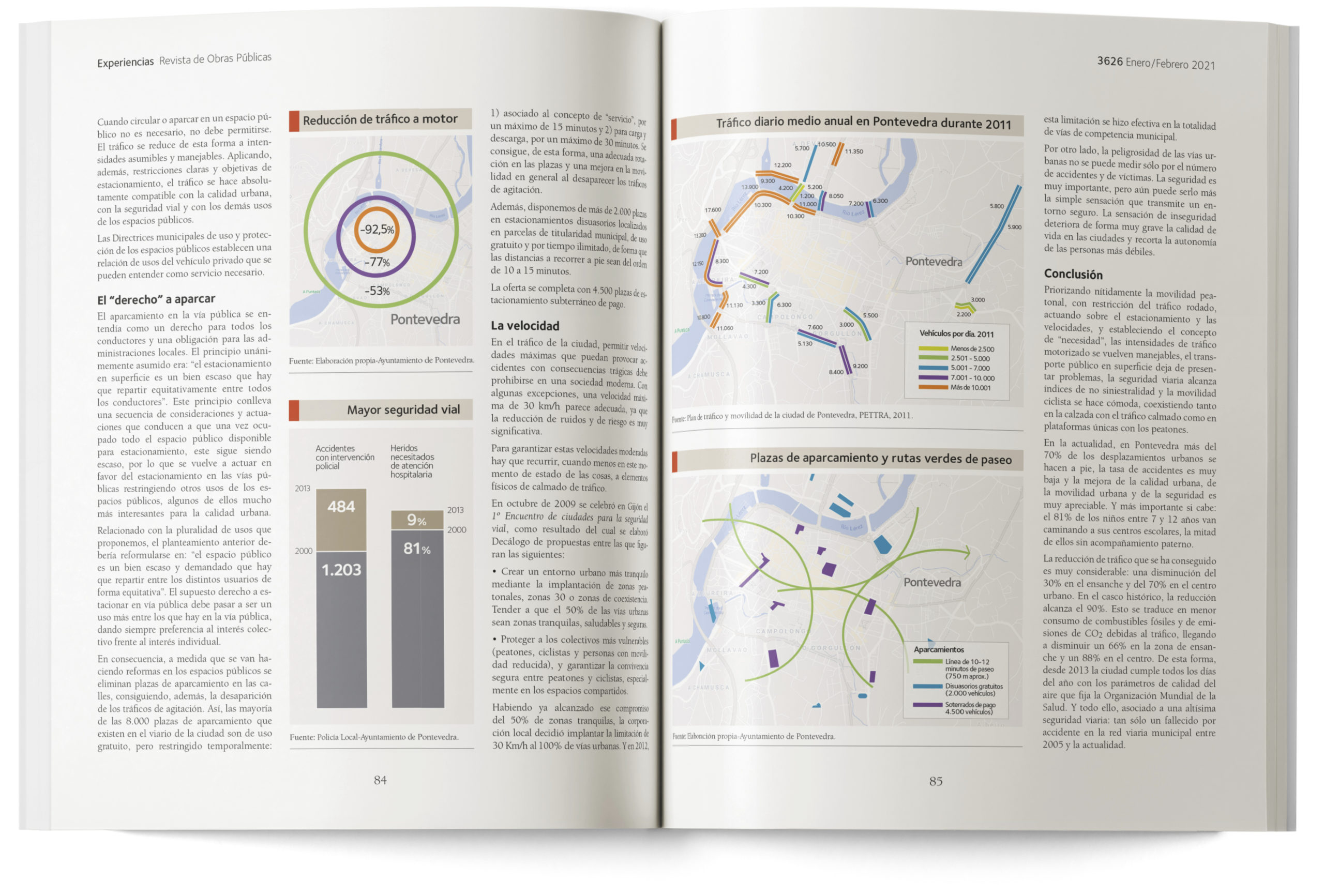
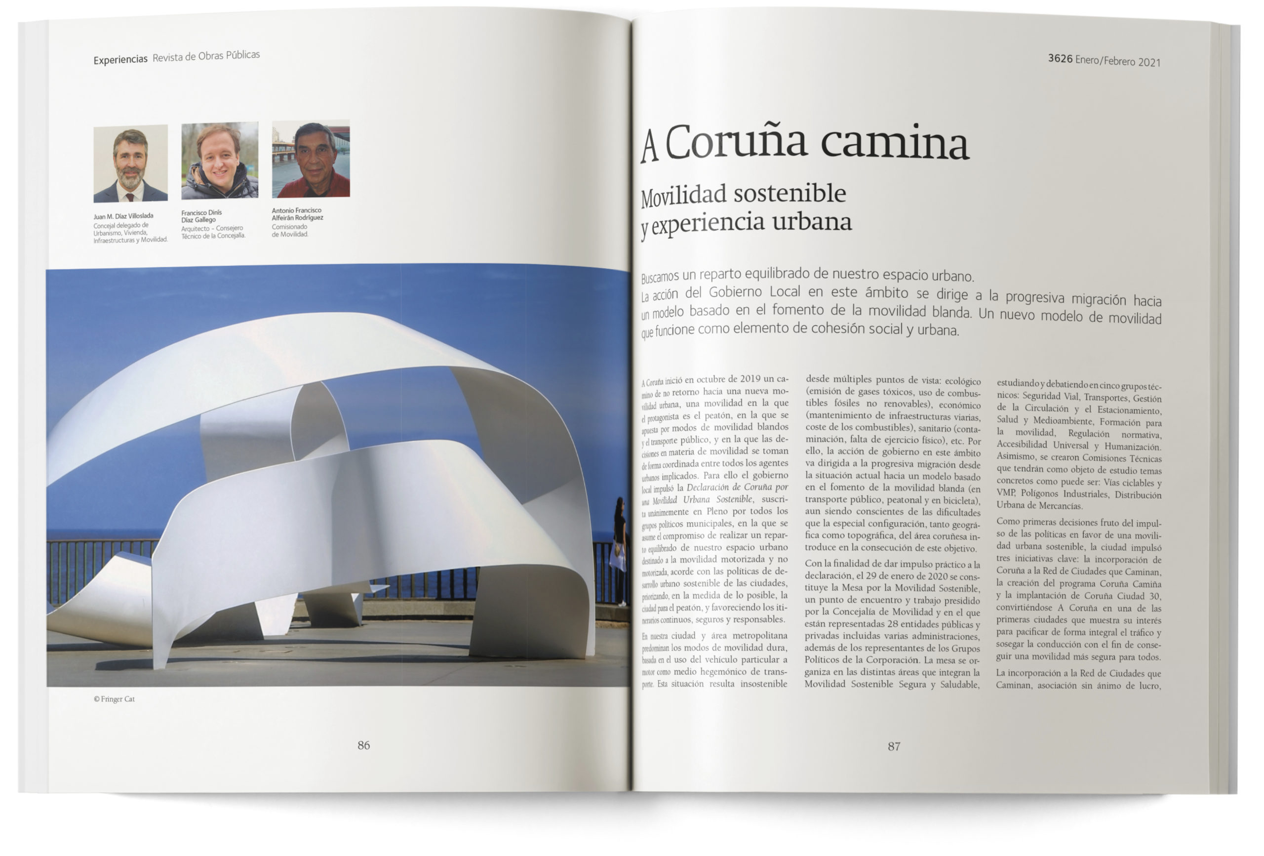
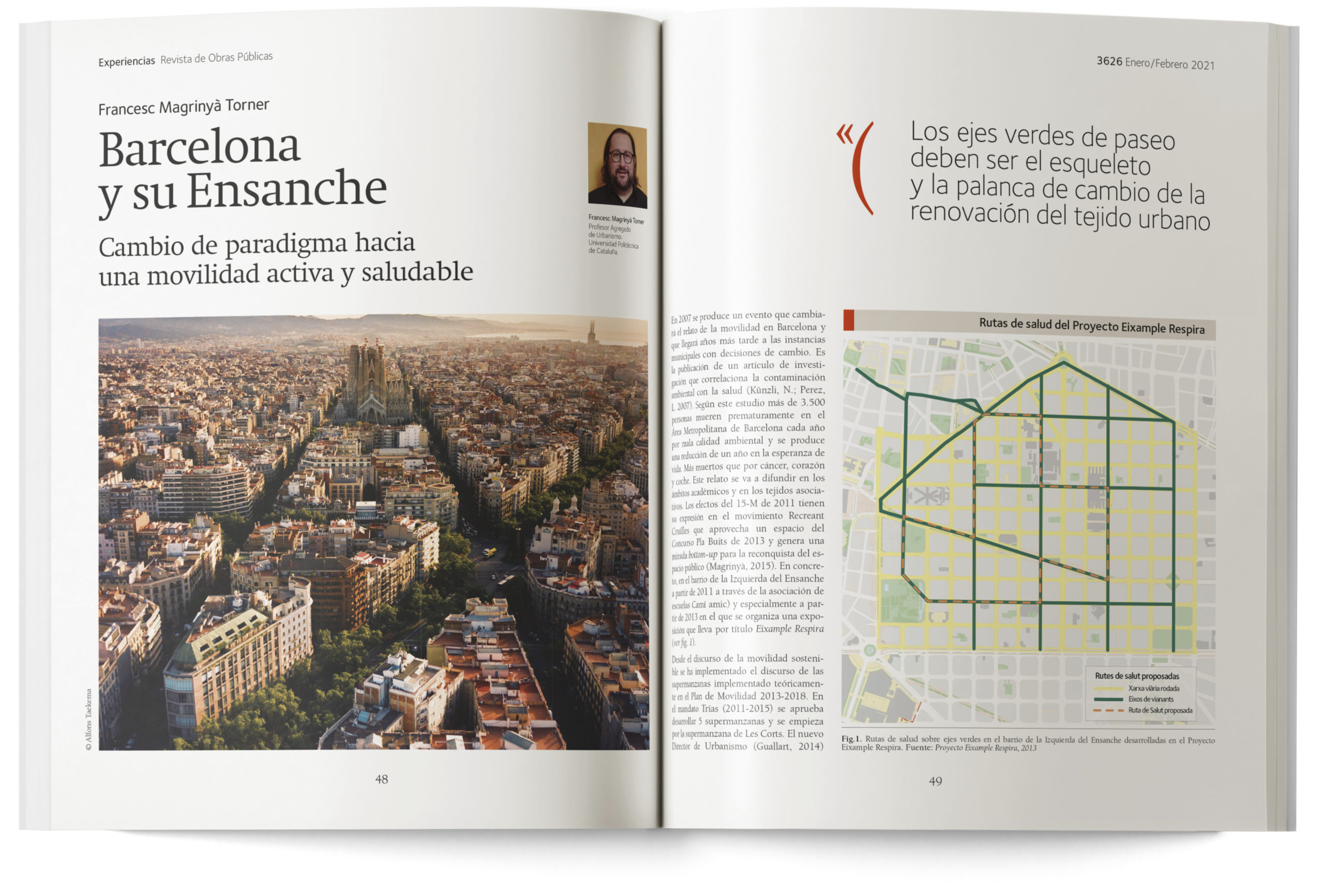
Publication design, art direction and layout
When we were commissioned with the new design of the Public Works Journal, published since 1992 by the Association of Civil Engineers, it was a surprise to discover that its publication had begun in 1853. In other words, it is one of the oldest journals in Spain. A fact that, on its own, shows the fundamental importance of Civil Engineering in the building and modernisation of Spain in the 19th and 20th centuries.
A masthead retrieved from the past
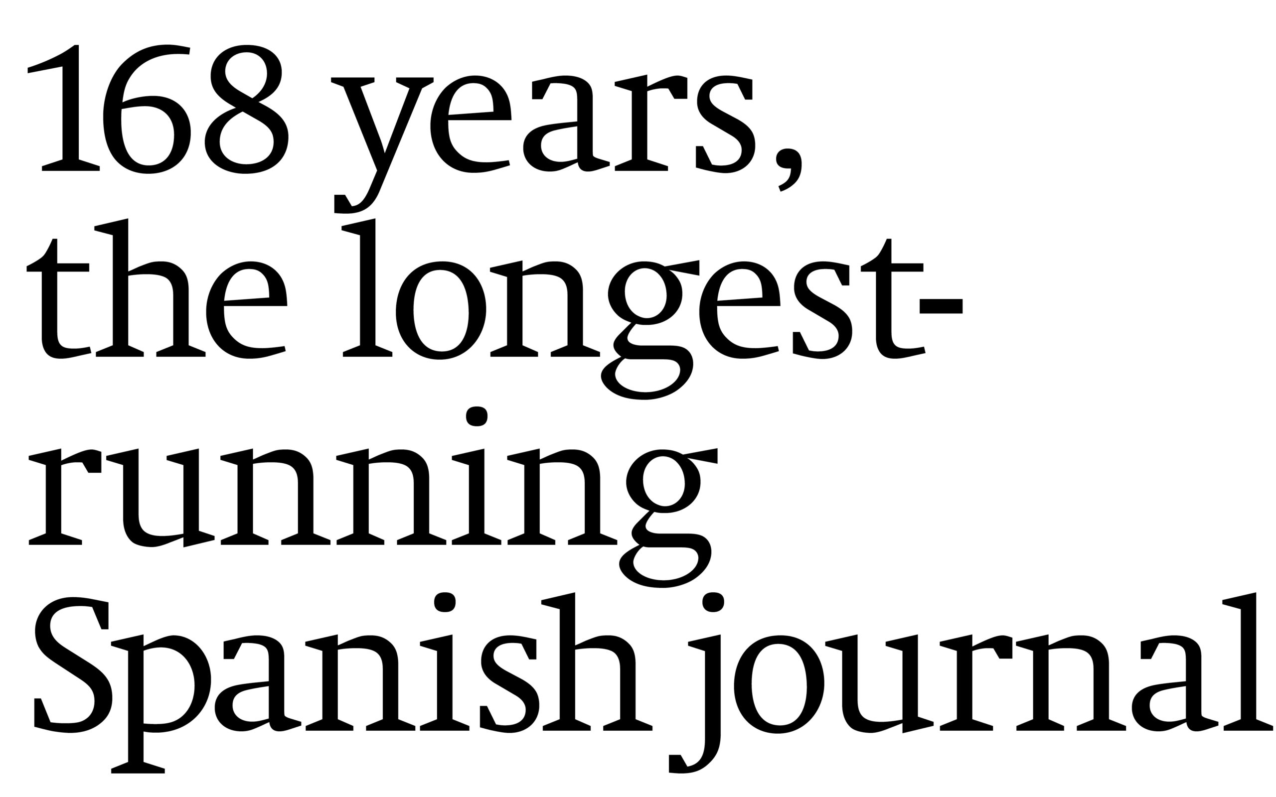
The Public Works Journal is one of the oldest journals in Spain. Founded in 1853, it is celebrating its 168th anniversary in 2021. It was essential to showcase once again the full name of the publication in the masthead, and to do it distinctly.
This number, displayed prominently in large figures in the masthead of the journal, is destined to become its symbol. Because it explains the tradition and continuity of the project.
And because it is associated with the technical vocation of Civil Engineering itself.
The Neue Swift font, designed
in 2009, has contemporary tendencies,
even though it maintains
the features of the classical
Roman serif typefaces.
by Cristina Rodrigo Romero | Apr 23, 2021
15M. The time of the squares
Designed by Estrada Design and edited by Alianza Editorial, Written by Julia Ramírez Blanco, 15M. The time of the squares offers an approximation of a phenomenon that left an indelible mark on the memory of several generations.






















Recent Comments