World Flamenco Congress

World Flamenco 
del Congress

Cervantes Institute

The Cervantes Institute, in its work to promote the Spanish language, holds an international Flamenco congress. Designed by Estrada Design and presented in Madrid in the month of May, its logo appears to the rhythm of a fragment of zapateado footwork by the dancer Carmen Amaya.

The logo, a lowercase letter ‘f’, divided in two, has several variations formed of its initial and a number of differing blue and black dots. This page shows several screens and copies of posters of the Congress’ activities.

You might also like...

Fundación Meditarráneo

Fundación Mediterráneo

New Brand Identity
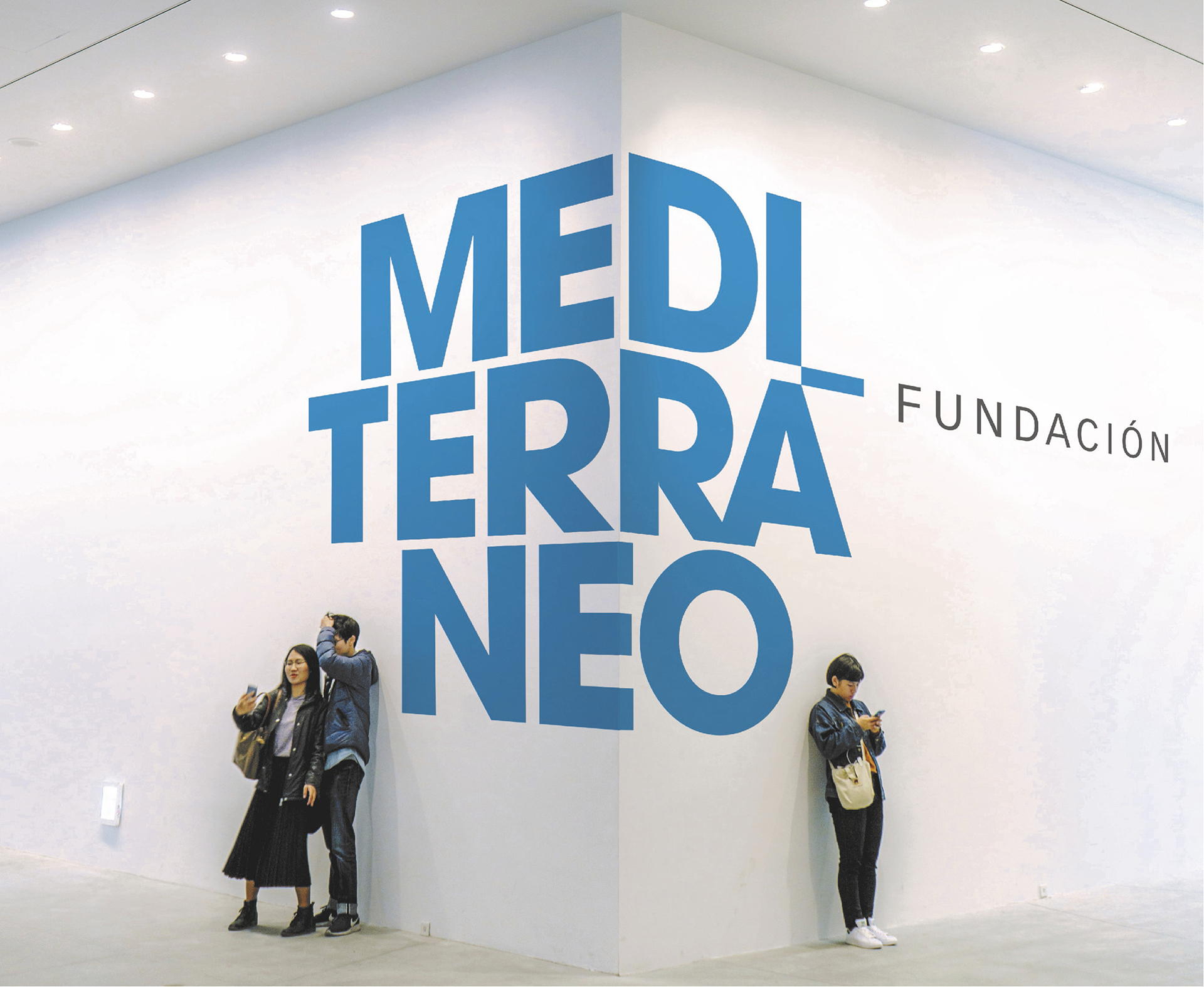
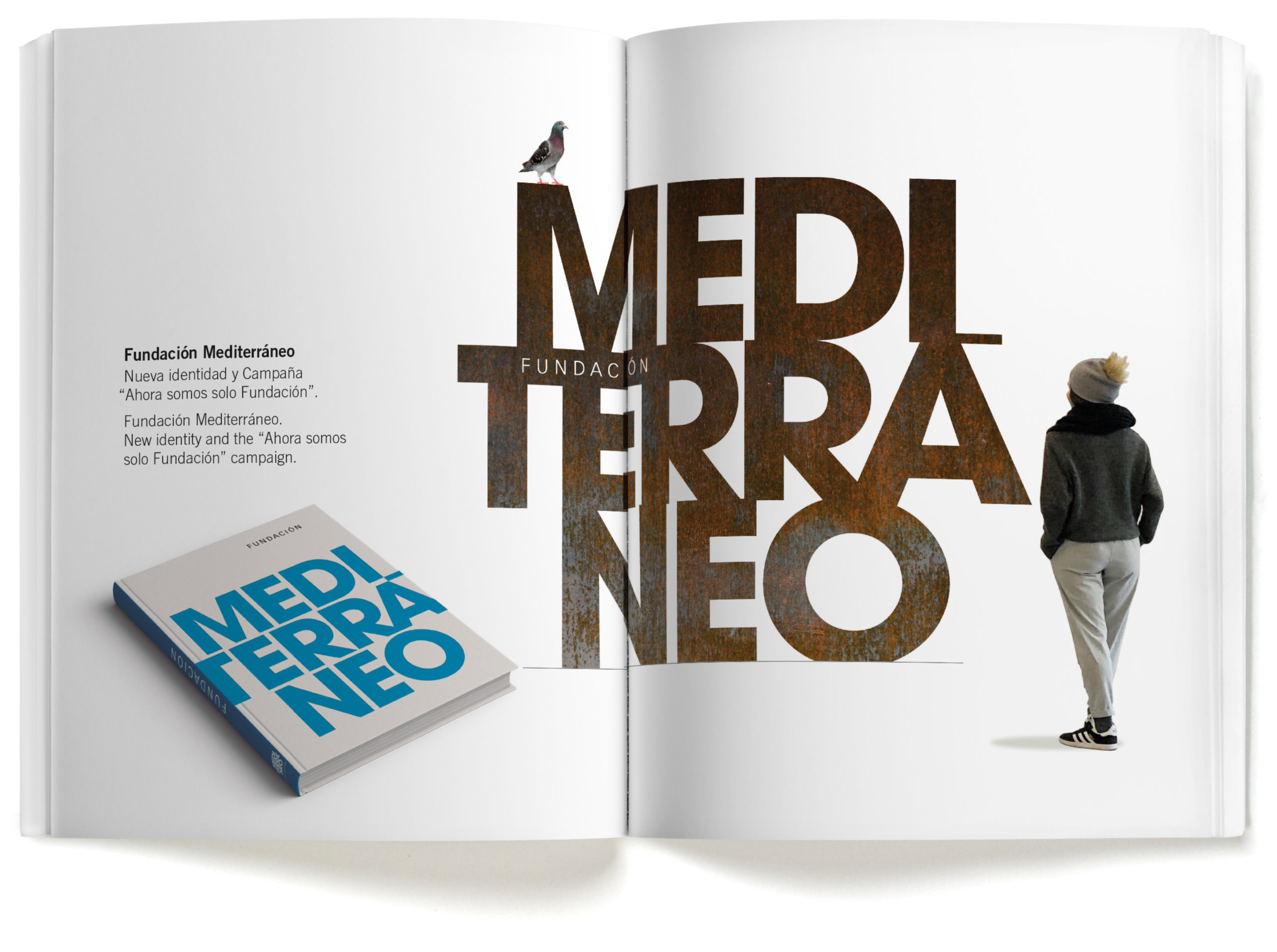
The key word in this identity process is Mediterranean, which has always been linked to the Foundation, with just one problem: the more than 600 entries registered in the European Trademark Office. It took a long time for the Foundation to be able to use the word legally as its name.
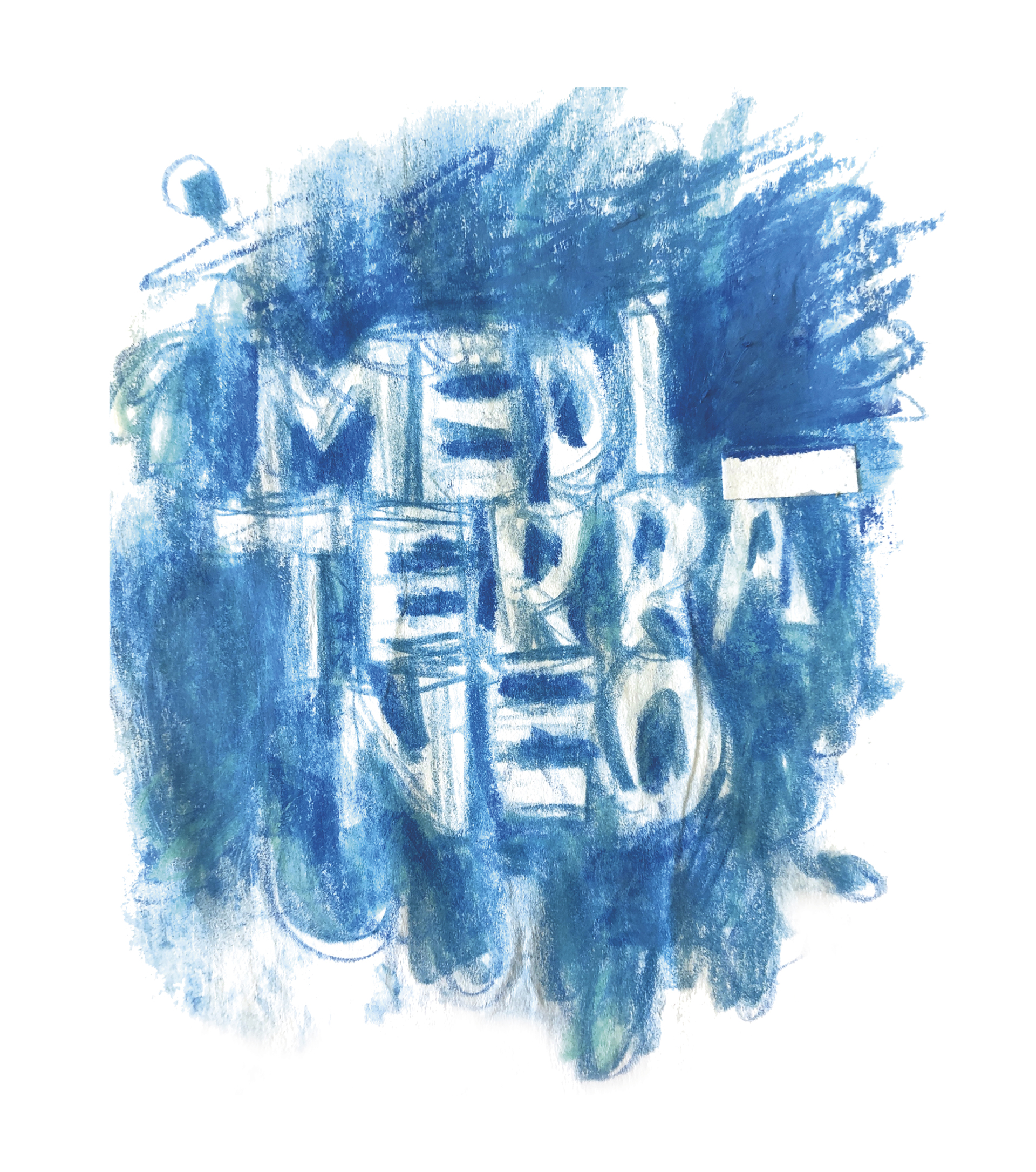
Now the word Mediterranean takes center stage. It is large, strong and positive, conveying to us not only culture and nature, but also life and the origin of our civilization. All that force contained in the word Mediterranean makes using a symbol or a sign unnecessary and even counter-productive, and that is why it is the image of the new Foundation. A Foundation that has three core areas of content: art, culture and the environment. These three things are there, encompassed in the Mediterranean.

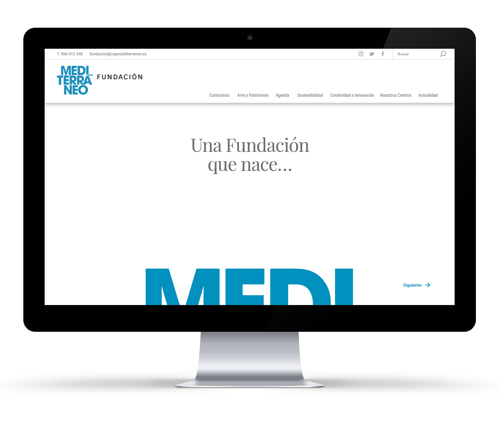
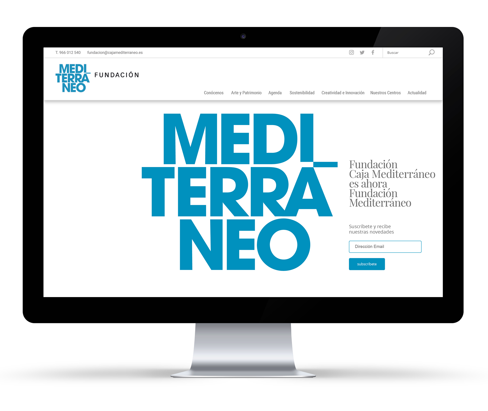
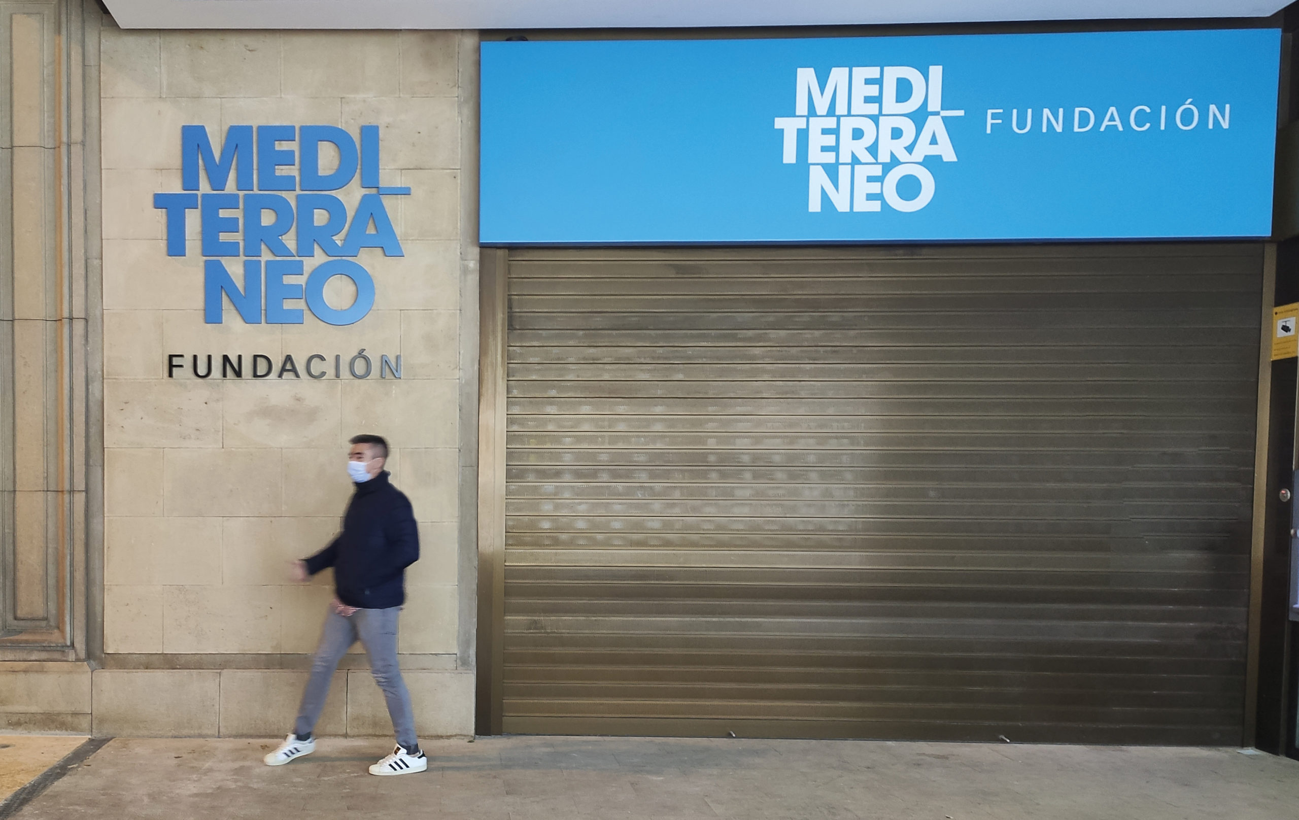
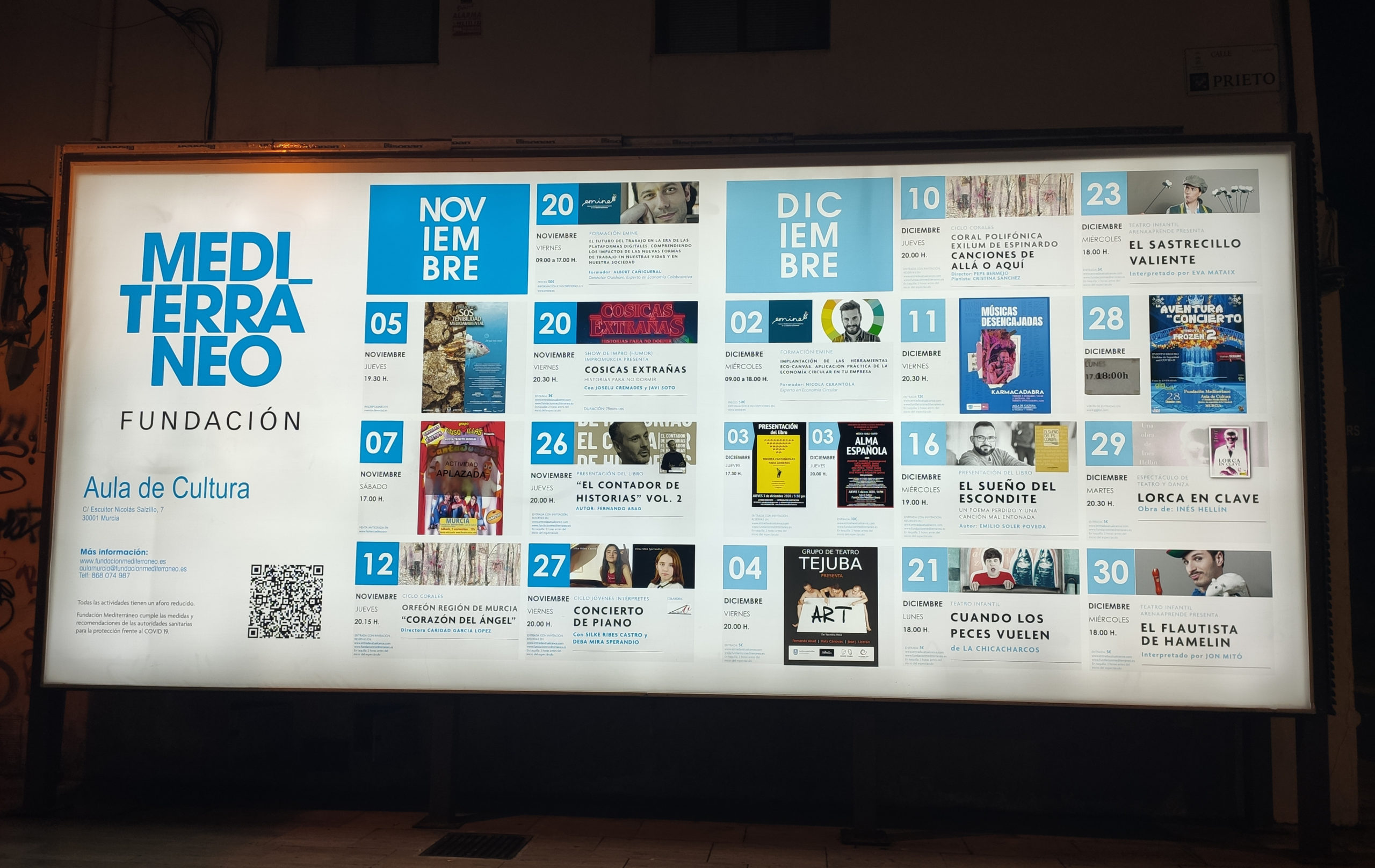
Here at Estrada our proposal was to use no other symbol than the word itself, a strong graphic image split into three compact lines. In a deep blue, the graphic accent of the á juts out over the edge of the logo as if it were a link, connecting the word Foundation to it. “The graphics speak more about a Mediterráneo Fundación than a Fundación Mediterráneo; Mediterranean is too big a word for it to be preceded by anything”.

“We wrote the word Mediterranean hundreds of times, in different ways; we replaced part of the letters by drawings, to give it greater visual quality, yet both we and the people who run the Foundation reached the conclusion that this is the best”.

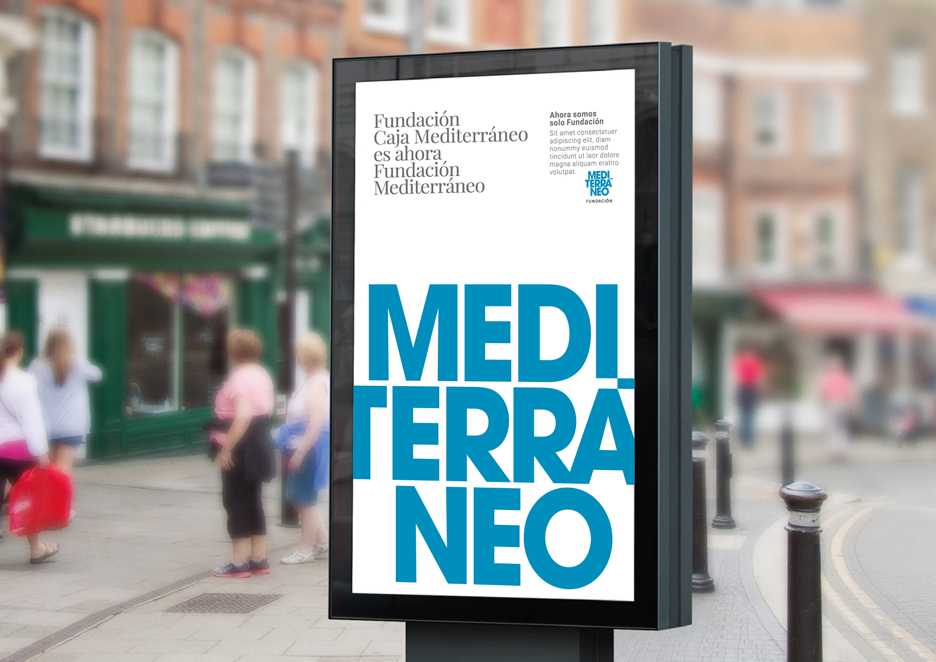
The corporate communication to show the time of the new brand has been structured in several “waves”. The first is titled: “Fundación Caja Mediterráneo is now Fundación Mediterráneo”. It is a Foundation that comes into being with extensive experience, but which does not in any way forsake its past, its enormous art collection or its important artistic heritage, its cultural centers, etc.”.

“Now we are Fundación” will be followed by the next wave of advertising that will speak through the heart, using the same protruding accent in the graphic image. “Now it is not backed by an institution or a major corporation; everything is willingness and heart to create culture and activities for people”.

The nature of an institution that does not aim to reap any profit is linked to this message: “Only Fundación, all Fundación”.

Here at Estrada Design we have no doubt that design has the power to build businesses and countries. It is essential that we view design as a problem-solving, applied art. In this time of pandemic, design, along with innovation and research, can be an important factor in contributing to recovery. A business factor. It cannot be an add-on; it has to promote better communication, stimulate, inspire, propose… it is not something superfluous, on the contrary, it is an economic and cultural driver.

You might also like…

Book to start 2021

Christmas’s Book

Publications

2021 is beginning, which today we sense intuitively as a light at the end of the tunnel, the beginning of the end of one of the darkest periods in our recent history. First healthcare workers, then teachers, civil servants and researchers have played an essential role in combatting this pandemic, which burst into our lives by surprise shortly after the beginning of the year that is now coming to an end. The designers, the small design companies, modestly feel that we have also played a clearly useful social role, keeping up our work with all of our normal intensity and energy, and perhaps with even more enthusiasm, if possible. We have facilitated communication activity and quality during these difficult times. We are convinced that design and innovation contribute to maintaining hope and activity in daily life.

We will not have truly emerged until we regain an atmosphere of normalcy and well-being for the majority of the population. The modest contribution of designers, far from the essential nature of healthcare workers or researchers, could also be very important in this period of normalisation. This small publication contains a good part of the projects completed by Estrada Design during the Covid year.

You might also like…

Paisaje de la Luz, Paseo del prado y buen retiro y Paisaje de Artes y las Ciencias

Alianza Ten Years

Alianza Editorial

The Paperback Book. Ten Years

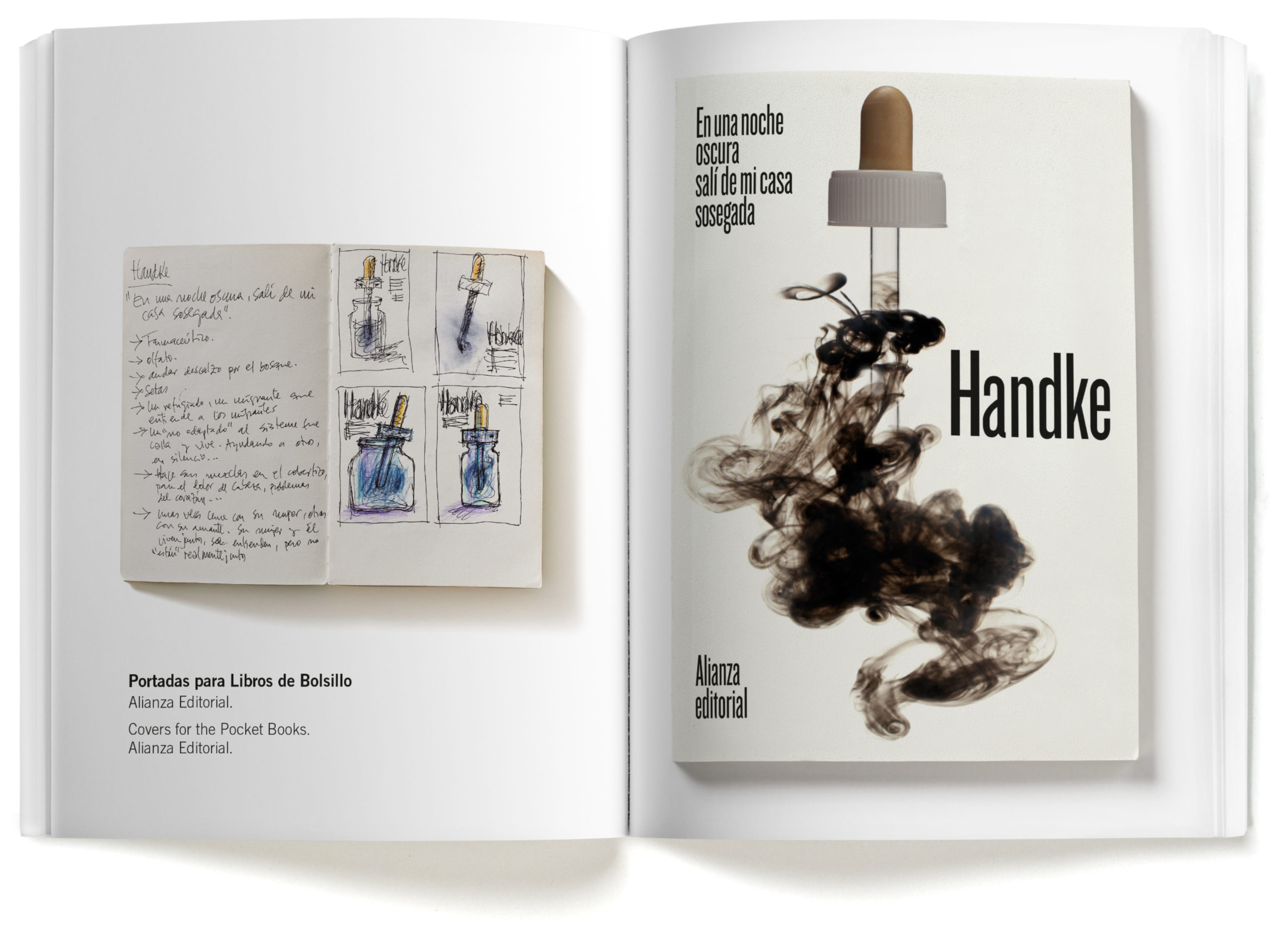
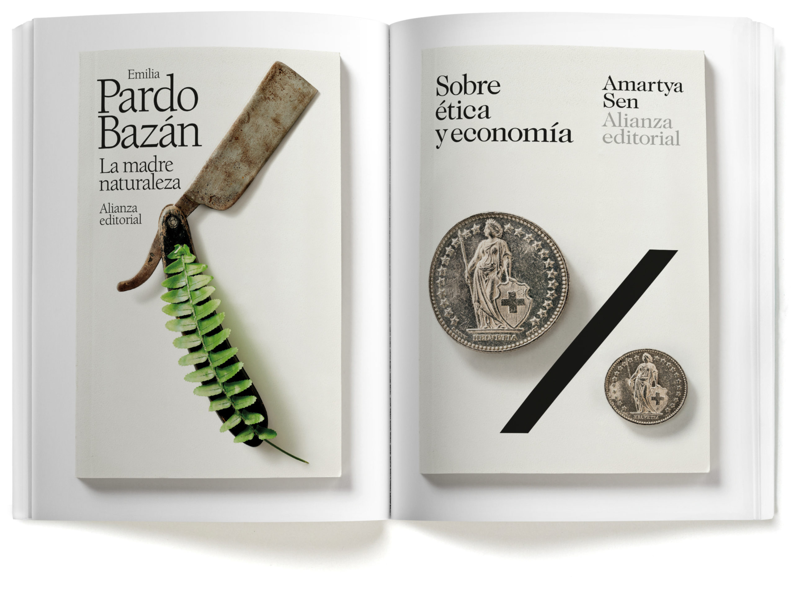
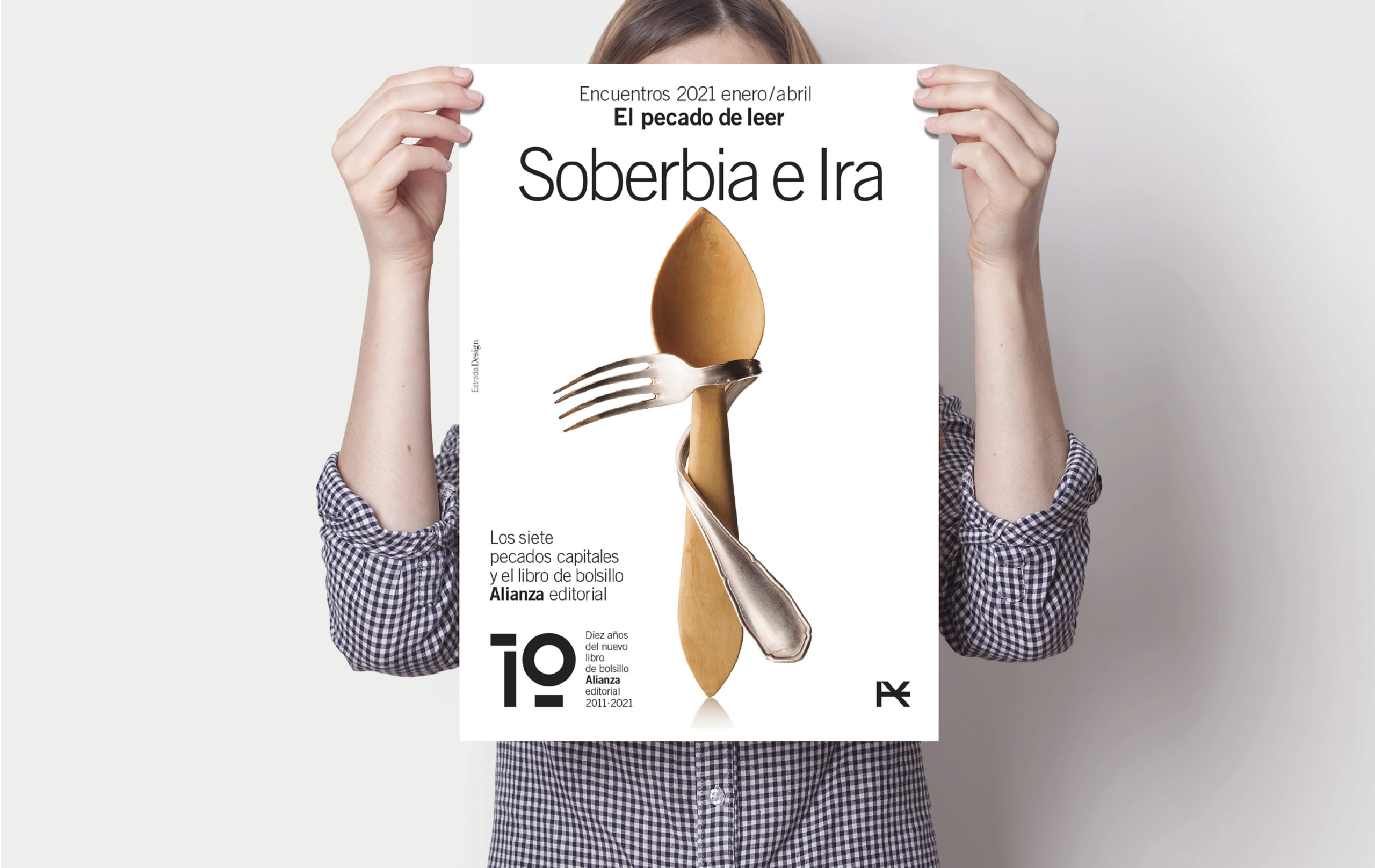
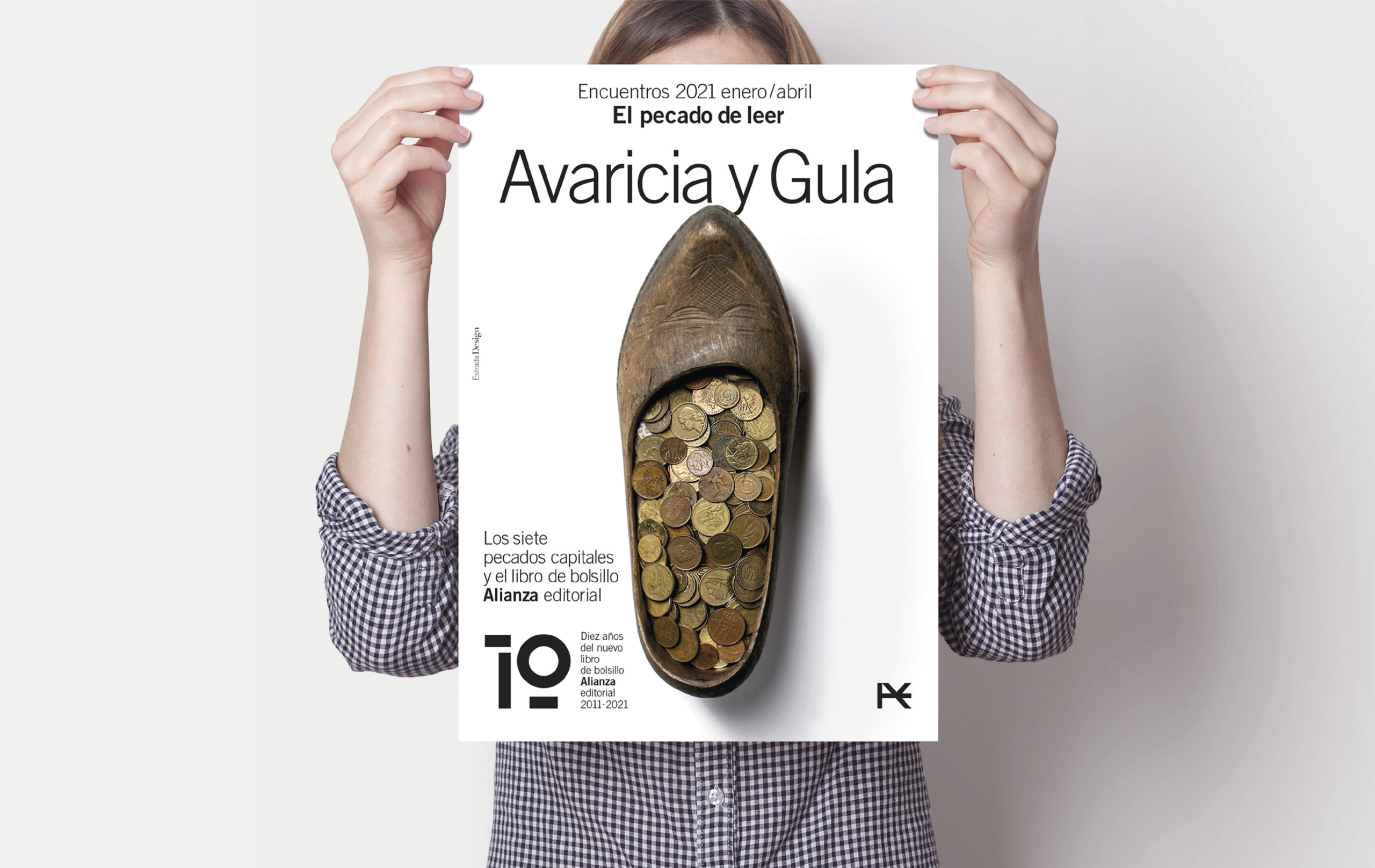
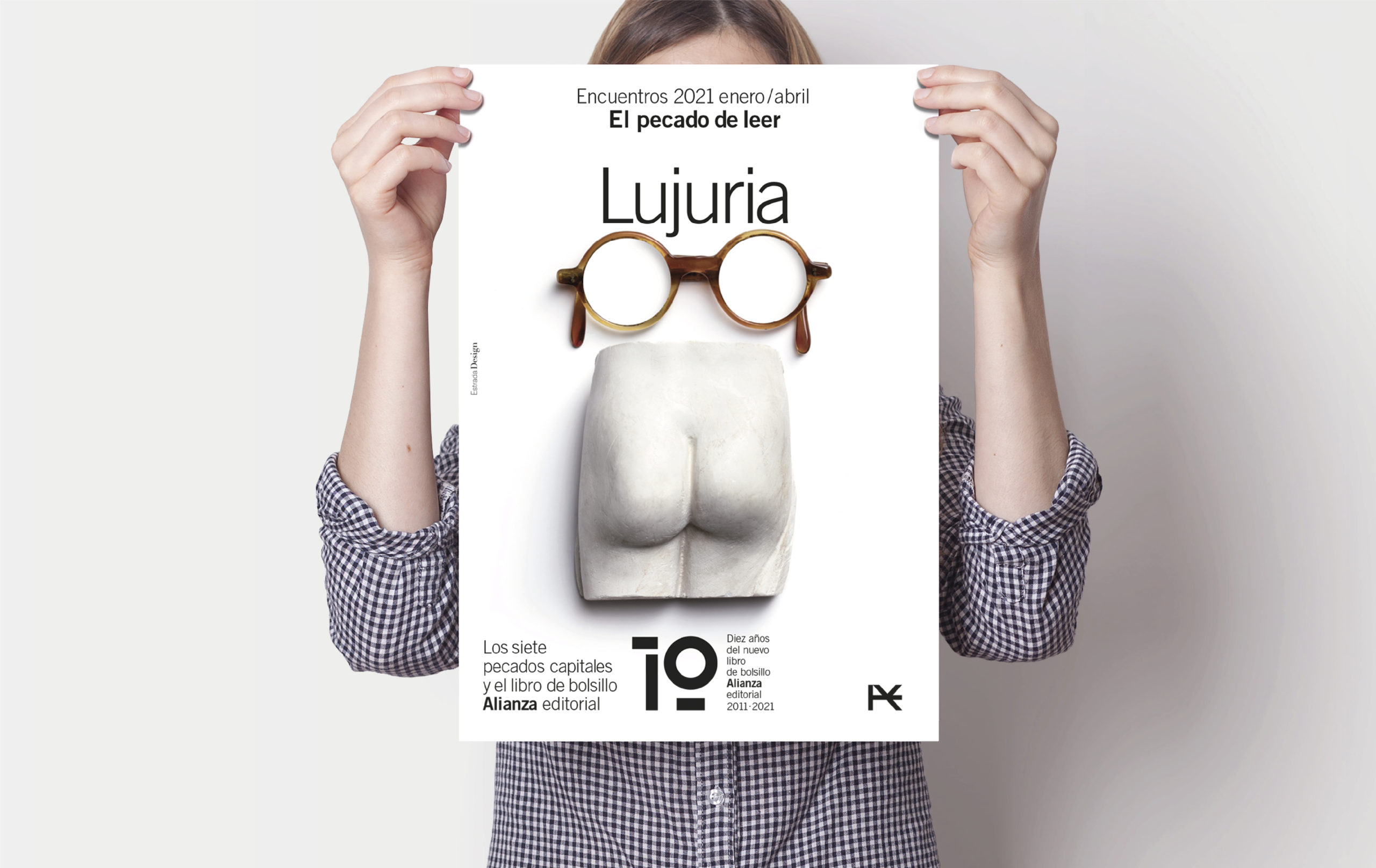
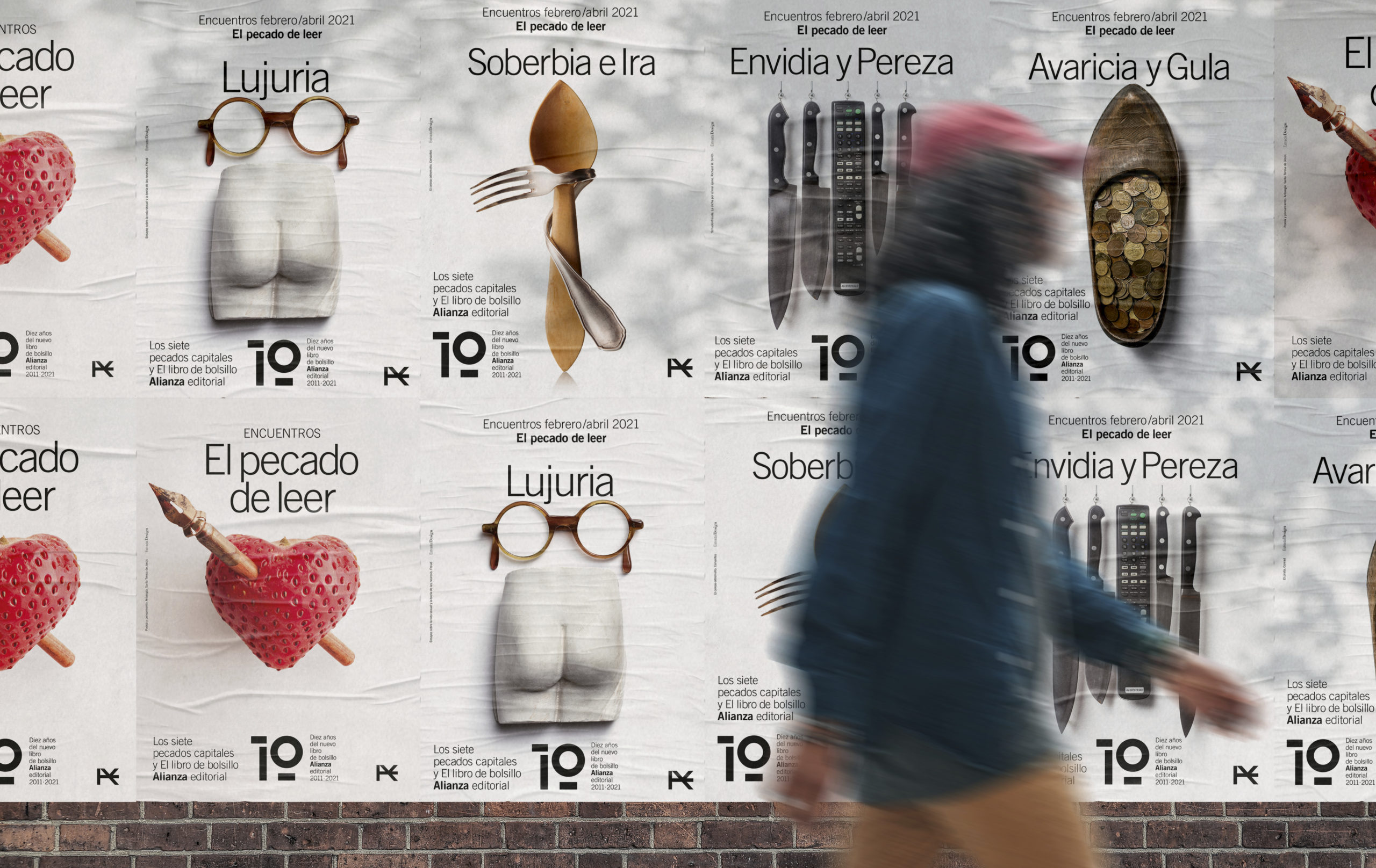
It has been ten years since Alianza Editorial set about redesigning its iconic The Paperback Book collection, which comprises 1,300 active titles and whose design was entrusted to Manuel Estrada’s studio.
Estrada Design has undertaken a comprehensive graphic project that encompasses not only the book covers but also the art direction of bookstore materials and campaigns, such as this one to celebrate its 10th anniversary.

Today publishing is a mortal sin, some say. In the months of February and March 2021, this tribute to Alianza’s The Paperback Book will bring together writers, literary critics and journalists who, with the collaboration of booksellers and readers, will gather to celebrate reading inspired by works from the extensive catalogue of Alianza’s The Paperback Book collection.
Over these 10 years, the new paperback book has made a meticulous selection of texts, classics, literature and thought, and published a significant number of new editorial developments, all carefully chosen and edited.

One of the chief initiatives of Alianza’s The Paperback Book collection is design. Tasked to Manuel Estrada and Estrada Design, over these 10 years they have produced hundreds of covers and complementary materials, such as this ‘The sin of reading’ campaign.

You might also like…

Landscape of Light

Landscape of Light

A World Heritage Site

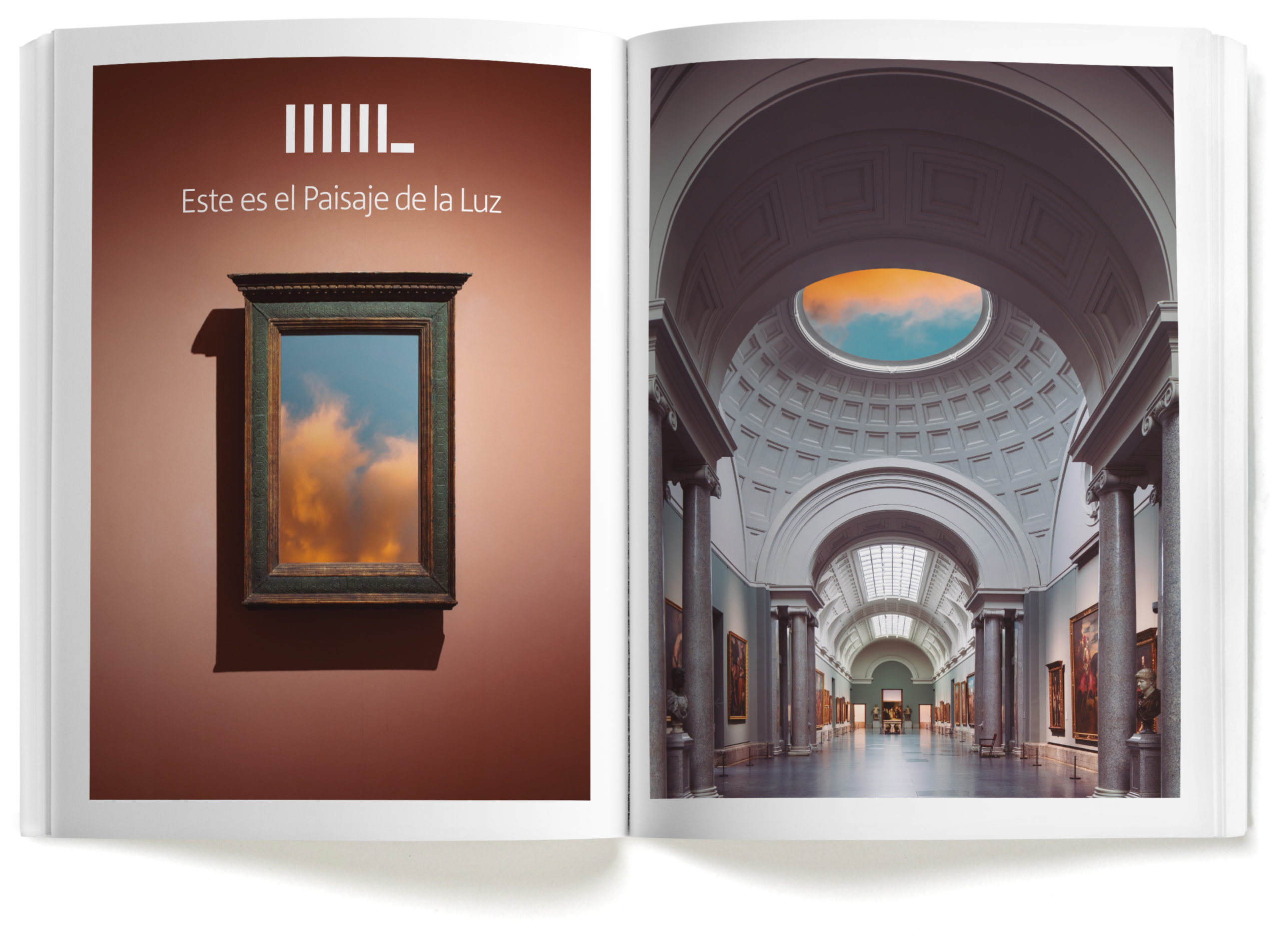
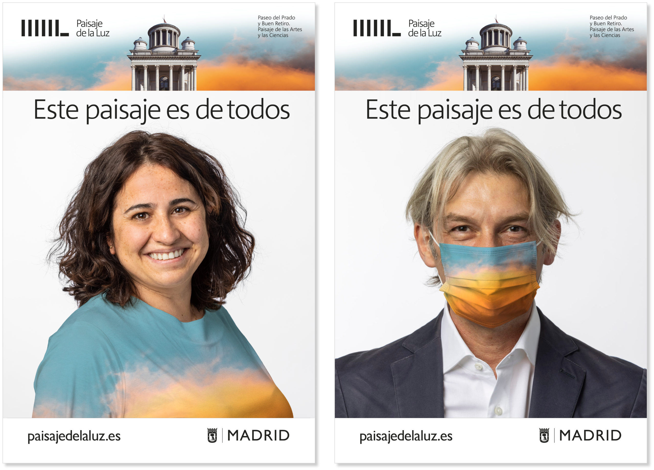
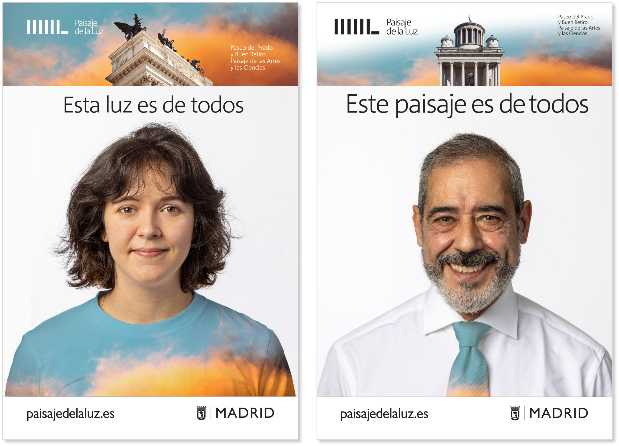
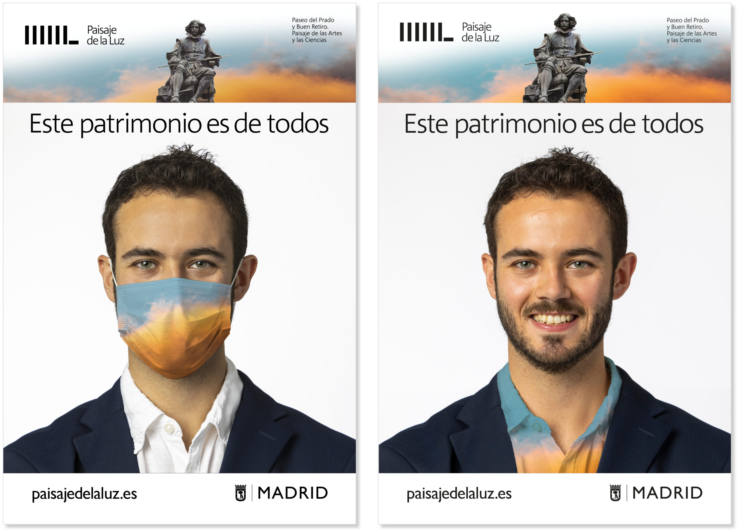
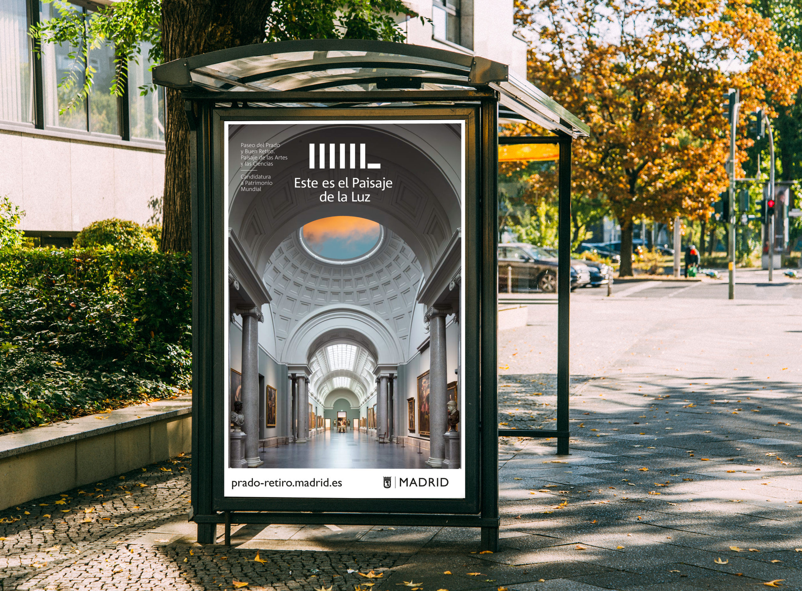
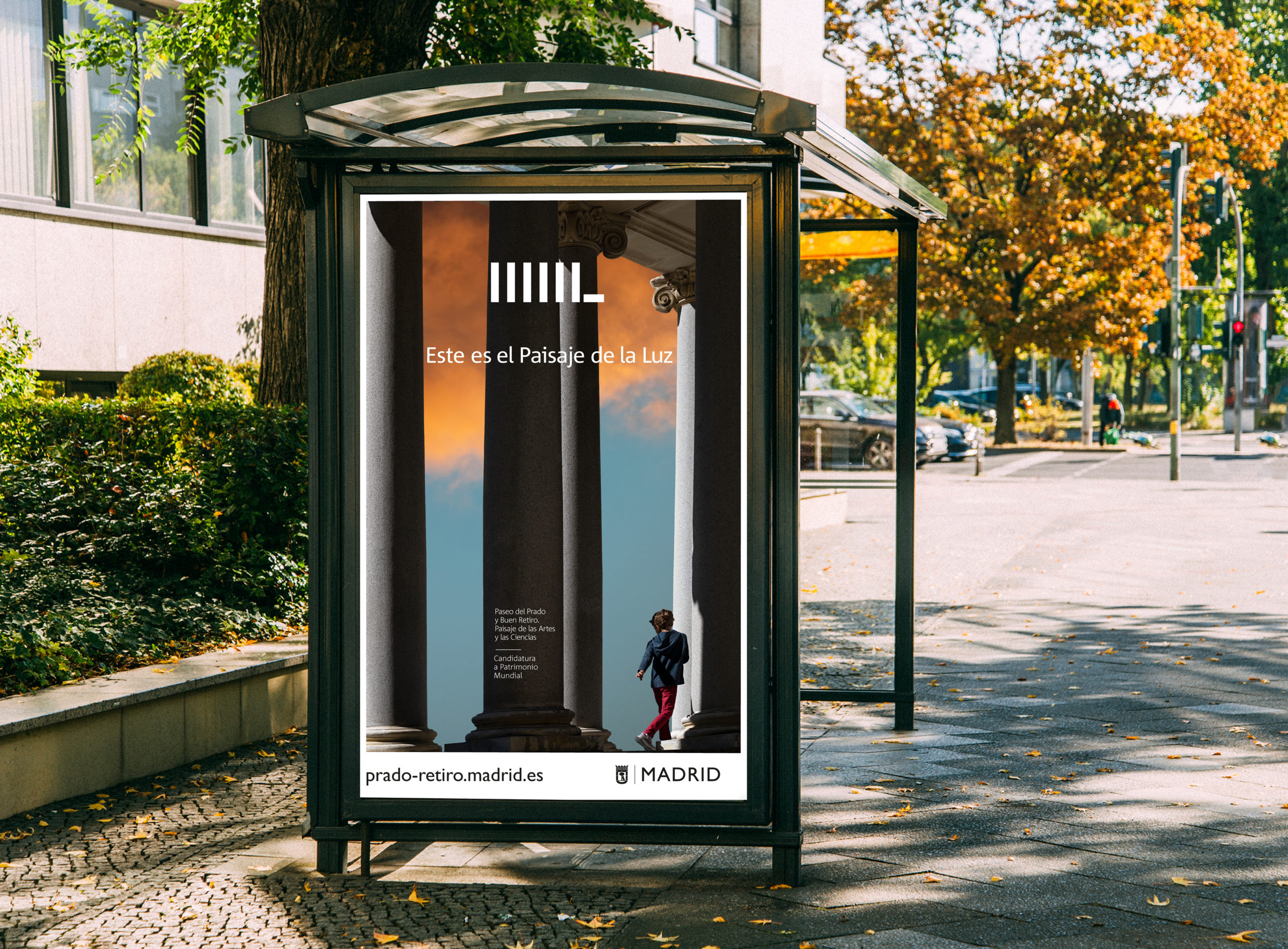
Madrid’s Landscape of Light has been included by the UNESCO as a ‘World Heritage Cultural Landscape’

Without a single dissenting vote cast by the ambassadors of the 21 countries gathered last Sunday, July 25, the project ‘Paseo del Prado and Buen Retiro. Landscape of Arts and Sciences of Madrid’ is now everyone’s heritage.

Its identity, name, logo and communication campaigns were devised by Estrada Design over the past year, commissioned by the Madrid City Council, although the body that officially submitted the project to the UNESCO was the Ministry of Culture of the Government of Spain.

Home image for the website,paisajedelaluz.es, developed by Estrada Design

…Light, reason, culture and nature are the unifying backbone of the Paseo del Prado and the Buen Retiro as the Landscape of the Arts and Sciences, a civic, illustrated space that has evolved since the 16th century, maintaining its essence. This lightscape illuminates everyone, citizens and visitors who have experienced, enjoyed and felt it, it is the historical memory of Goya and of Ramón y Cajal, of the Guernica and of the Puerta de Alcalá, of the lions of the Congress of Deputies and of the legends of the House of America,…


Fragment fromthe Light Manifesto

You might also like…