by f8c898fb93 | Jan 13, 2020
The brand of the State-owned
International Exhibition
The brand of the State-owned International Exhibition Enterprise, responsible for the Spanish pavilions at international trade fairs and a large portion of Spanish exhibitions overseas.
This state-owned enterprise commissioned its new image from Estrada Design after the studio won a bid for the graphics of the Spanish pavilion at the Zaragoza International Exhibition 2008. The commission called for a bold image, able to represent Spain overseas and forsaking clichés.
Estrada Design created all the signage for the offices and the events it organises as well as materials and merchandising.
by f8c898fb93 | Jan 9, 2020
The symbol of Ahorro Corporación, a two-headed griffin, represents the dual nature of the company, which came into being as a result of the merger of two companies, Gesinca and Gesmosa. It uses the mythological figure of the griffin, half lion and half eagle, regarded in European mediaeval culture as the custodian of family treasures.
Ahorro Corporación was seeking a symbol that suggested robustness, tradition and prestige in the financial world. As part of the incorporation of the company, the Contrapunto advertising agency masterminded a campaign based on the logo using the slogan ‘The Birth of a Financial Behemoth’.
by f8c898fb93 | Jan 14, 2020
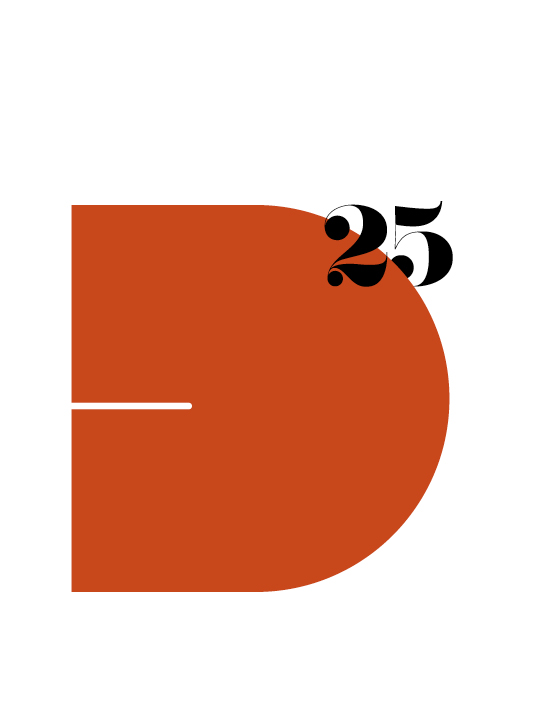
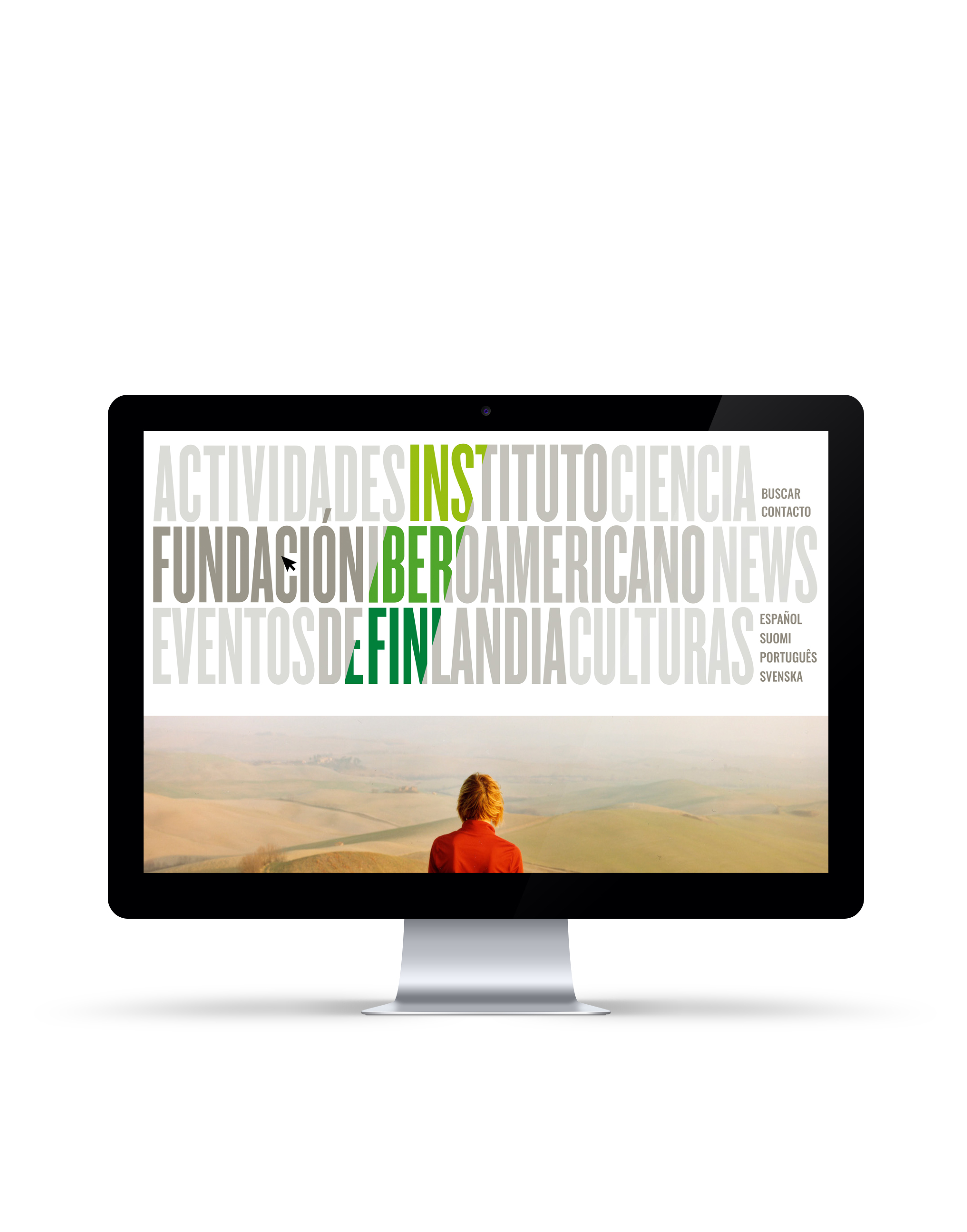
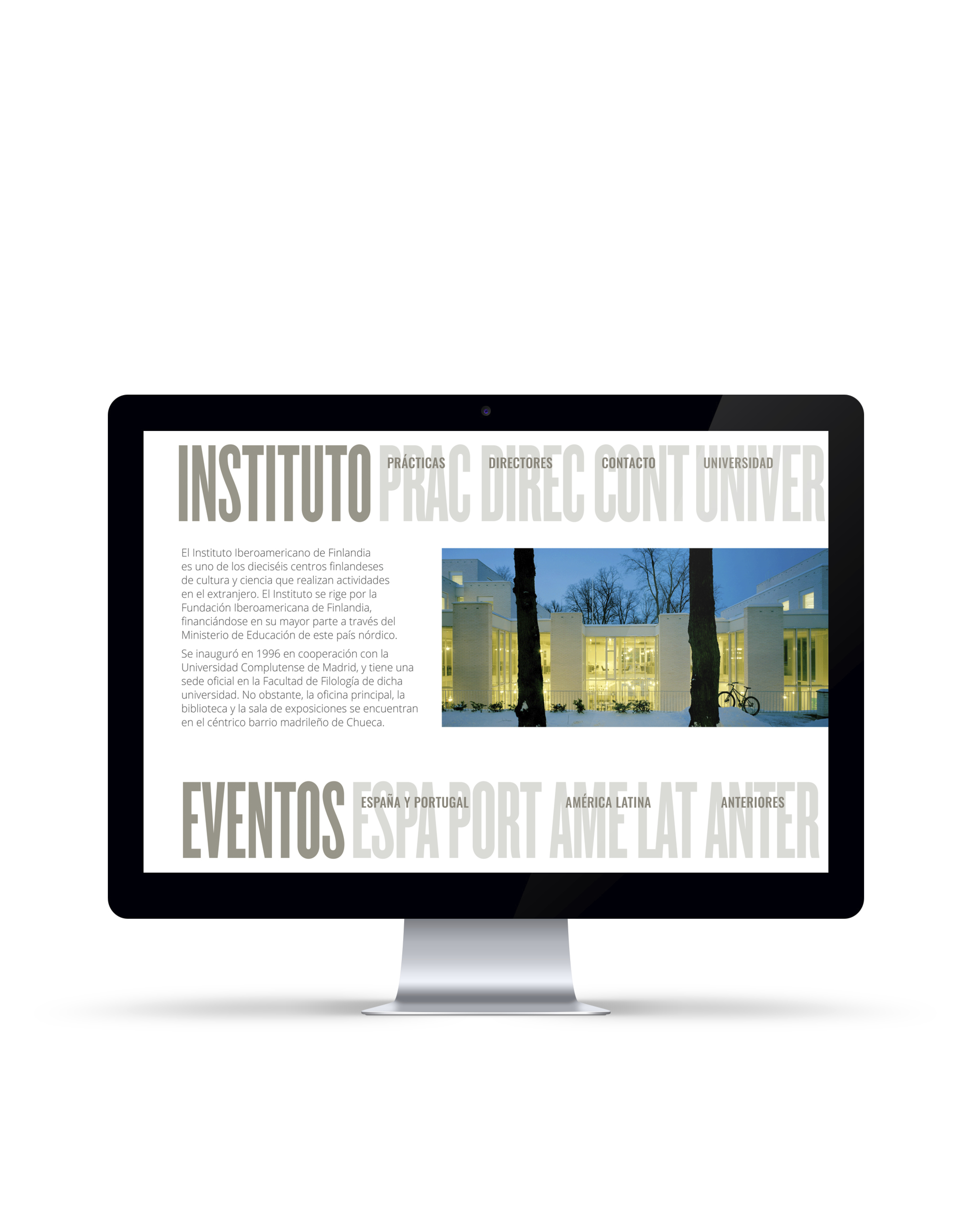
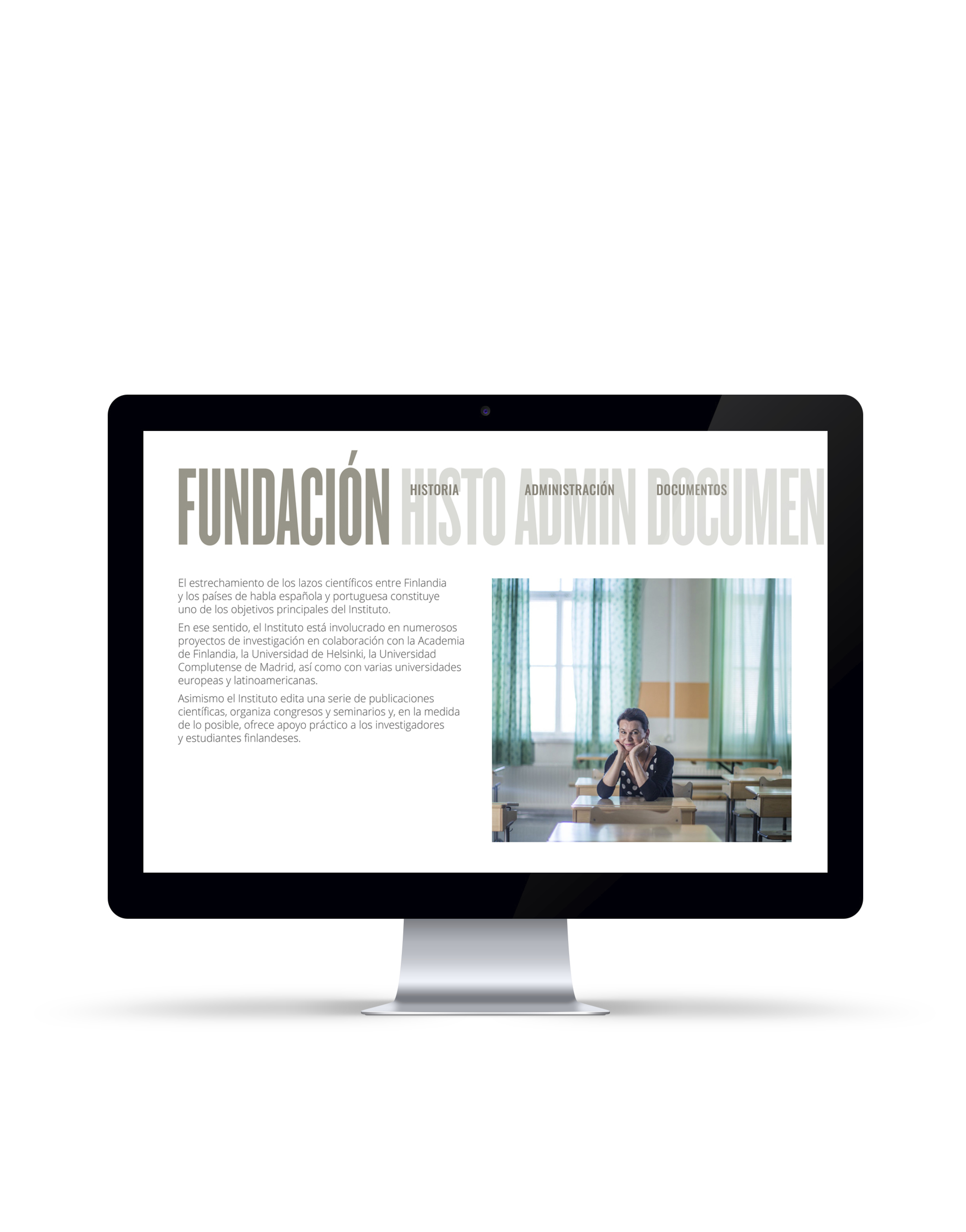
The Ibero-American Institute
of Finland
On the occasion of the opening of its new headquarters in Madrid in 2018, the Ibero-American Institute of Finland commissioned its corporate identity from Estrada Design. The studio not only designed the new identity but was also tasked with designing and producing signage elements and merchandising and with creating its webpage.


Recent Comments