by Cristina Rodrigo Romero | Feb 16, 2023
International Congress
on Longevity Economy
Identity and Applications
Longevity is a long, precise, graphic word in itself. It contains, in its 9 letters and its four syllables, its hopeful meaning. As if it were the conceptualisation of a good wish. That is why this preview of the graphic program on Longevity Economy is based on evidencing the potential of the word and the letter L it begins with.
It is used to generate a logo, which is actually a graphic generator that developed gradually as our work progressed.
It is often said that one way to measure a design is its ability to grow with a project.
We believe that this proposal has that quality.
We shall see.
by f8c898fb93 | Jan 9, 2020
Brand identity, Wayfinding, Museum graphics
The project for the museum comprises not only the design of the identity guidelines and the full signage programme but also applications, such as street pennants, panels for different events, graphics for temporary exhibitions and its publications line.
Regarded as one of the best garment museums in Europe, it was created thanks to a variety of private collections belonging to Spanish fashion designers, such as Balenciaga, and to Julio Caro Bajora’s project for the Museum of Ethnology. It boasts an important collection of unique textiles coupled with a comprehensive informative project on costumes, clothing and sociology.
by f8c898fb93 | Jan 9, 2020
Brand identity, Wayfinding, Architectural
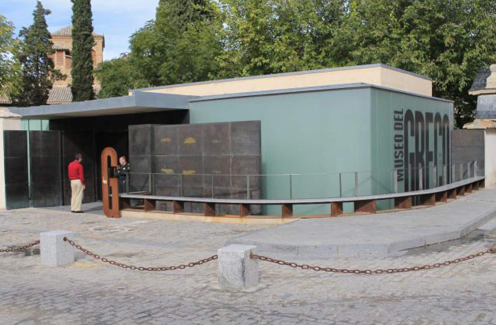
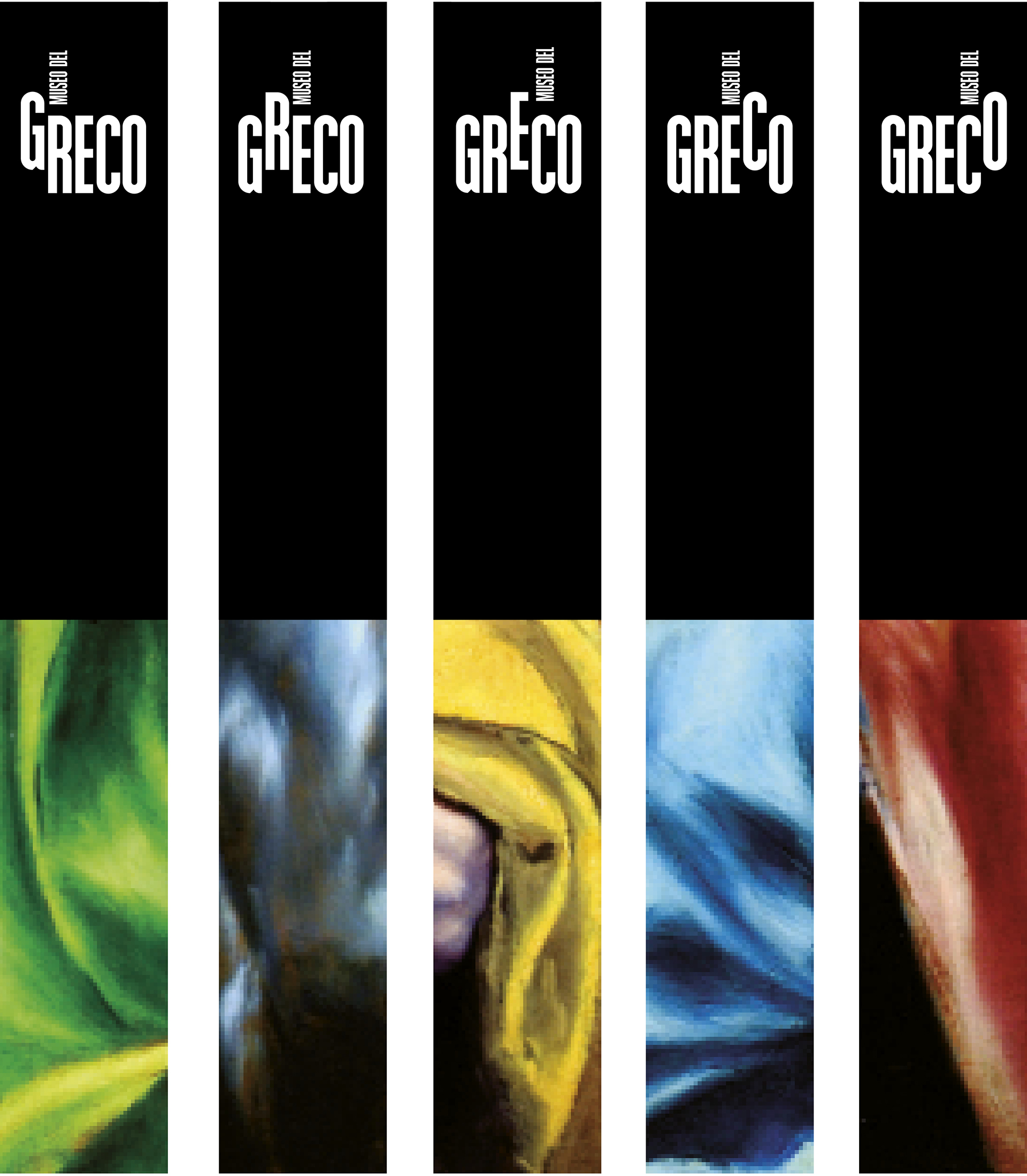
Estrada Design designed the logo for the museum, its publications, website and its signage project.
The museum’s graphic identity is based on the five very vertical letters of its name that generate five versions of the logo. On touring the museum, the separate letters mark the different milestones of the museum from the entrance. An especially vertical system of icons rounds off the identity.
by f8c898fb93 | Jan 9, 2020
Signage and Architectural Graphics
Estrada Design devised the signage and architectural graphics project for the building designed and constructed by the architect Guillermo Vázquez Consuegra in Seville.
Letters and numbers, transformed into gigantic, two-metre-high signs, showcase from any angle the five extensive spaces: two large exhibition halls, the auditorium and two multi-purpose rooms, in addition to a Kids’ Space and a spacious cafeteria-cum-restaurant.
by f8c898fb93 | Jan 10, 2020
Brand identity, Architectural graphics, Cross-sectional design
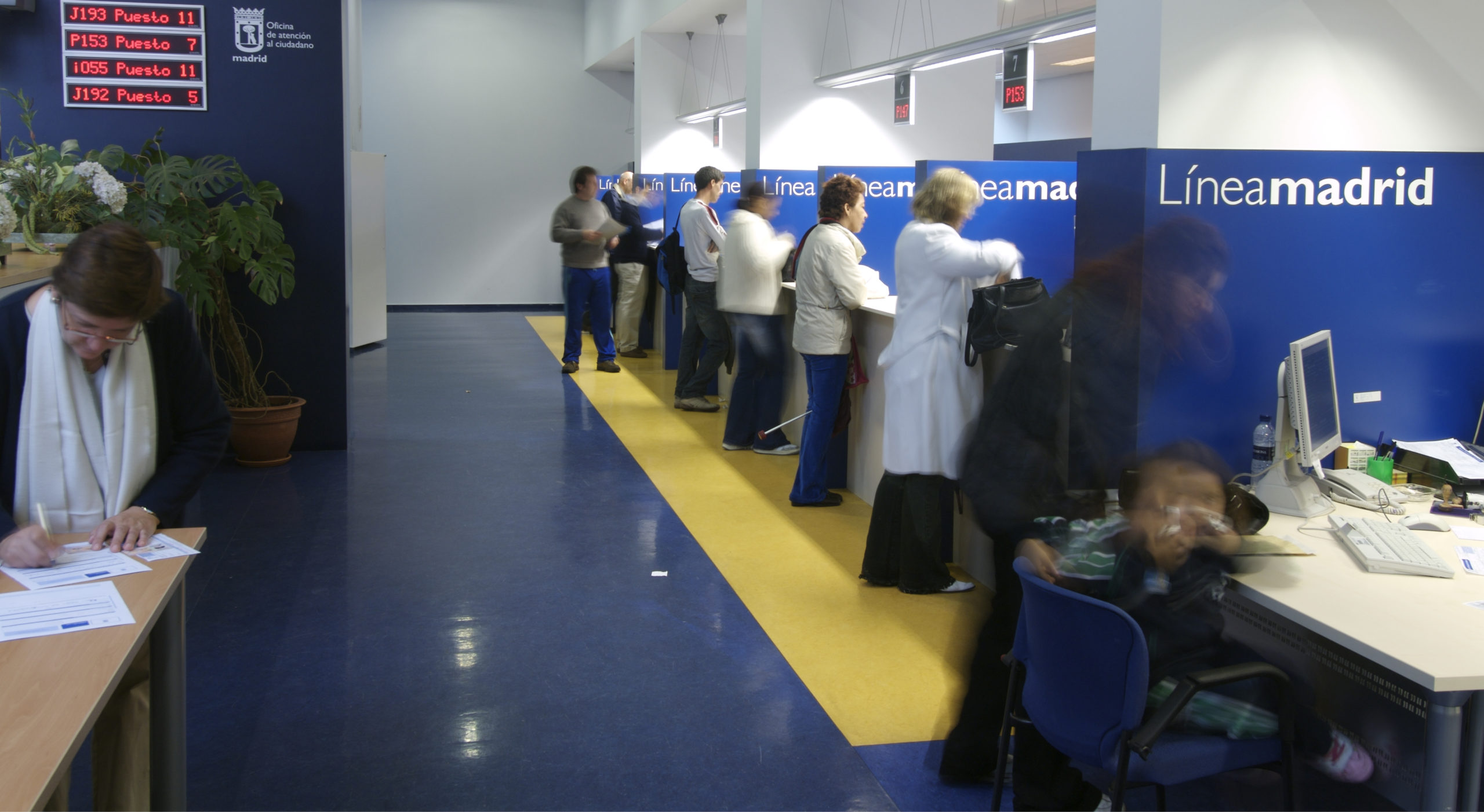
Línea Madrid is the name and concept proposed by Estrada Design for the line used by the City Council to keep in contact with citizens. A brand that identifies, in an integrated manner, the three citizen service channels available: the 010 telephone line, Citizen Service Bureaux and the Online Service.
The programme developed by Estrada Design, in collaboration with the architect Lorenzo Alonso, covers not only the spatial articulation and the interior architecture of the 25 service bureaux, but also the design of the Madrid website, the image of the 010 information telephone number, the brand architecture for the three services and the communication campaign.


Recent Comments