by f8c898fb93 | Jan 10, 2020
Don Quijote de La Mancha Award
Image and Communication Campaign
Estrada Design is the creator of the identity and communication campaign implemented to disseminate this Award that showcases the use of the Spanish language: press advertisements, postcards and posters, in addition to the graphics illustrating the space for the award ceremony.
The logo impregnates all the communications, an almost empty circumference, a small circle with a subtle indentation to evoke a basin, Don Quixote’s helmet.
The Award is promoted by the Regional Government of Castilla La Mancha and the Santillana Foundation and, in its first edition, was presented to the Mexican writer Carlos Fuentes and to the President of Brazil at the time Luiz Inácio Lula da Silva.
by f8c898fb93 | Jan 10, 2020
AFI International
Financial Analysts
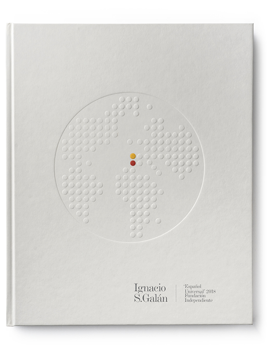
Estrada Design, charged with the company’s corporate identity and its logo, produced the book commemorating 30 years since its creation: 1987-2017. Spain. Economic, financial and social transformations. An insight into the history of the company and the most significant transformations in the global and Spanish economy.
International Financial Analysts (AFI) puts it signature to a large portion of the analyses published in the daily press and the reports for a good number of Spanish savings banks and banks. It is a benchmark institution in Spain, specialising highly in economic and financial advisory services, consulting and training.
by f8c898fb93 | Jan 10, 2020
Estrada Design is the author of the logo, of the Theatre brand, whose initial T is holding up the space’s characteristic dome, in addition to the programmes and posters of recent years.
Now in its third season, the image of the Theatre has been strengthened through its publications and its street graphics: pennants and posters and its press releases. In these, a predominant role is played by a generally white backdrop, containing collages or illustrations combined with photographs, and the bold presence of the typeface.
by f8c898fb93 | Jan 10, 2020
Branding and Communication
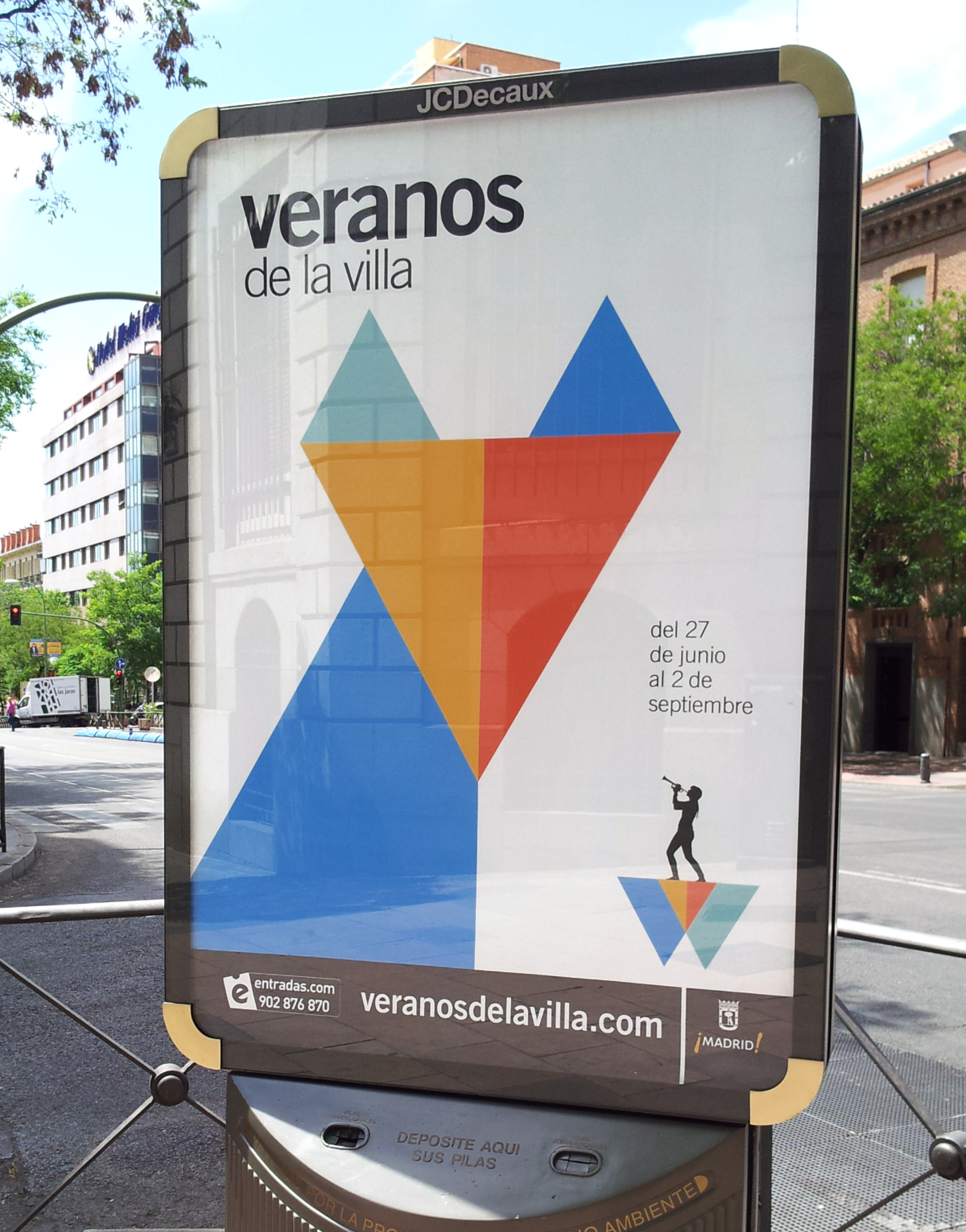
Design of the image of the summer festival of musical and theatrical entertainment in Madrid.
Estrada Design created an image based on the initial of the word Verano (summer in English): a letter V formed of two colours that are reminiscent of the streamers or pennants that decorate popular fiestas and open-air dances in Spain.
Estrada Design has also been charged with the graphic communication of several editions, working on a core graphic element applied in different ways and a colour code to identify different areas, venues or activities.
by f8c898fb93 | Jan 10, 2020
Delivering and bringing music since 1993
Boa is an independent record label, specialising in contemporary music, ranging from urban rock and rap to Celtic music. Its distinctive sign, designed by Estrada Design, is an upside-down heart evoking a human figure with its hands together on its head and which, in turn, is also a drawing of the three letters making up the company’s name.
Lohondo is a flamenco record label owned by Boa Music. Its distinctive sign shows the colours of Spain and alludes to a flamenco singer’s chair and a Spanish guitar.










Recent Comments