by f8c898fb93 | Jan 9, 2020
Corporate Publications, Website
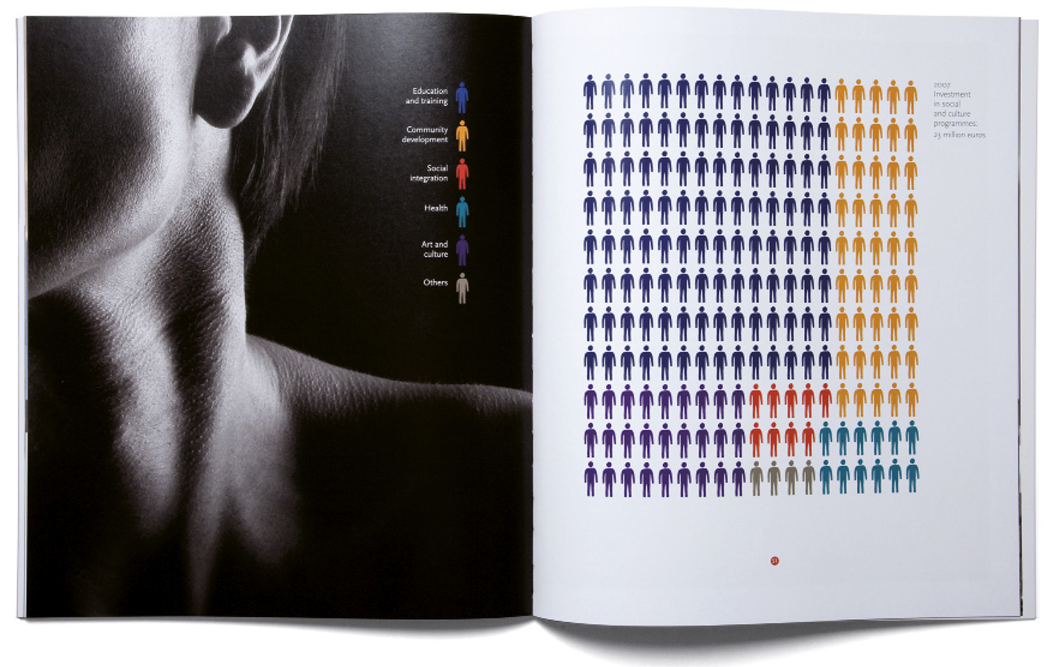
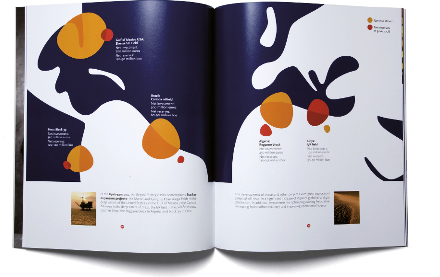
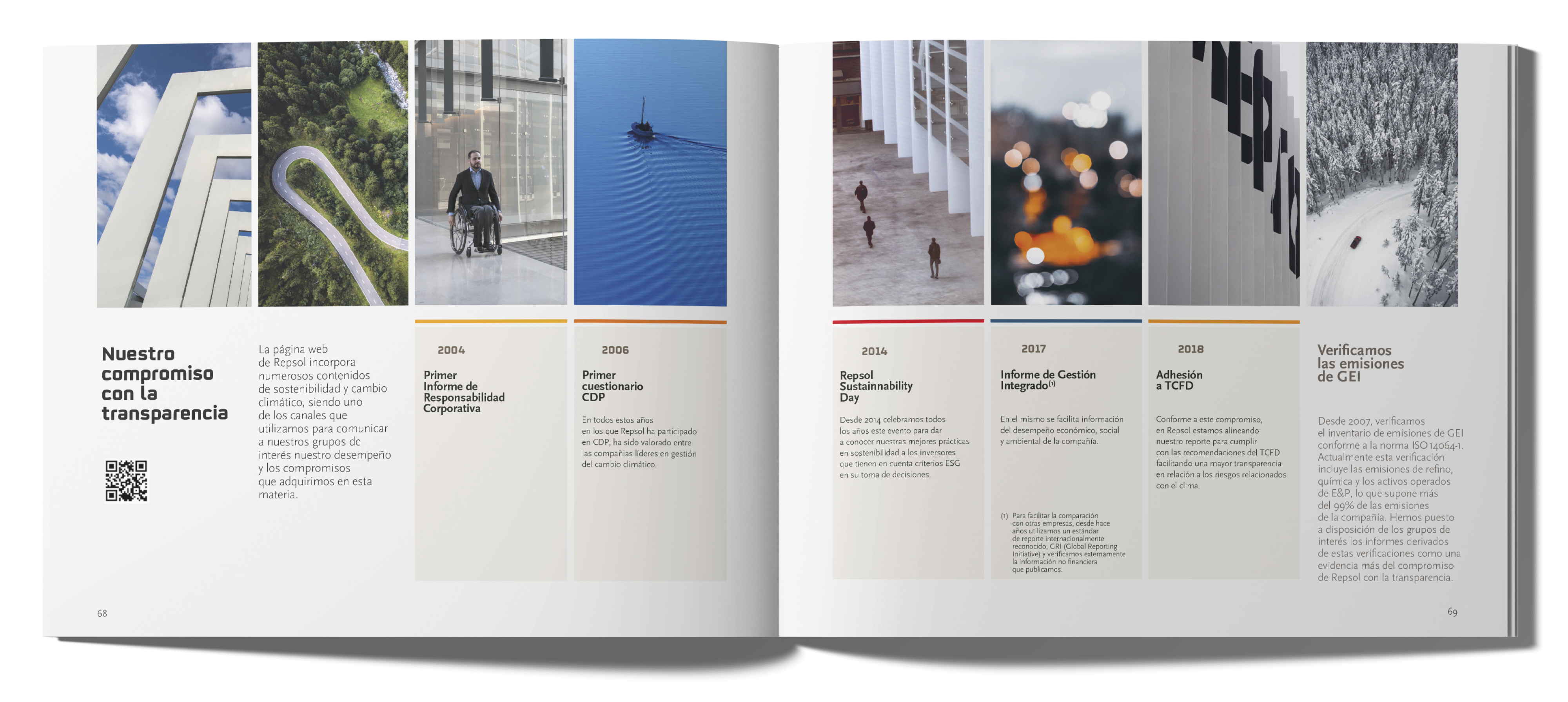
Estrada Design has been designing for Repsol since 2008: its paper publications, such as annual reports, books and corporate pamphlets, as well as its digital projects, including the website and newsletters.
In 2018, it prepared the first Integrated Management Report, which recently received third prize for the best Financial Report at the IR Magazine Awards presented in London.
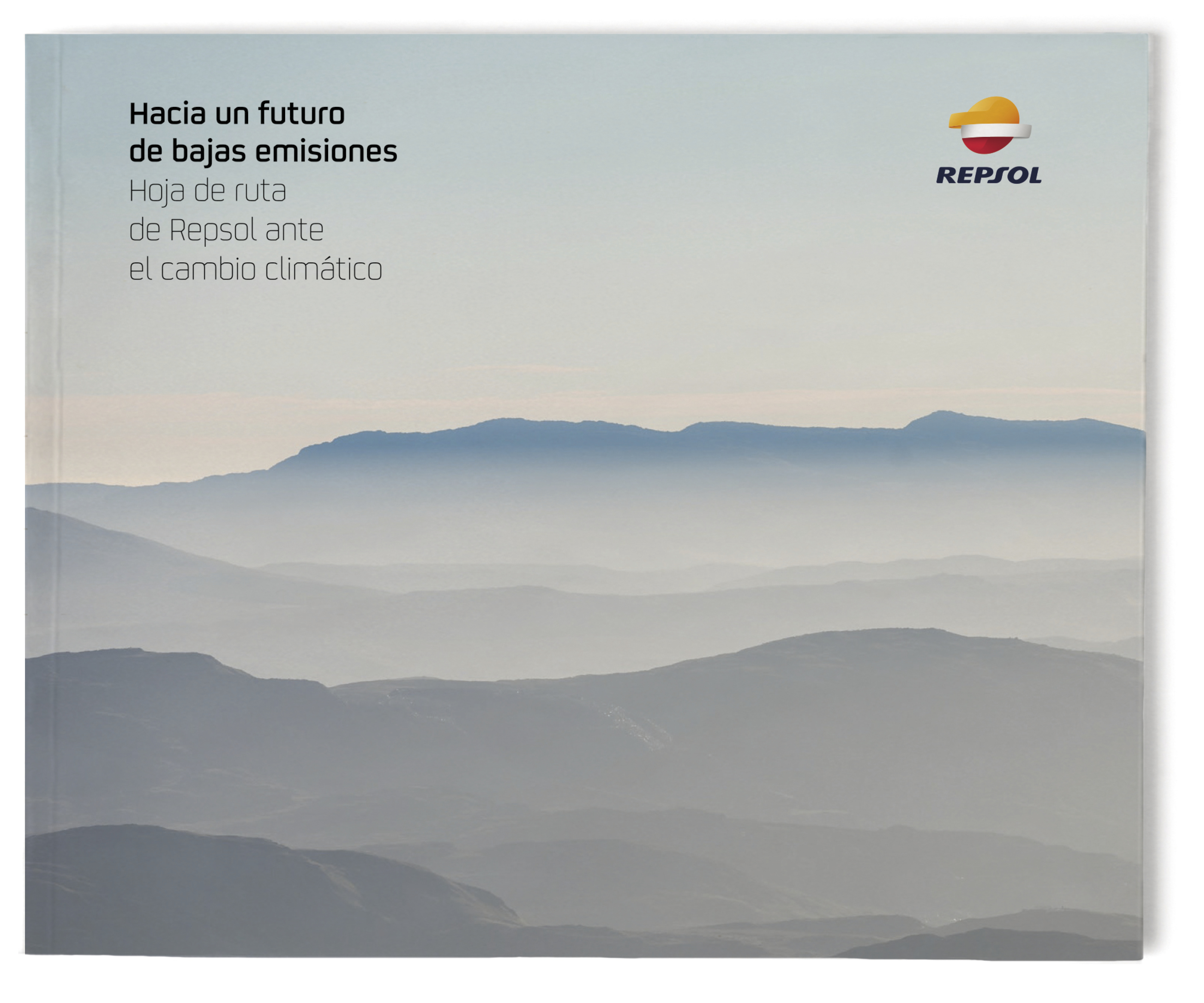
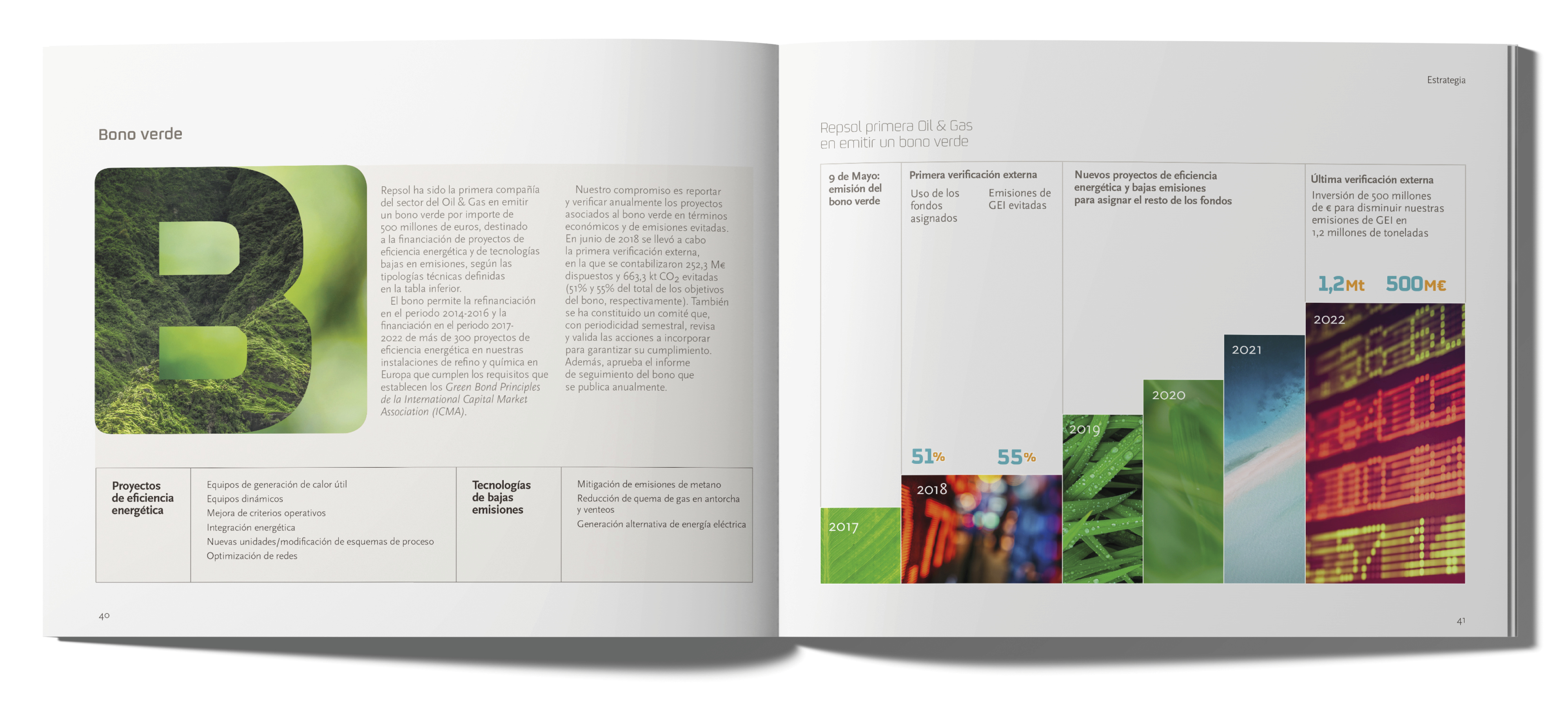
Repsol publicó en 2019 la “Hoja de ruta ante el cambio climático”, mostrando su implicación en el camino de la sostenibilidad y en el cumplimiento de objetivos del Acuerdo de París sobre la reducción de las emisiones
de CO2.
The onomastic book of the largest Spanish refinery in Cartagena and samples of the newsletters designed by Estrada Design.
by f8c898fb93 | Jan 10, 2020
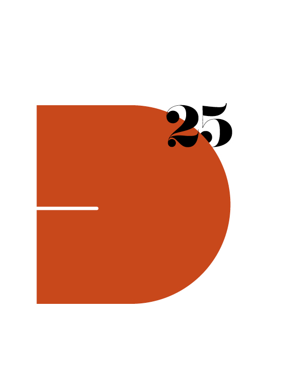
Few Spanish companies can boast turning 175 years of age. In order to celebrate this important milestone, Gas Natural Fenosa commissioned a commemorative logo from Estrada Design. The 175 logo was generated using the colour texture of the corporate symbol itself.
También te puede
interesar…
by f8c898fb93 | Jan 10, 2020
Repsol Annual Report 2018
Publications, Annual Report
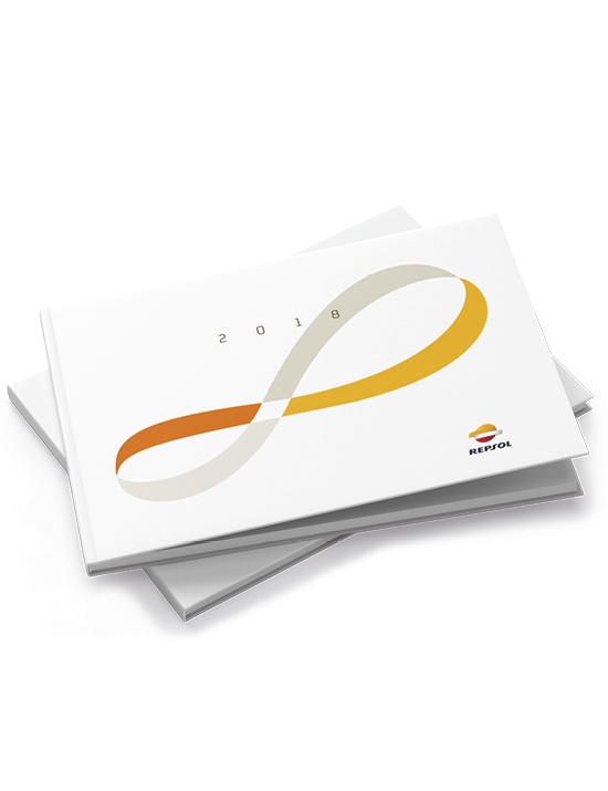
Estrada Design was tasked with preparing the Repsol Annual Report 2018, in its paper and website versions. That year saw the use of graphics consisting of a number eight, the symbol for infinity, as the key, innovating image, which continues to express the notion of this great company’s energy, transparency and modernity. Estrada Design also created the Annual Report website, transferring the same conceptual and graphic lines to its design.
by f8c898fb93 | Jan 9, 2020
Two food and design exhibitions, masterminded by Estrada Design, were staged in New York within the framework of the prominent Spanish gastronomy event titled Eat Spain Up!
The first exhibition, Spain’s Eleven, displayed the eleven icons of Spanish cuisine. In the second, Estrada Design Kitchen, Manuel Estrada explored the similarities between the design process and graphic creation and cooking.
Eat Spain Up! was an event held in New York to put Spanish food, wine and culture on the map. A culinary journey entailing a month of exhibitions, tastings, debates, projections, pop-up windows and special food offers in different parts of the city.
by f8c898fb93 | Jan 10, 2020
Brand Identity and Product Design
The Casa de Alba brand, designed by Estrada Design, seeks a balance between the heraldic tradition of one of the oldest surnames in Europe and the requirements of commercial communication.
In order to prepare the central element of the brand, its symbol, Estrada Design used the coat of arms of the Casa de Alba, focussing on the only one of its four fields whose symbolic root is of Spanish origin, compared to the other three fields that represent heraldic elements from England, Scotland and Ireland. The core component of the brand is a blue and silver, slightly curved, chequered field, or as is said in Heraldry, inscribed on an escutcheon, and a simplified version of the five-point ducal crown.















Recent Comments