by f8c898fb93 | Jan 10, 2020
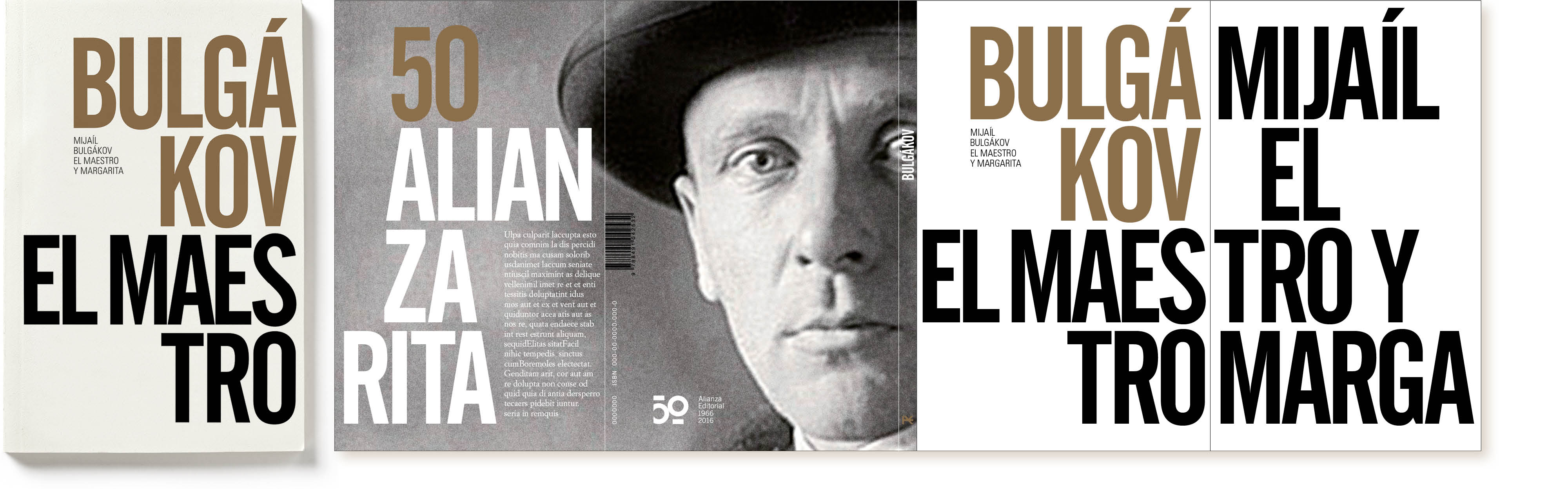
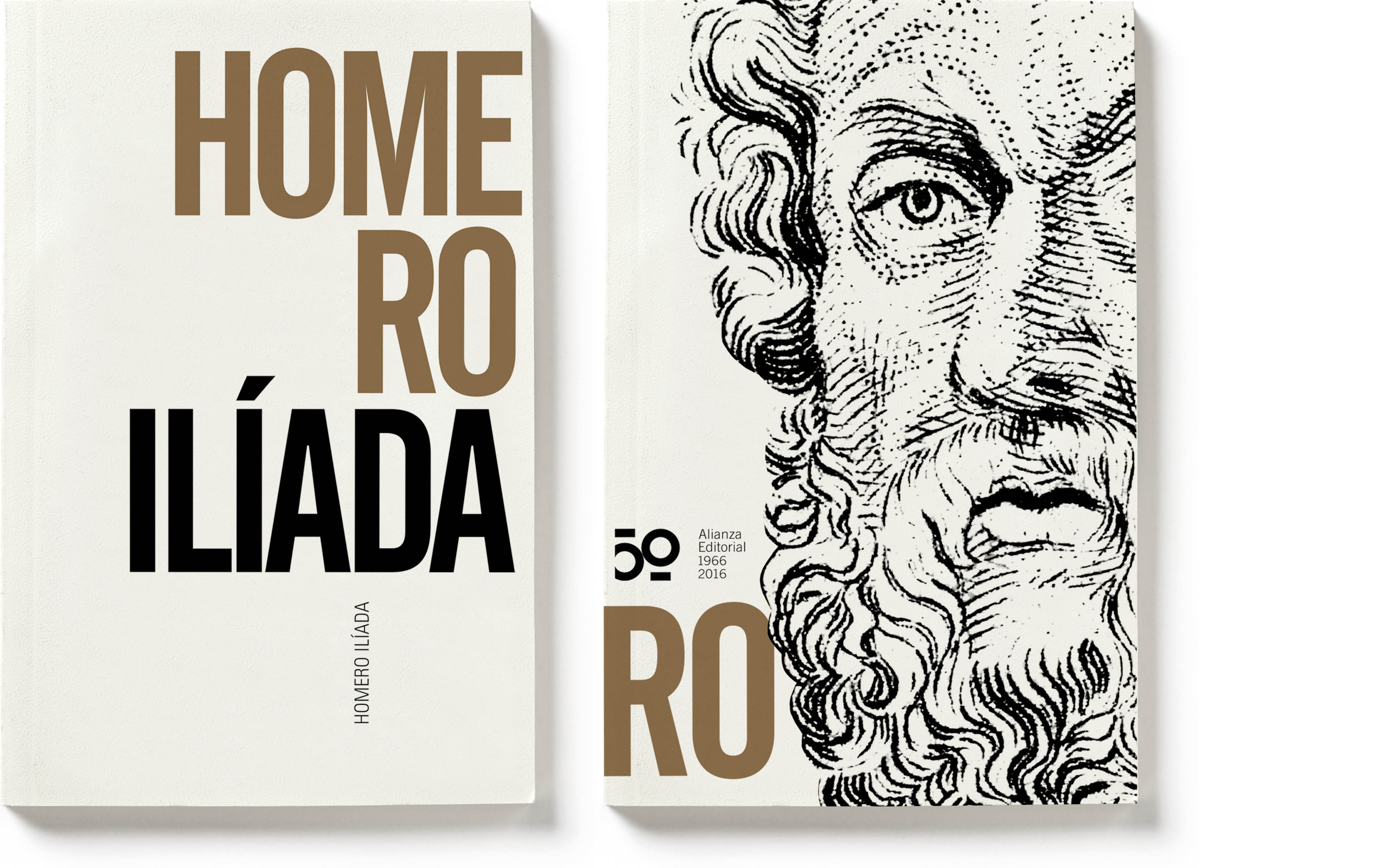
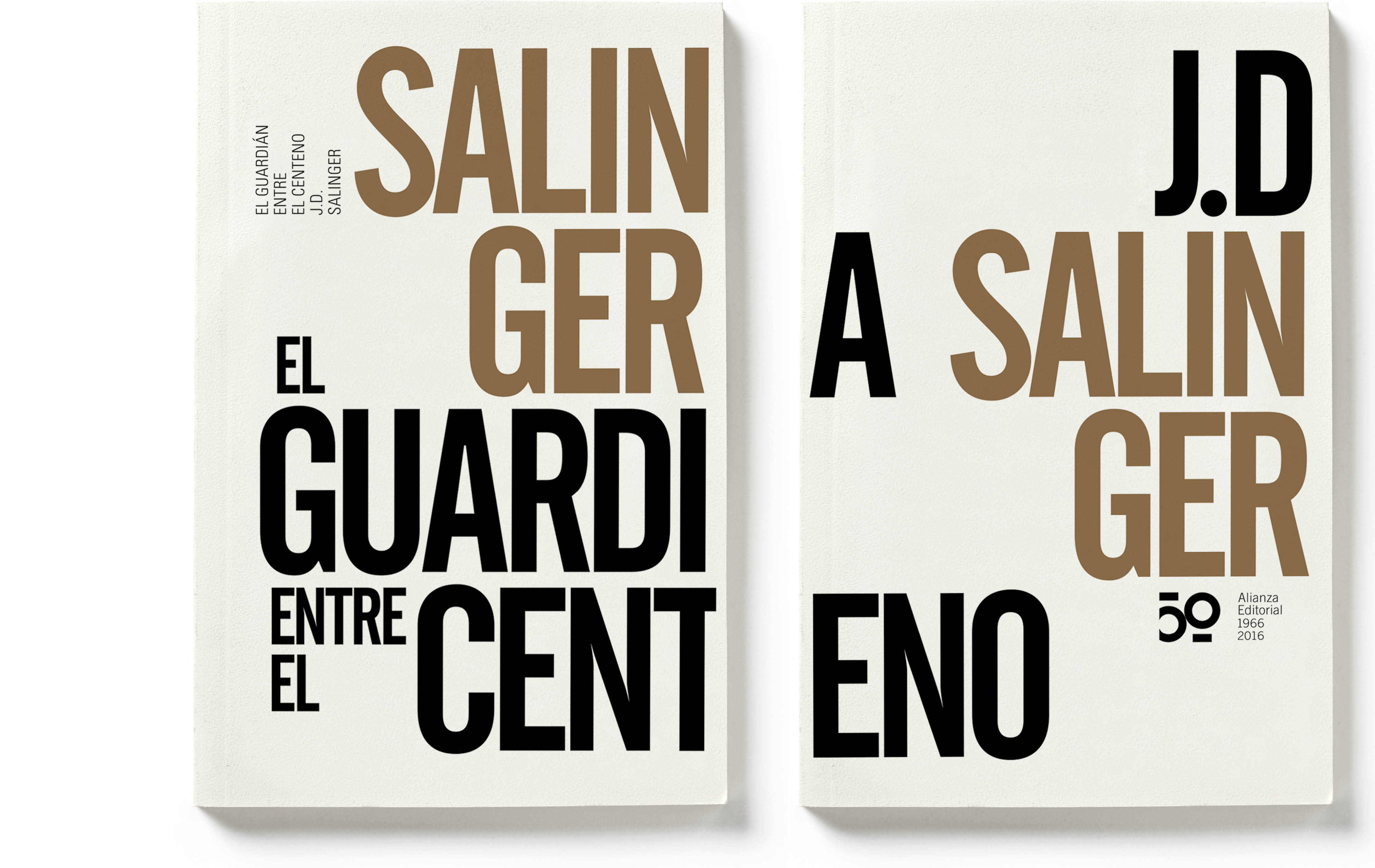
50 years of Alianza Editorial
Design of the commemorative logo and a special 50th anniversary collection.
On the occasion of its 50th anniversary, Alianza Editorial launched a small collection of 16 titles that form part of the history of the publishing house and are classics of universal literature and works of reference: Schopenhauer, Salinger and Maalouf.
by f8c898fb93 | Jan 9, 2020
CRUE Spanish universities
The association that encompasses all Spanish universities needed to strengthen and revamp its image. The new symbol is a letter U, the typographic sum of the one hundred universities it comprises.
CRUE acts as a liaison with the central government and its purpose is to lead the promotion of academic life at a time of significant challenges for universities and to transfer their values to society. The new brand seeks to convey a message of power, will and capability, as well as serving to express and strengthen relations between universities, their working groups and their projects.
CRUE works to promote Spanish universities and to contribute to the development and progress of Spanish society and its university teaching by improving higher education, scientific research and knowledge transfer.
by f8c898fb93 | Jan 14, 2020
El País. The Look of Time
Spanish society in the 20th century.
Edited and published every week by El País newspaper in 20 volumes, Estrada Design is the author of this series of books, which are a trip through the graphic memory of Spanish history and society in the 20th century.
The books cover the politics, economy and cultural life of the people of Spain based on research, study and documentation of hundreds of thousands of photographs. The series offered an important selection of images, most of which were sourced from the photo archives of the Agencia EFE and El País newspaper, with comments from experts and texts by well-known writers and journalists.
by f8c898fb93 | Jan 10, 2020
Repsol Climate Change 2018
For the first time
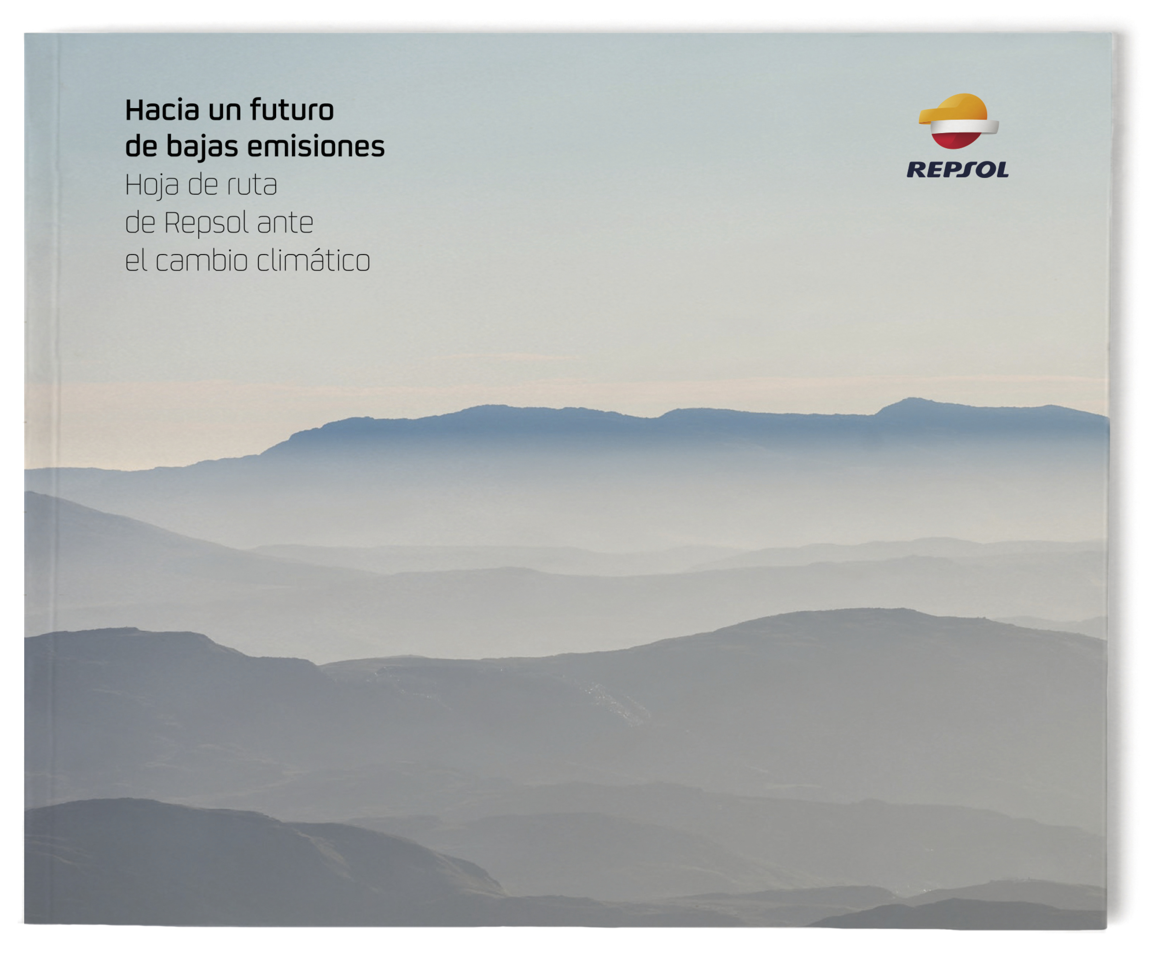
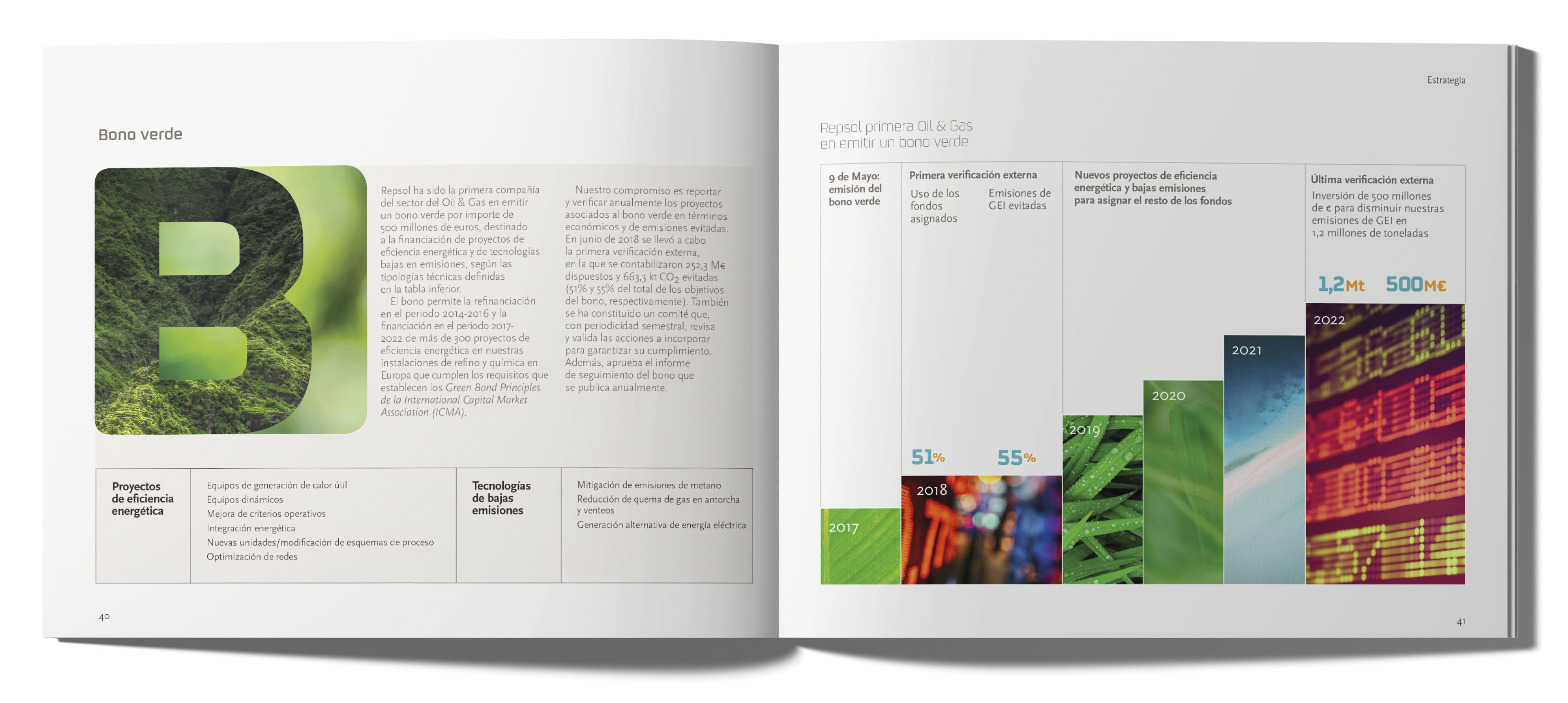
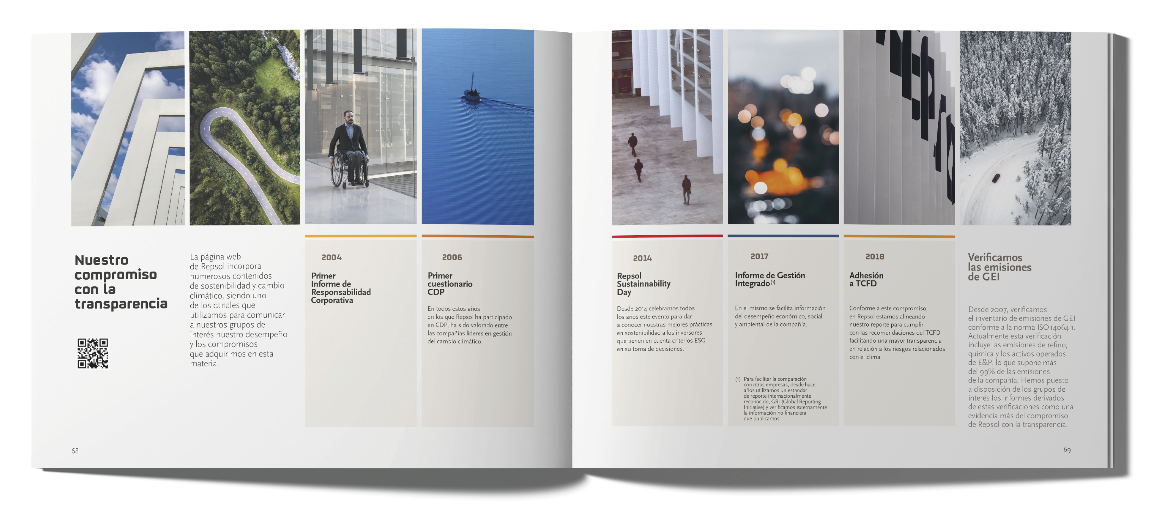
Repsol has published its ‘Climate Change Roadmap’, illustrating its involvement in the path to sustainability and compliance with the Paris Agreement on the reduction of CO2 emissions. Estrada Design was tasked with the design, layout and production of the publication.
by f8c898fb93 | Jan 14, 2020
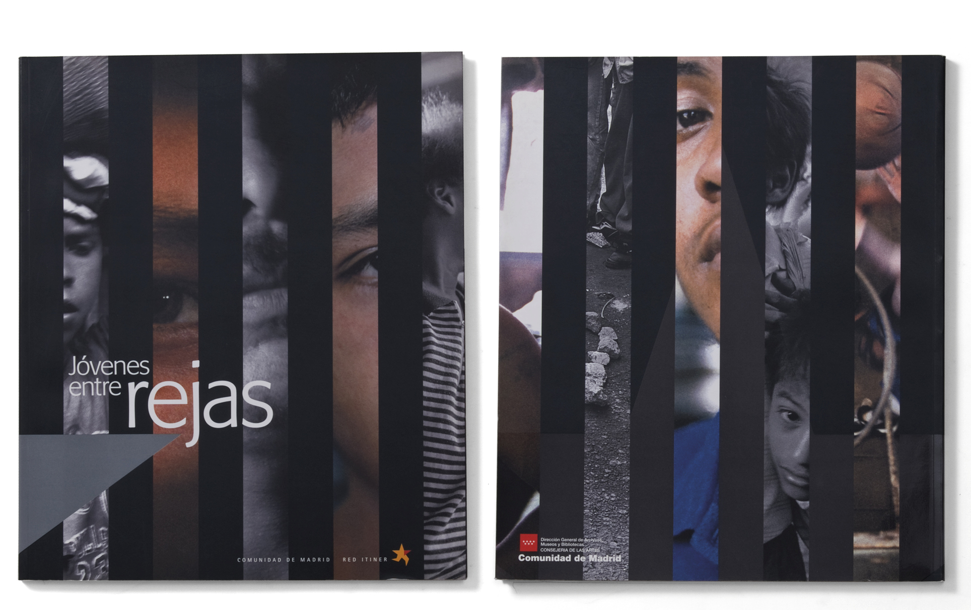
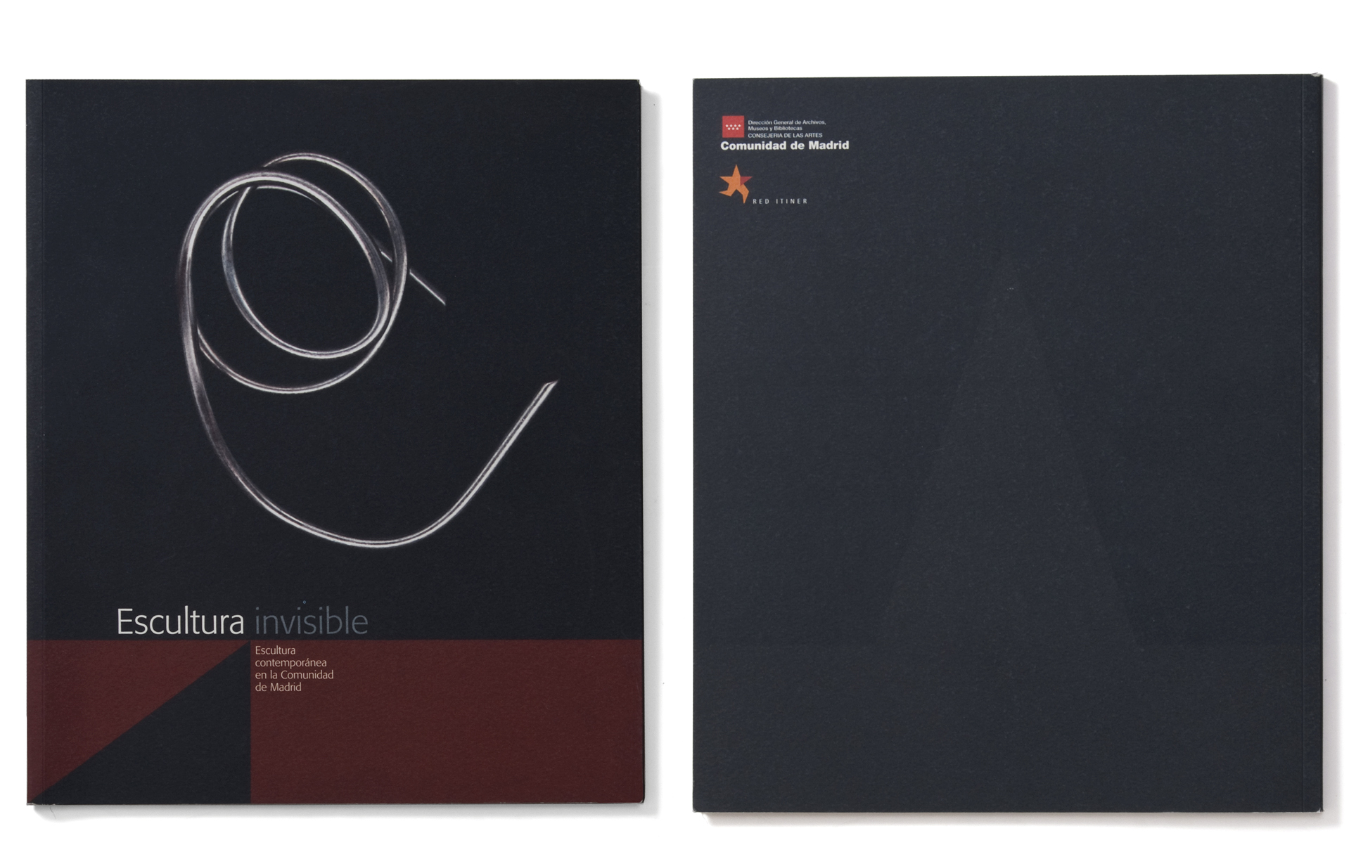
Red Itiner. Autonomous Community of Madrid
Design of the symbol and publications of the Travelling Exhibition Network in the Autonomous Community of Madrid, which takes cultural proposals on films, immigration, tourism and Spanish music around the whole region on an itinerant basis.
Red Itiner came into being as a platform for cooperation between the municipalities and the regional government.
The Red Itiner logo shows a five-pointed star that appears to be running: its two lower points have been turned into two running legs that throw a shadow behind them, and its right arm, coloured in red, is pointing the way.




























Recent Comments