by f8c898fb93 | Jan 9, 2020
Corporate Identity, Architectural Graphics and Communication
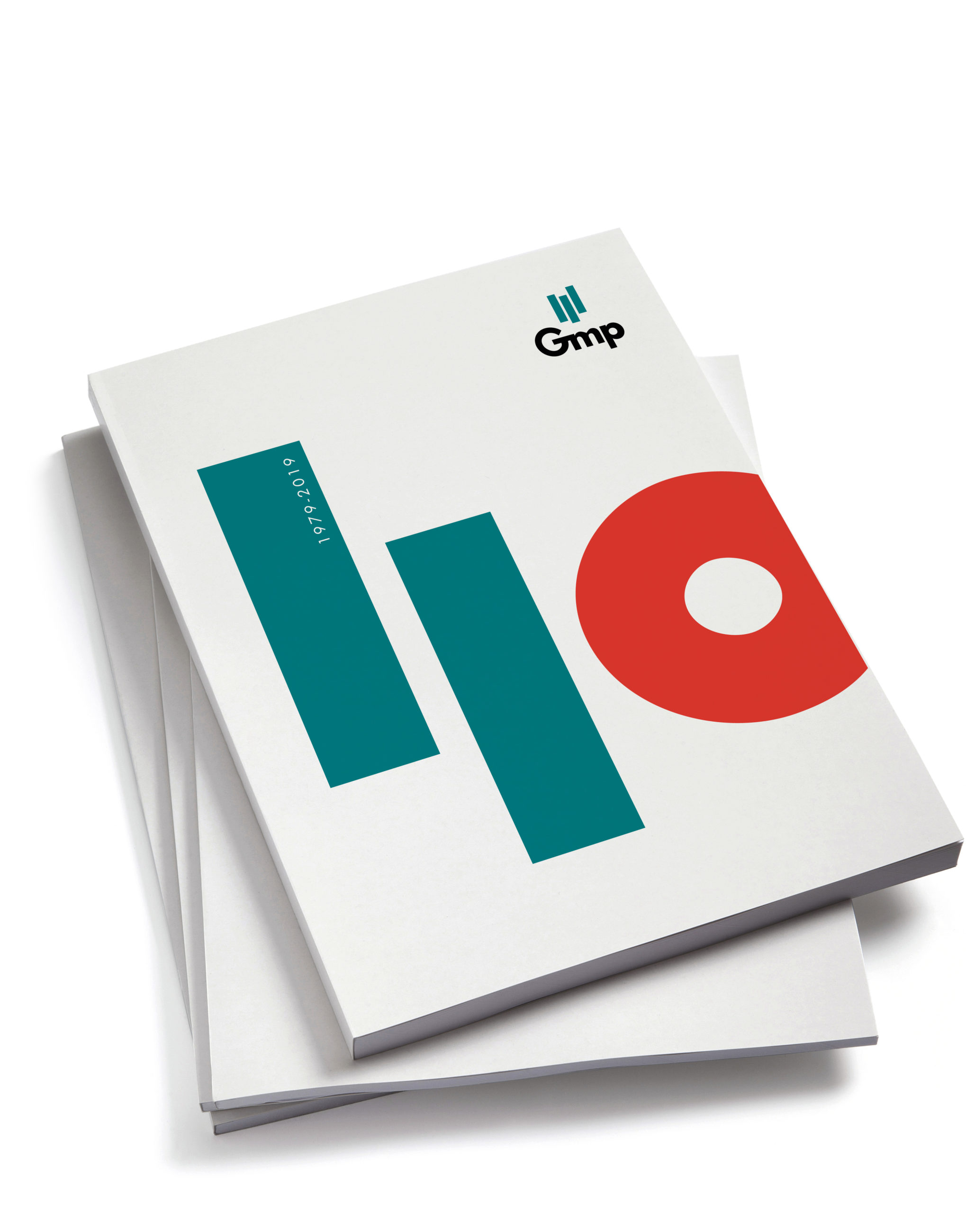
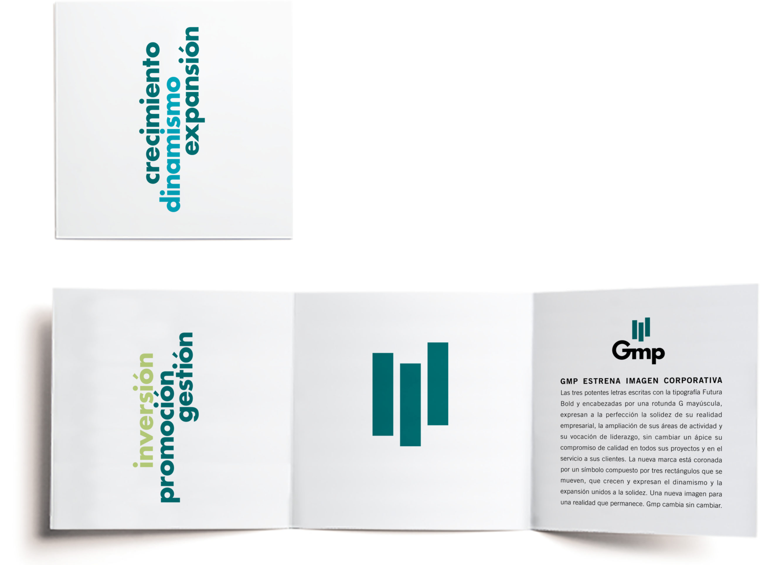
Founded in 1979, the GMP Group celebrated its 40th anniversary in 2019. Estrada Design, the author of its corporate identity, designed its commemorative logo for the occasion.
The rational, simple and direct symbol designed by Estrada Design many years ago for the Group is comprised of three small vertical bars. They represent a gentle upward movement that encapsulates the idea of construction and growth. In the logo for its 40th anniversary, the symbol is transformed into a figure, thus evoking the path travelled by a company that has become one of the leading real estate groups in Spain.
by f8c898fb93 | Jan 13, 2020
Brand Identity and Wayfinding
Bibliometro is a programme run by the City Council of Madrid that consists in taking libraries to readers. For this purpose, new spaces were installed at the metro stations in Madrid that have the highest number of interchanges–Moncloa, Nuevos Ministerios, Príncipe Pío and Legazpi–, so that, on their way, the users of this method of transport would come across an advertising ploy that acts almost like a powerful magnet. In the very short time it has been in operation, thousands of library cards have been issued.
The corporate identity created by Estrada Design for Bibliometro comprises a comprehensive visual system, a logo, an identity programme and a signage and communication plan, ranging from the spine labels for covering the books to the posters pointing to the book kiosks. The studio also designed the graphics used in the kiosks themselves, an undulating structure shaped like the tilde on the letter ñ, designed by the Paredes Pedrosa Arquitectos architecture studio.
by f8c898fb93 | Jan 10, 2020
Spanish Pavilion
at Expo Zaragoza 2008
Brand identity, signage, architectural graphics,
corporate publications
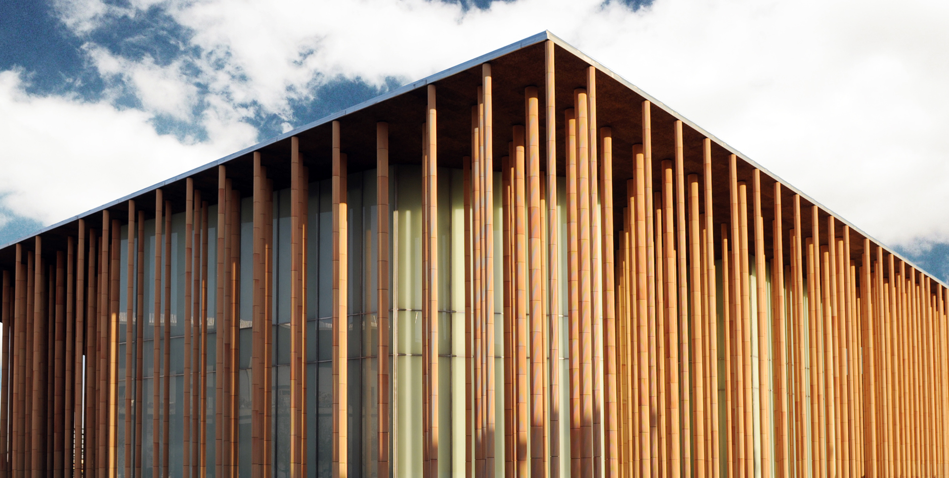
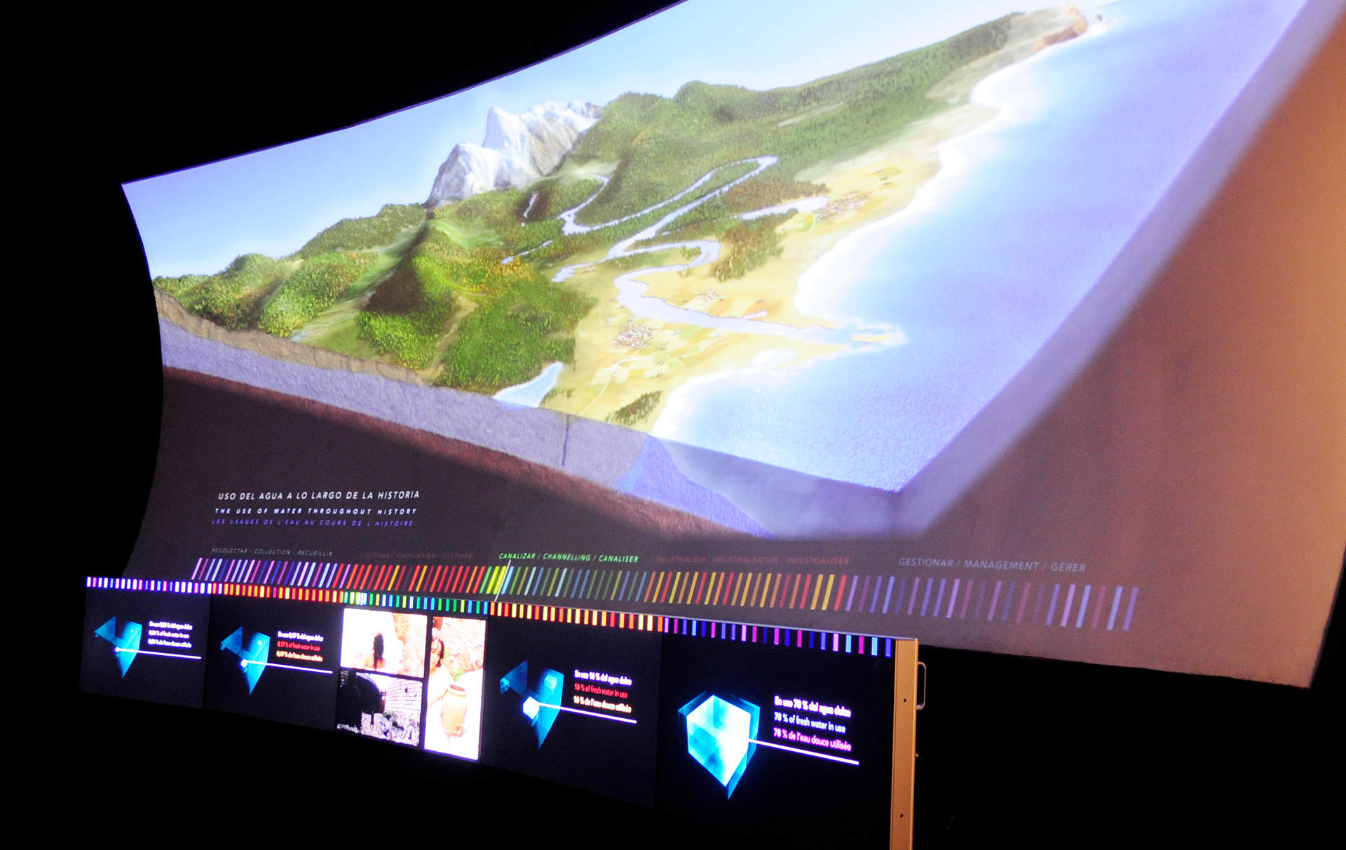
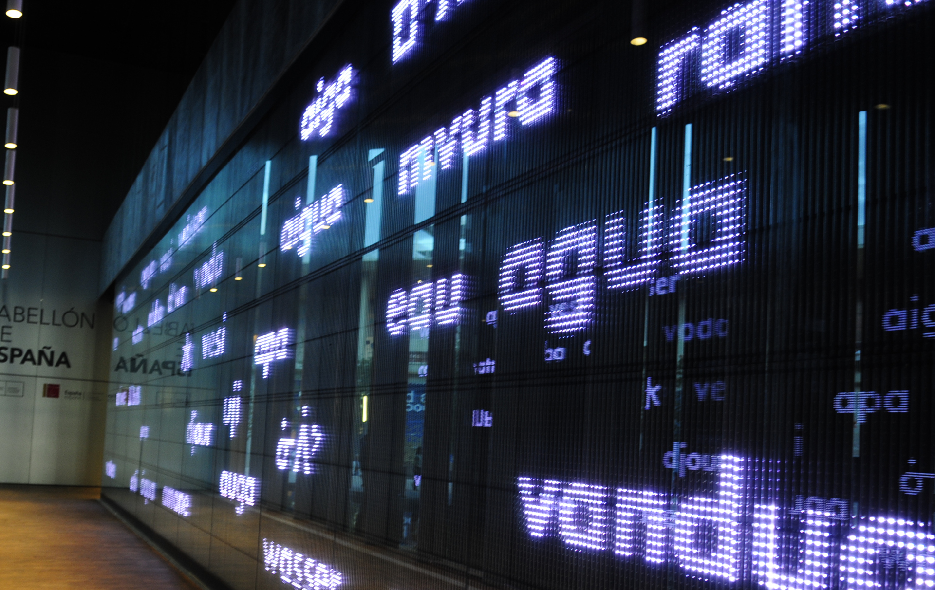
Estrada Design is the mastermind behind the image and identity of the Spanish Pavilion at the International Exhibition of Zaragoza 2008, designed by Patxi Mangado. The studio also created its brand, architectural graphics and signage by deploying a large mural installation showing, via LED lighting, the word Agua (‘water’ in English) written in 78 different scripts representing almost 140 languages from around the world. The letters were used to create movements and typeface animations that simulated a variety of water-related visual elements.
The pavilion is structured around open ceramic pillars which, in the brand, are transformed into 2D, like a barcode of changing colours. In the same way, the graphics used in the restaurant and the store are based on this barcode script and are adapted specifically to each space. This identity system has been used throughout virtually the entire Pavilion, signalling exits, merchandising, information panels, etc.
by f8c898fb93 | Jan 10, 2020
This noteworthy museum on the military history and history of Spain, located in the historic building of the Fortress of Toledo, is one of the most important military museums in the world. Promoted by the Ministry of Defence and the Ministry of Culture of Spain, it was inaugurated in 2010.
Estrada Design is the mastermind behind the brand, the visual identity and the museum project. The brand is based on a distinctive sign that is a simplification of the image of the Fortress of Toledo.
The aim of the museum project is to link as far as possible the history of the Army to the history of Spain, using the very best images from the history of art.
by f8c898fb93 | Jan 9, 2020
Corporate image design for Persán, a Spanish company at the forefront of the detergent industry on the Iberian Peninsula and a technology innovation benchmark in Europe.
The new brand design introduces the emotional factor as a core ingredient in corporate culture. It conveys and establishes its values, succeeds in guaranteeing sales and ensures a positive presence in society. In tandem, it enhances the feeling of belonging, unites and serves as a brand identifier
The competitive international market needs images to effectively reflect products and business capability. Innovation is one of the driving forces that has led Persán to the level of major global leaders.


Recent Comments