by Cristina Rodrigo Romero | Feb 26, 2021
Cover, Conversations with Berlanga.
Estrada Design has designed the covers, for this book edited by Alianza Editorial, where Manuel Hidalgo and Juan Hernández Les, two important film critics, propose a lively set of questions and answers to Luis García Berlanga (1921-2010), the undisputed master of Spanish cinema.
by f8c898fb93 | Jan 9, 2020
1080 Cooking Recipes is the most widely sold cookery book in the entire history of Spanish publishing.Estrada Design designed the covers and block of the book in its pocket and large-sized editions.
The success of this book, an institution in Spanish kitchens, led to the creation of the ‘1080 cooking ideas’ label under which Alianza Editorial began publishing other titles, such as Easy, Simple Cooking and Gluten- and Lactose-Free Cooking. These editions are also designed by Estrada Design.
by f8c898fb93 | Jan 9, 2020
Corporate Publications, Website
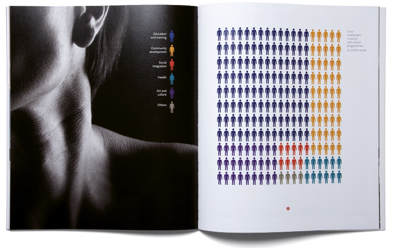
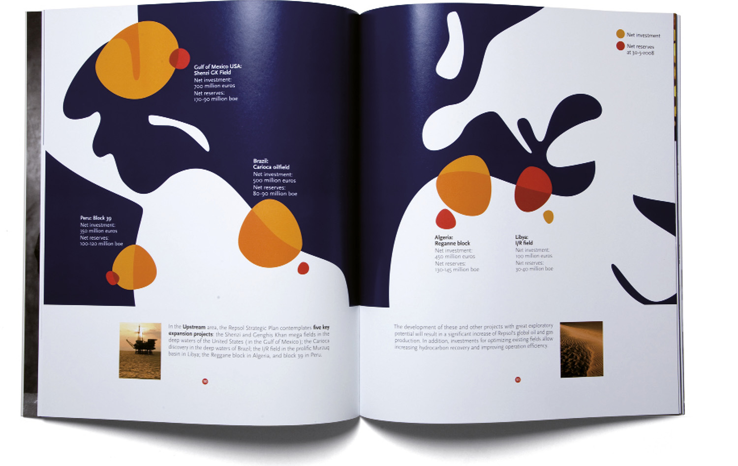
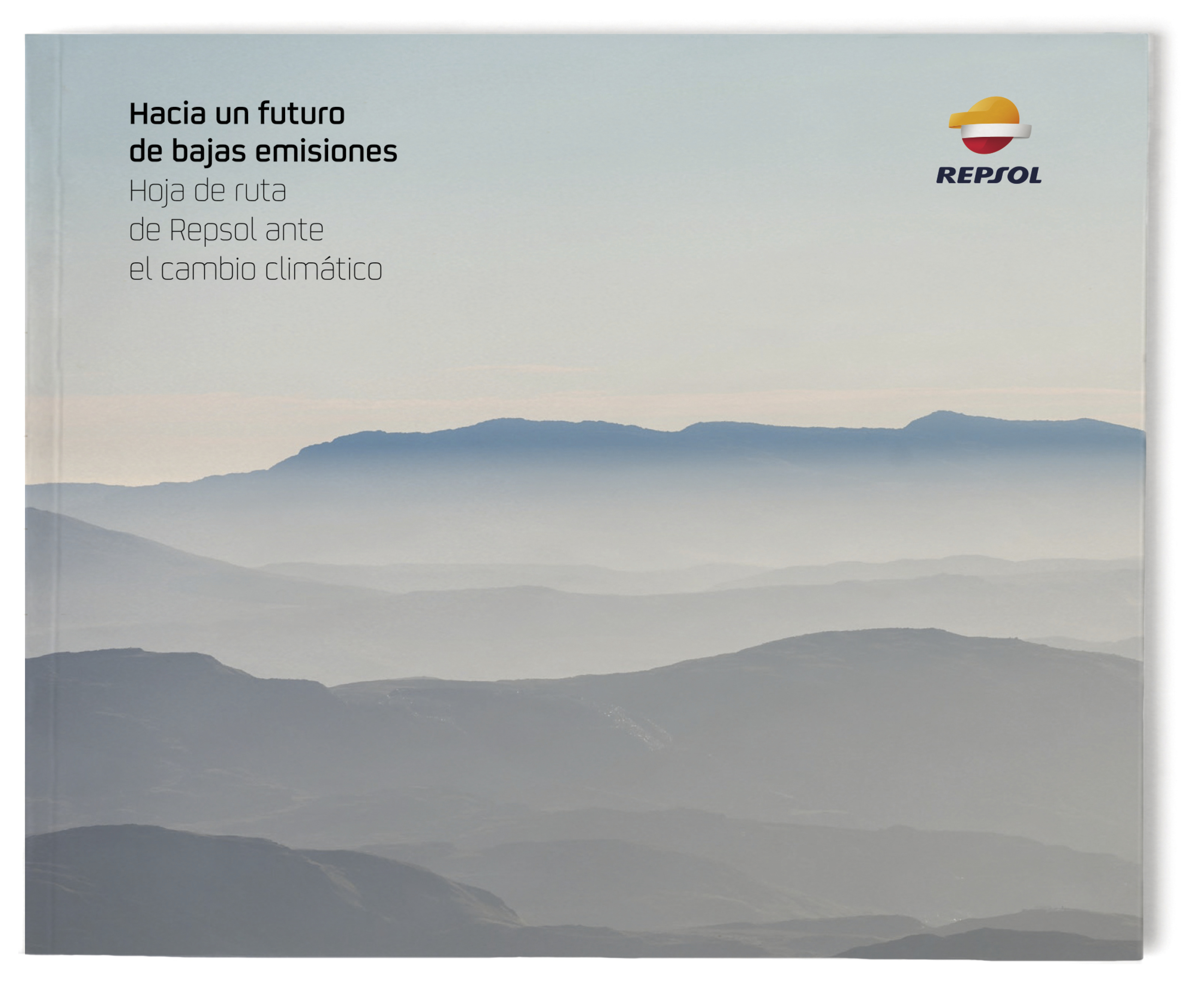
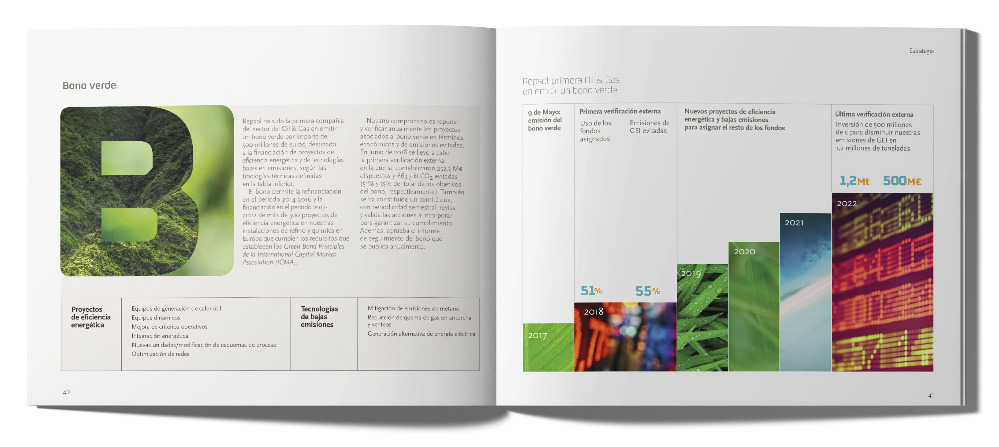
Estrada Design has been designing for Repsol since 2008: its paper publications, such as annual reports, books and corporate pamphlets, as well as its digital projects, including the website and newsletters.
In 2018, it prepared the first Integrated Management Report, which recently received third prize for the best Financial Report at the IR Magazine Awards presented in London.
Repsol publicó en 2019 la “Hoja de ruta ante el cambio climático”, mostrando su implicación en el camino de la sostenibilidad y en el cumplimiento de objetivos del Acuerdo de París sobre la reducción de las emisiones
de CO2.
The onomastic book of the largest Spanish refinery in Cartagena and samples of the newsletters designed by Estrada Design.
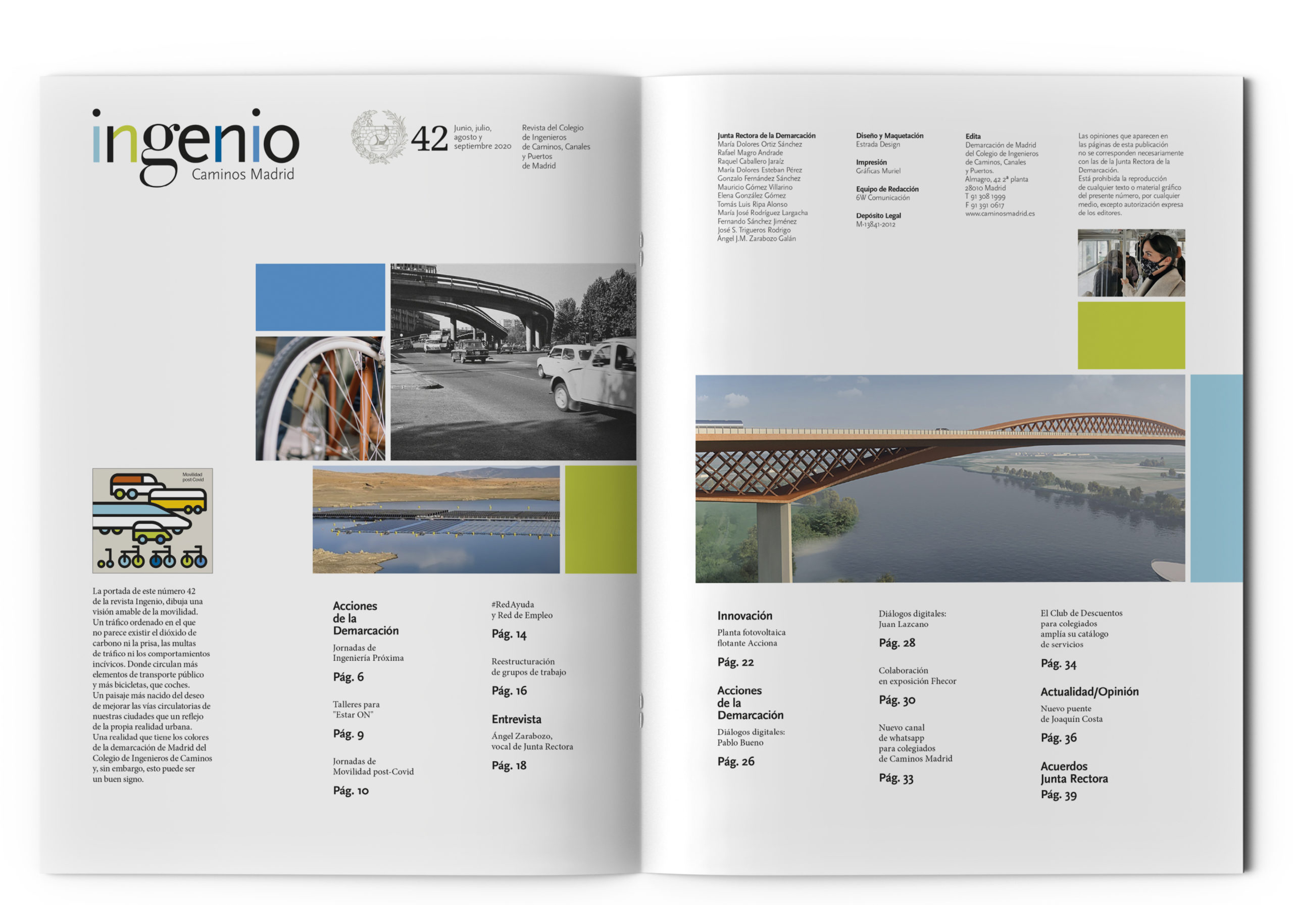
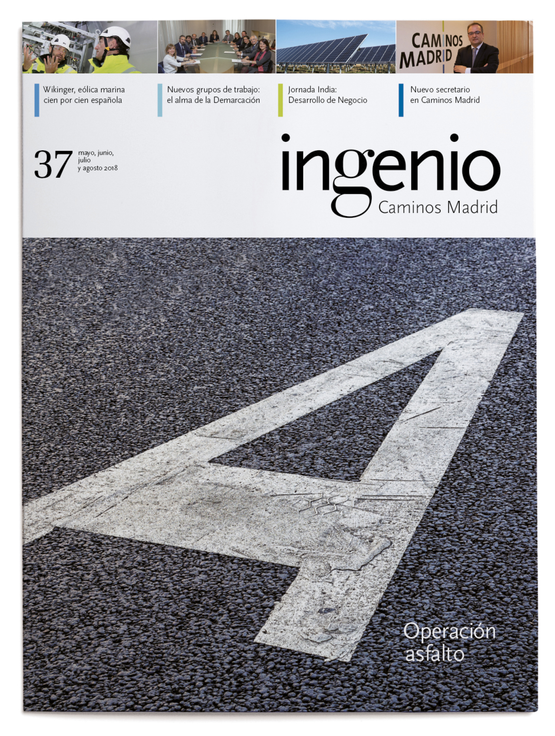
by f8c898fb93 | Jan 10, 2020
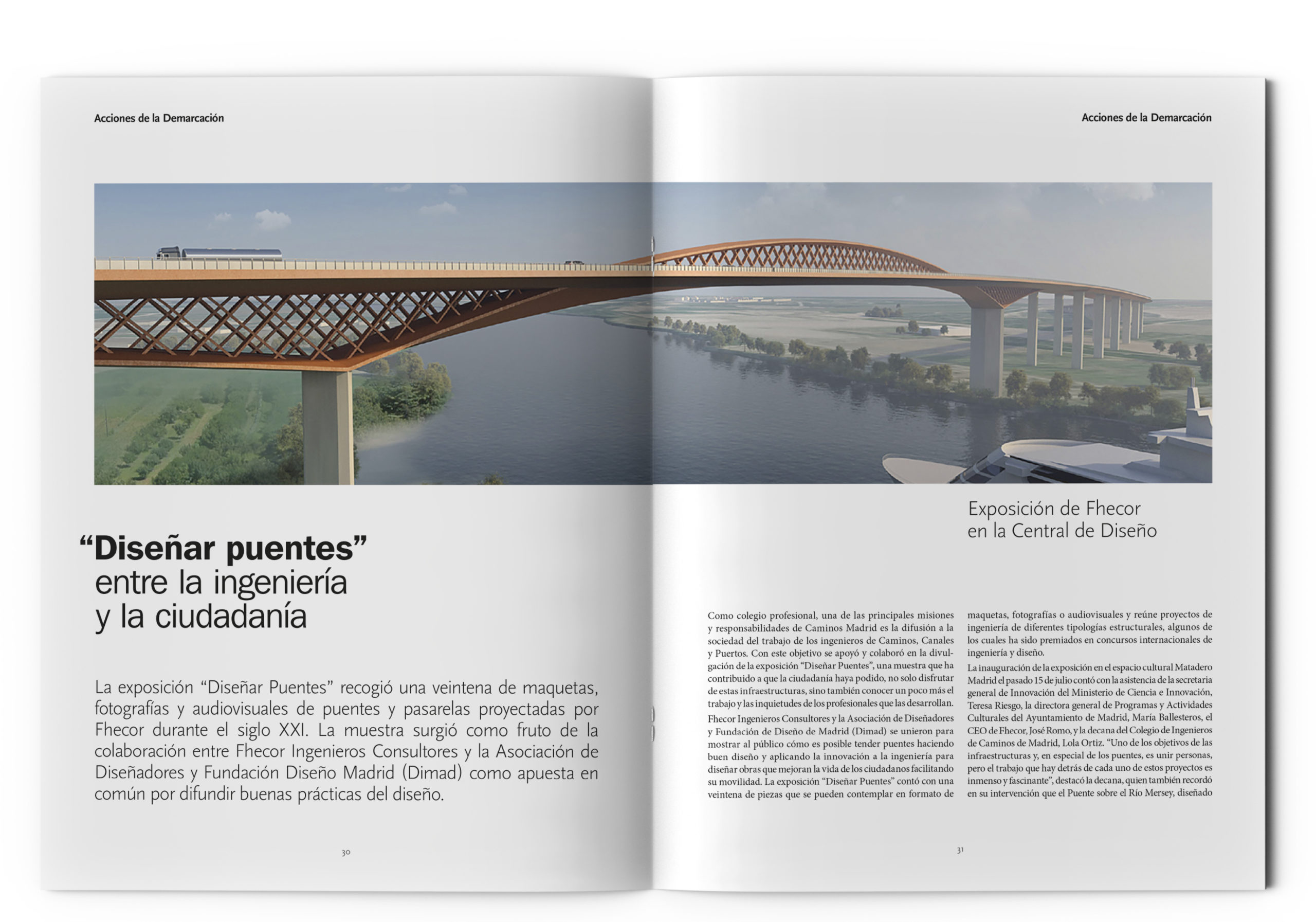
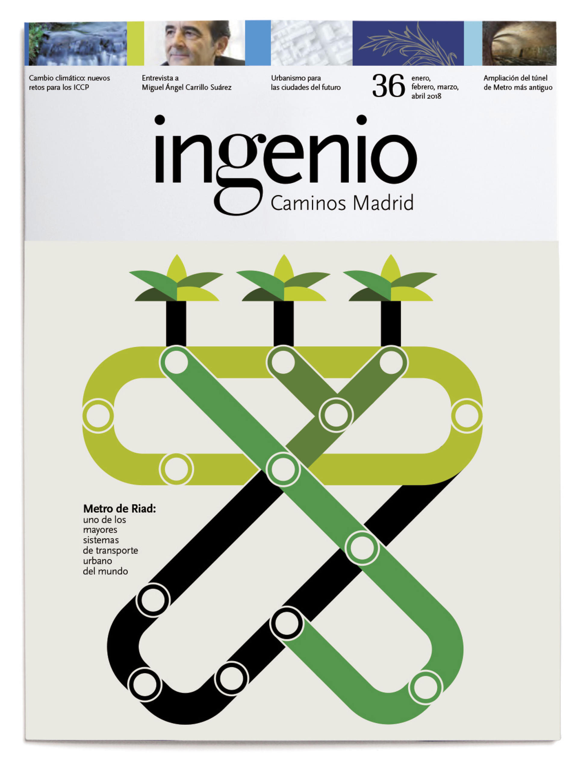
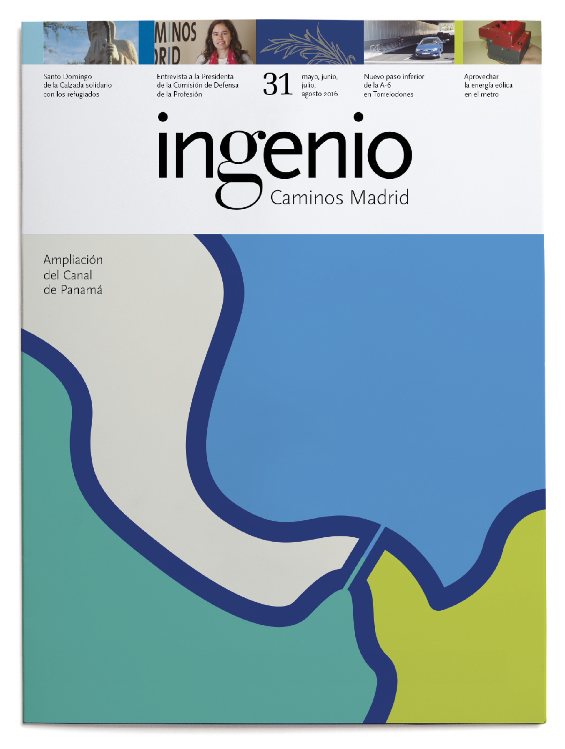
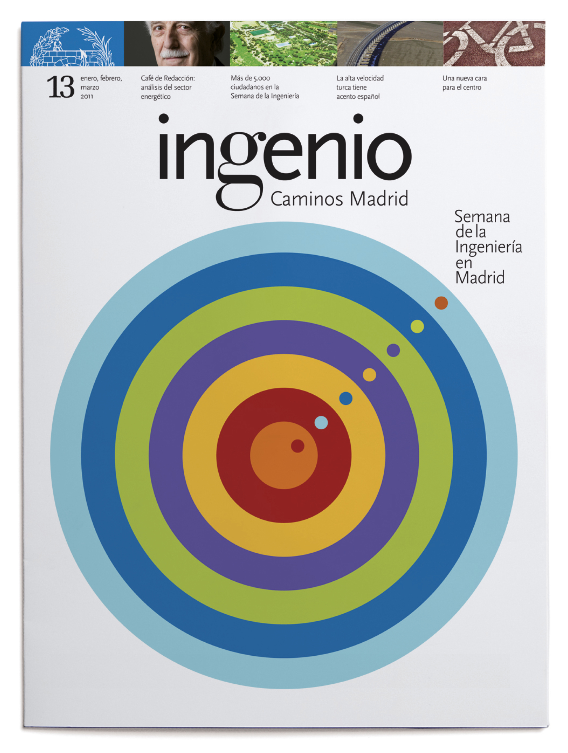
Estrada Design is the designer of the Ingenio Journal, the publication of the Professional Association of Civil Engineers of Madrid, which takes meticulous care of both the contents and the graphics alike: interviews, reports and the Association’s activities. On the covers, there is a predominance of illustrations using spot colours in line with the Association’s identity.
The cover of this issue 42 of the magazine Ingenio, draws a friendly vision of mobility. An orderly traffic in which there does not appear to be carbon dioxide or haste, traffic fines or incival behaviour. Where more elements of public transport and more bicycles circulate than cars.
A landscape more born of the desire to improve the circulatory routes of our cities than a reflection of the urban reality itself.
A reality that has the colors of the Madrid demarcation of the College of Road Engineers and yet, this can be a good sign.
by f8c898fb93 | Jan 9, 2020
Corporate image and packaging
for this leading spice company
Carmencita turns 100.
Turning a century is a very important milestone. And the number one hundred is, typographically speaking, equal to that numerical and historical importance. The hundred is what we call a round number.
A discreet curl, on the front of the two zeros, turns the number 100 into an unmistakable Carmencita number, and does so fulfilling the two essential physical characteristics for a good Logo: Work equally in positive and negative and do not lose readability in small sizes.
Estrada Design’s proposal entailed simplifying its logo, building its brand and implementing it across its product range, increasing the presence of the brand in displays and packaging to drive and strengthen this own name, which is one of the firm’s primary distinguishing marks.
This brand, which is an industry leader in Spain and started out in 1920 trading saffron, is based on the image of the young Carmencita, the grandmother of one of the current owners of the firm, wearing traditional dress, a Cordoban hat and a Manila shawl. Estrada Design proposed simplifying its logo and is the mastermind behind the firm’s current image.


Recent Comments