by Florencia Schmidt | Feb 17, 2023
The Royal Collections Museum
Identity and Applications
The Royal Collections Gallery is Spain’s key museum initiative of recent years.
The gallery, boasting the outstanding, award-winning architecture of Emilio Tuñón and Luis Moreno Mansilla, stands next to the Royal Palace of Madrid and will house some of the treasures of Spanish National Heritage.
The gallery’s identity expresses its vocation for modernity and, at the same time, the nature and origin of its collections, works of art and articles from the old Royal Collections.
Its brand is a simplified crown together with an initial small ‘g’ that form a sign that is, at once, compact and open.
by Cristina Rodrigo Romero | Jul 8, 2021
World Flamenco
del Congress
The Cervantes Institute, in its work to promote the Spanish language, holds an international Flamenco congress. Designed by Estrada Design and presented in Madrid in the month of May, its logo appears to the rhythm of a fragment of zapateado footwork by the dancer Carmen Amaya.
The logo, a lowercase letter ‘f’, divided in two, has several variations formed of its initial and a number of differing blue and black dots. This page shows several screens and copies of posters of the Congress’ activities.
by f8c898fb93 | Jul 28, 2020
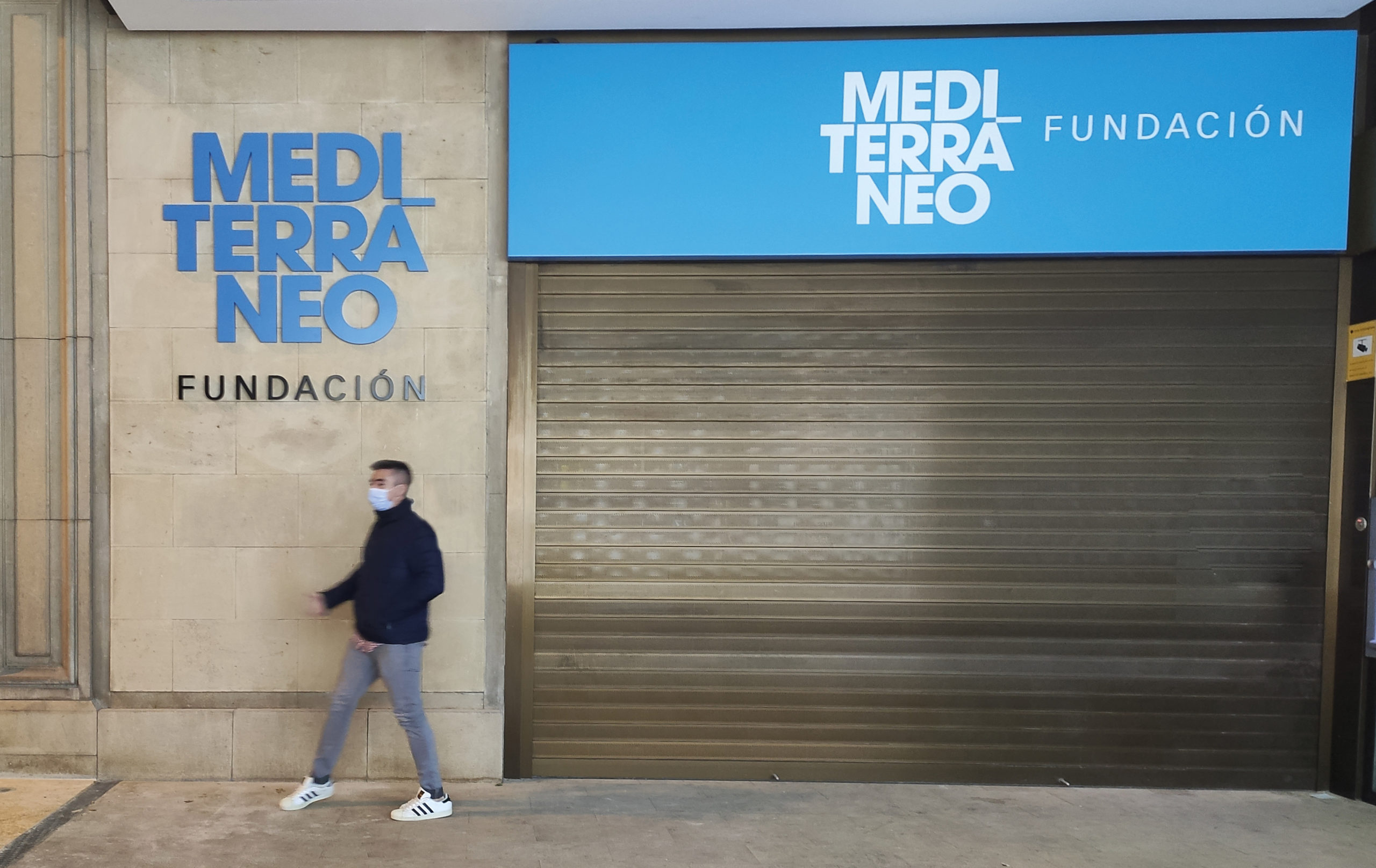
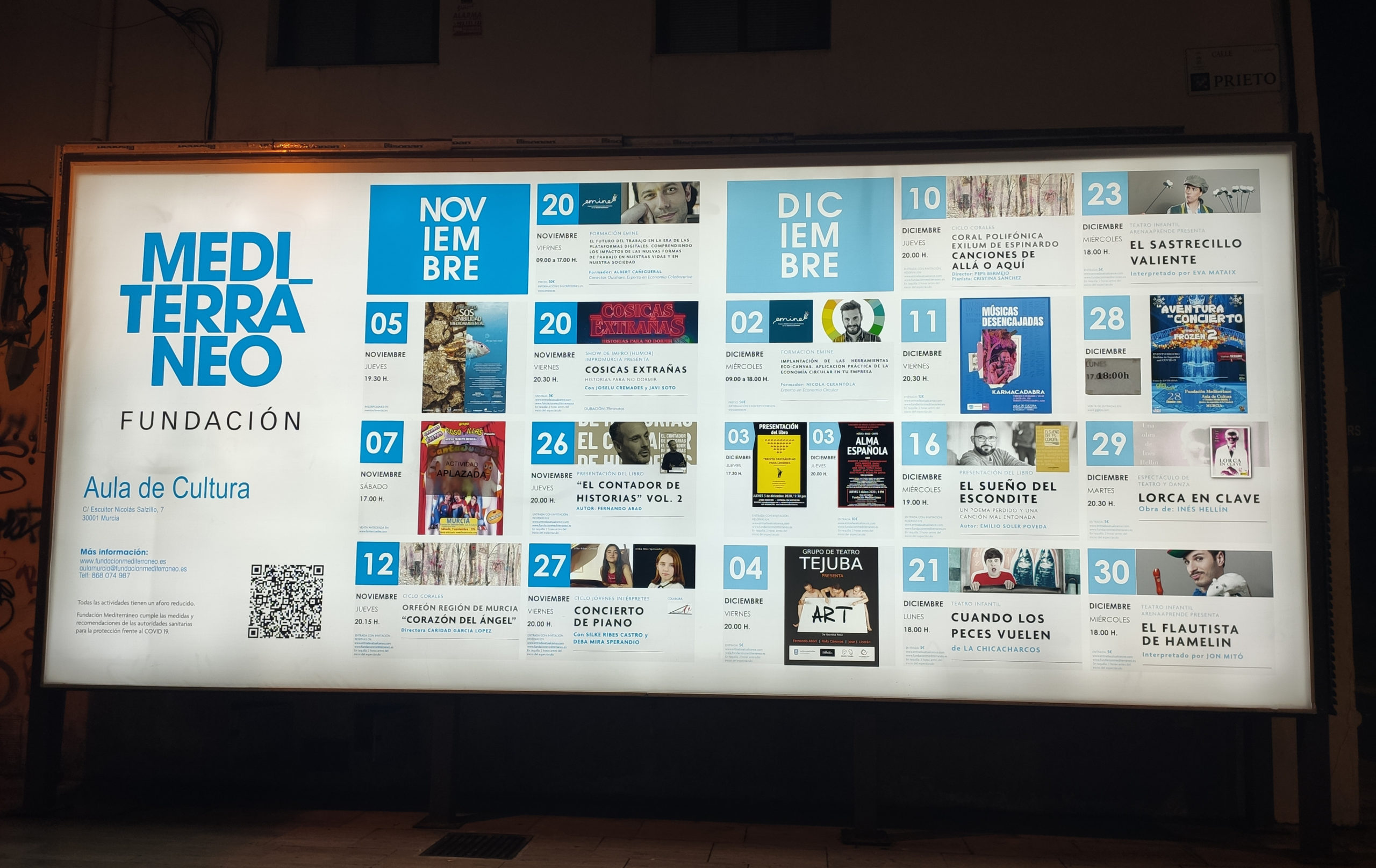
The key word in this identity process is Mediterranean, which has always been linked to the Foundation, with just one problem: the more than 600 entries registered in the European Trademark Office. It took a long time for the Foundation to be able to use the word legally as its name.
Now the word Mediterranean takes center stage. It is large, strong and positive, conveying to us not only culture and nature, but also life and the origin of our civilization. All that force contained in the word Mediterranean makes using a symbol or a sign unnecessary and even counter-productive, and that is why it is the image of the new Foundation. A Foundation that has three core areas of content: art, culture and the environment. These three things are there, encompassed in the Mediterranean.
Here at Estrada our proposal was to use no other symbol than the word itself, a strong graphic image split into three compact lines. In a deep blue, the graphic accent of the á juts out over the edge of the logo as if it were a link, connecting the word Foundation to it. “The graphics speak more about a Mediterráneo Fundación than a Fundación Mediterráneo; Mediterranean is too big a word for it to be preceded by anything”.
“We wrote the word Mediterranean hundreds of times, in different ways; we replaced part of the letters by drawings, to give it greater visual quality, yet both we and the people who run the Foundation reached the conclusion that this is the best”.
The corporate communication to show the time of the new brand has been structured in several “waves”. The first is titled: “Fundación Caja Mediterráneo is now Fundación Mediterráneo”. It is a Foundation that comes into being with extensive experience, but which does not in any way forsake its past, its enormous art collection or its important artistic heritage, its cultural centers, etc.”.
“Now we are Fundación” will be followed by the next wave of advertising that will speak through the heart, using the same protruding accent in the graphic image. “Now it is not backed by an institution or a major corporation; everything is willingness and heart to create culture and activities for people”.
The nature of an institution that does not aim to reap any profit is linked to this message: “Only Fundación, all Fundación”.
Here at Estrada Design we have no doubt that design has the power to build businesses and countries. It is essential that we view design as a problem-solving, applied art. In this time of pandemic, design, along with innovation and research, can be an important factor in contributing to recovery. A business factor. It cannot be an add-on; it has to promote better communication, stimulate, inspire, propose… it is not something superfluous, on the contrary, it is an economic and cultural driver.


Recent Comments