by f8c898fb93 | Jan 9, 2020
Food and Wines from Spain
An identity to promote Spanish products
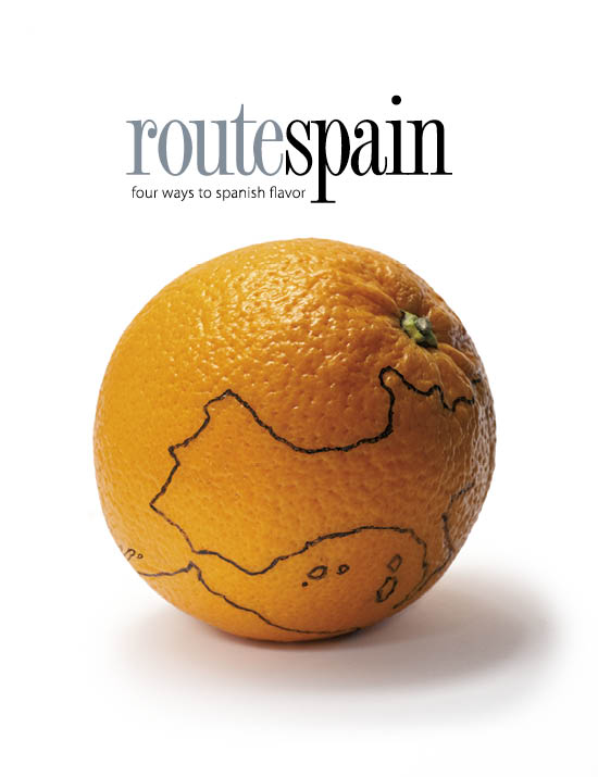
Estrada Design created the Foods and Wines from Spain logo for the Spanish Institute of Foreign Trade (ICEX). Using the S sign, the initial of Spain, as its core, the brand is articulated in its different modalities, generating in this way all the versions of the brand.
Full development of the entire brand name, including the separate ‘Wines’ and ‘Foods’ versions. Finally, a simplified version that has become a generic element of great value for institutional and promotional actions for different Spanish products in any industry.
by f8c898fb93 | Jan 10, 2020
Brand identity, Architectural graphics, Cross-sectional design
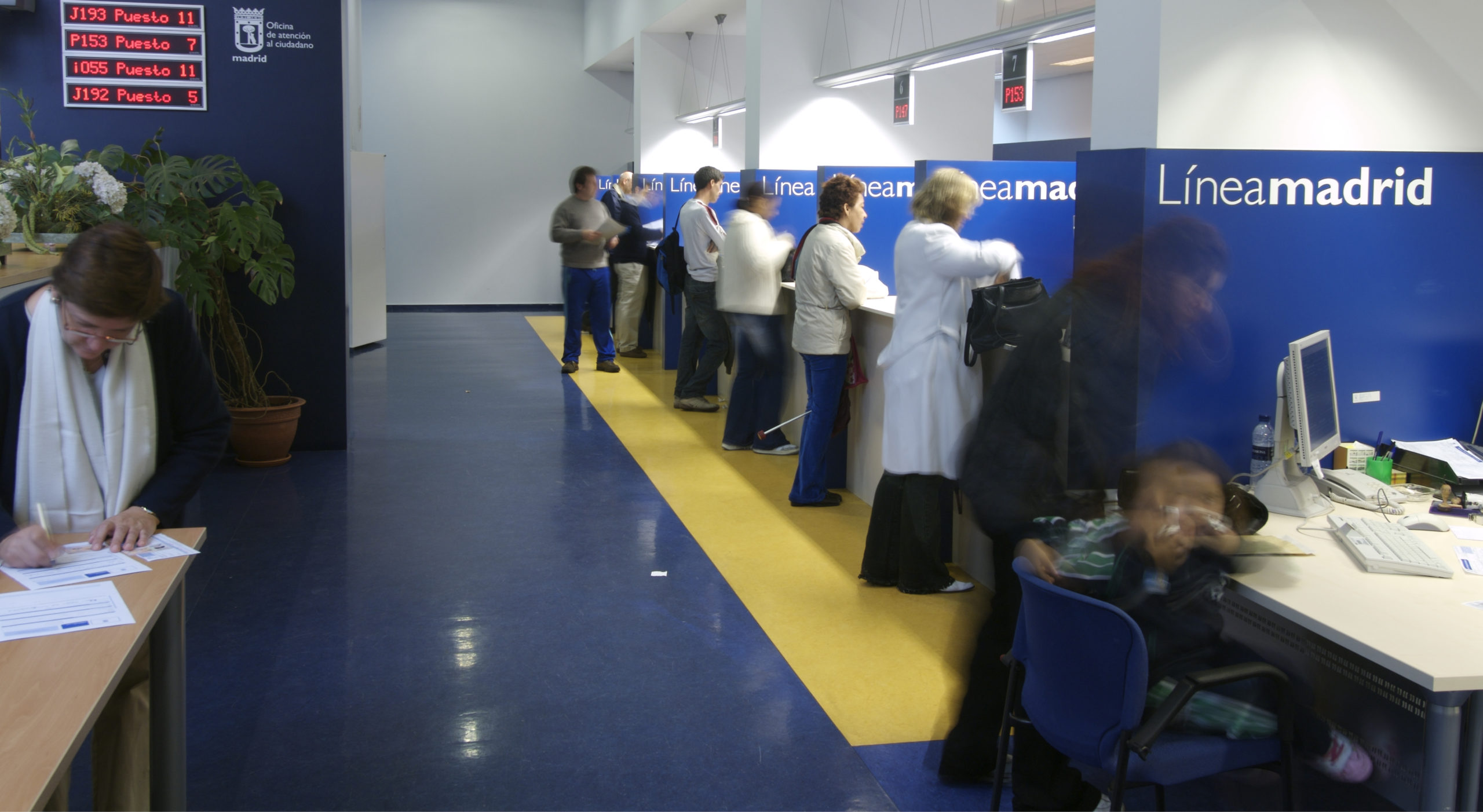
Línea Madrid is the name and concept proposed by Estrada Design for the line used by the City Council to keep in contact with citizens. A brand that identifies, in an integrated manner, the three citizen service channels available: the 010 telephone line, Citizen Service Bureaux and the Online Service.
The programme developed by Estrada Design, in collaboration with the architect Lorenzo Alonso, covers not only the spatial articulation and the interior architecture of the 25 service bureaux, but also the design of the Madrid website, the image of the 010 information telephone number, the brand architecture for the three services and the communication campaign.
by f8c898fb93 | Jan 9, 2020
Corporate Identity, Architectural Graphics and Communication
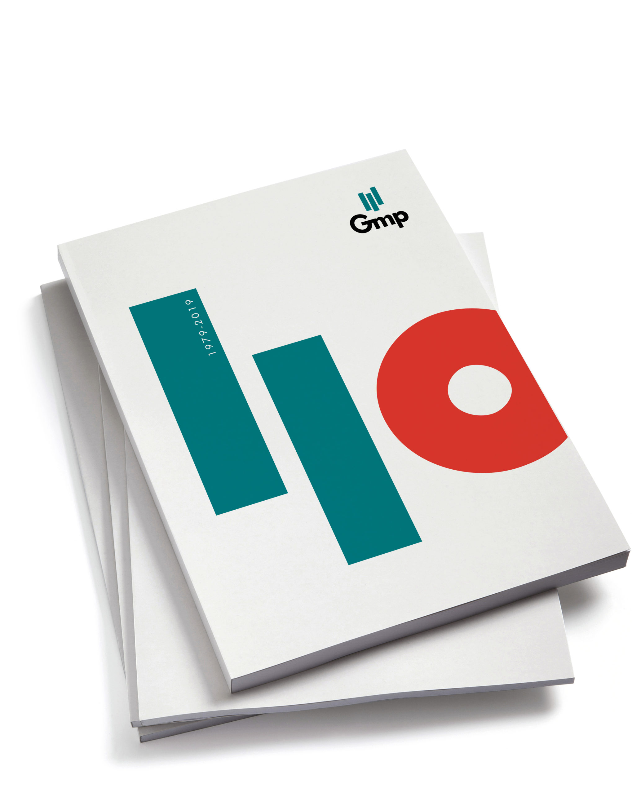
Founded in 1979, the GMP Group celebrated its 40th anniversary in 2019. Estrada Design, the author of its corporate identity, designed its commemorative logo for the occasion.
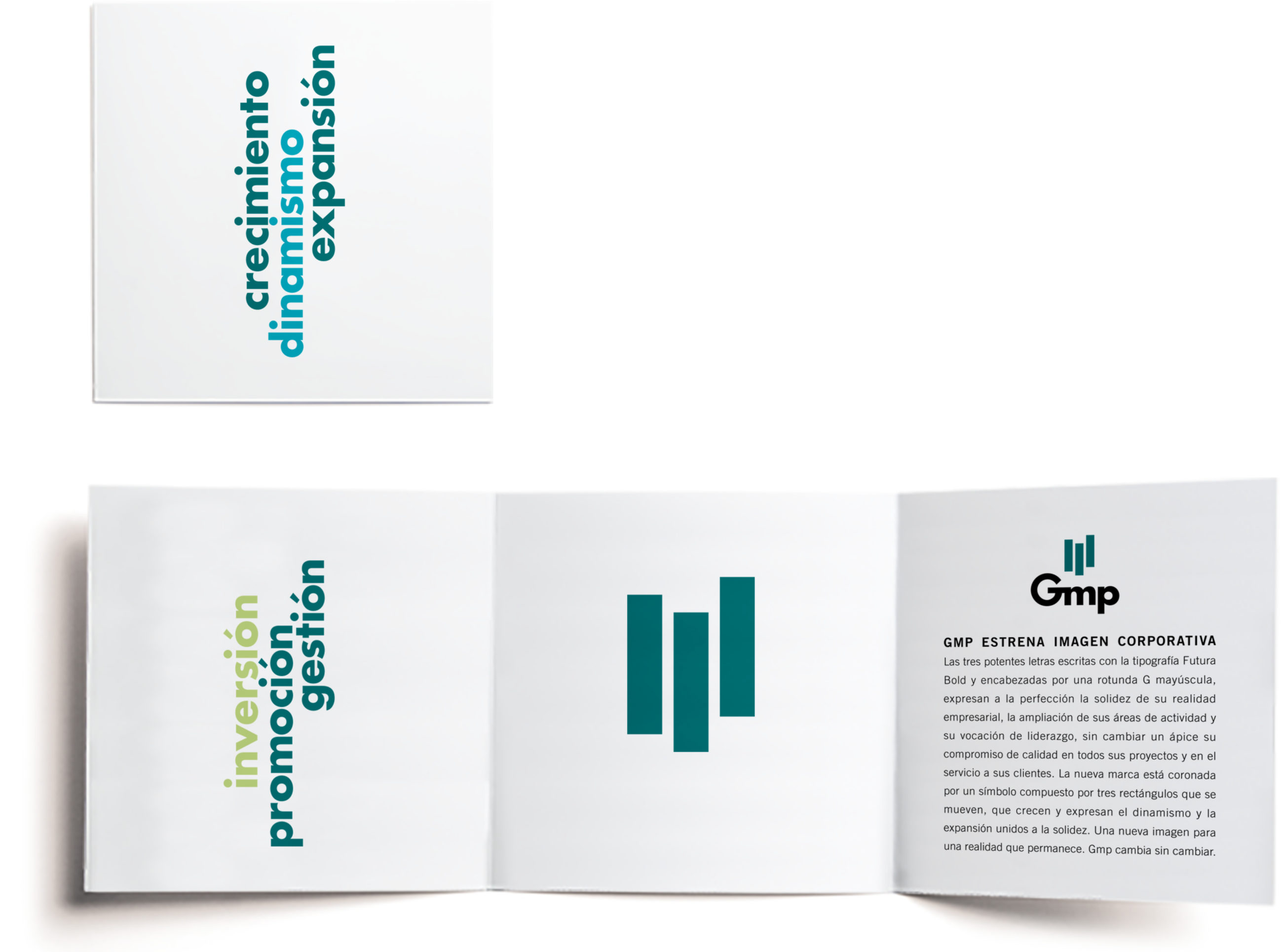
The rational, simple and direct symbol designed by Estrada Design many years ago for the Group is comprised of three small vertical bars. They represent a gentle upward movement that encapsulates the idea of construction and growth. In the logo for its 40th anniversary, the symbol is transformed into a figure, thus evoking the path travelled by a company that has become one of the leading real estate groups in Spain.
by f8c898fb93 | Jan 13, 2020
Brand Identity and Wayfinding
Bibliometro is a programme run by the City Council of Madrid that consists in taking libraries to readers. For this purpose, new spaces were installed at the metro stations in Madrid that have the highest number of interchanges–Moncloa, Nuevos Ministerios, Príncipe Pío and Legazpi–, so that, on their way, the users of this method of transport would come across an advertising ploy that acts almost like a powerful magnet. In the very short time it has been in operation, thousands of library cards have been issued.
The corporate identity created by Estrada Design for Bibliometro comprises a comprehensive visual system, a logo, an identity programme and a signage and communication plan, ranging from the spine labels for covering the books to the posters pointing to the book kiosks. The studio also designed the graphics used in the kiosks themselves, an undulating structure shaped like the tilde on the letter ñ, designed by the Paredes Pedrosa Arquitectos architecture studio.
by Cristina Rodrigo Romero | Apr 26, 2021
Publication design, art direction and layout
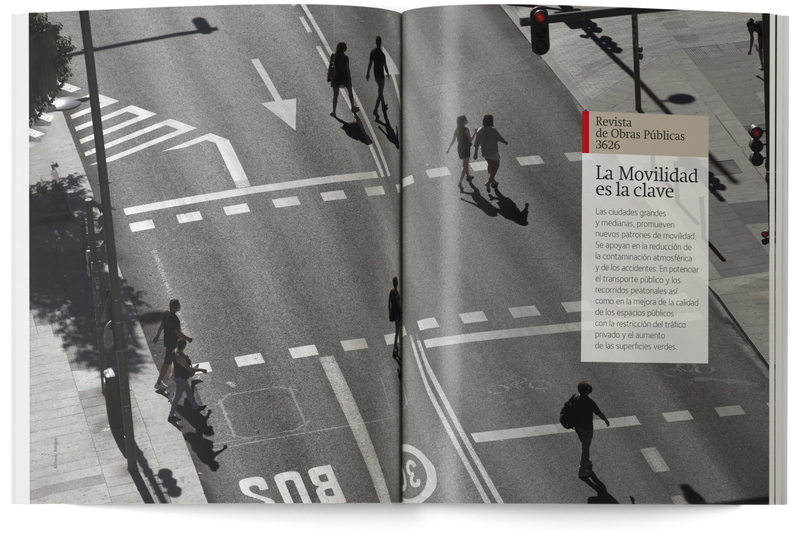
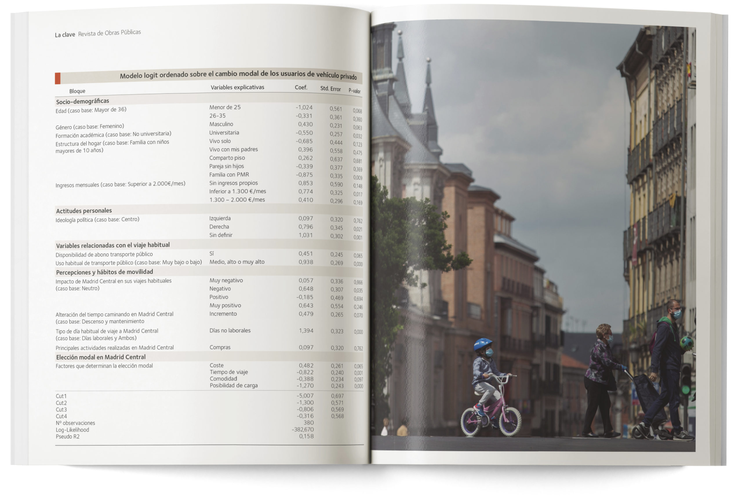
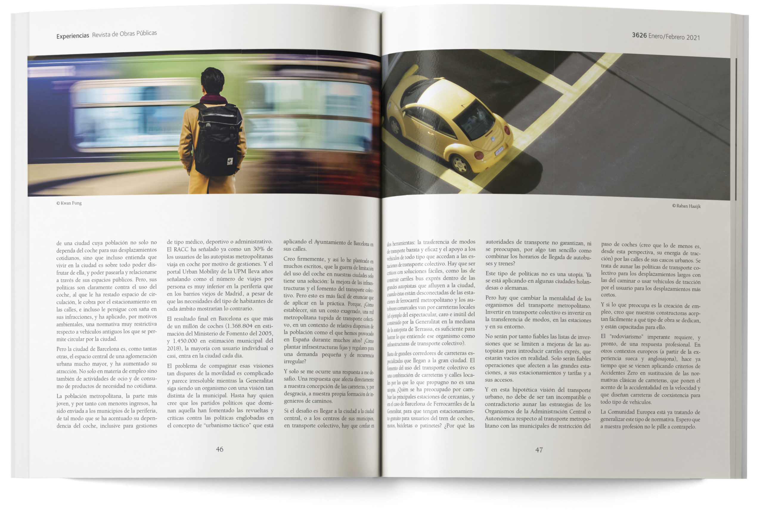
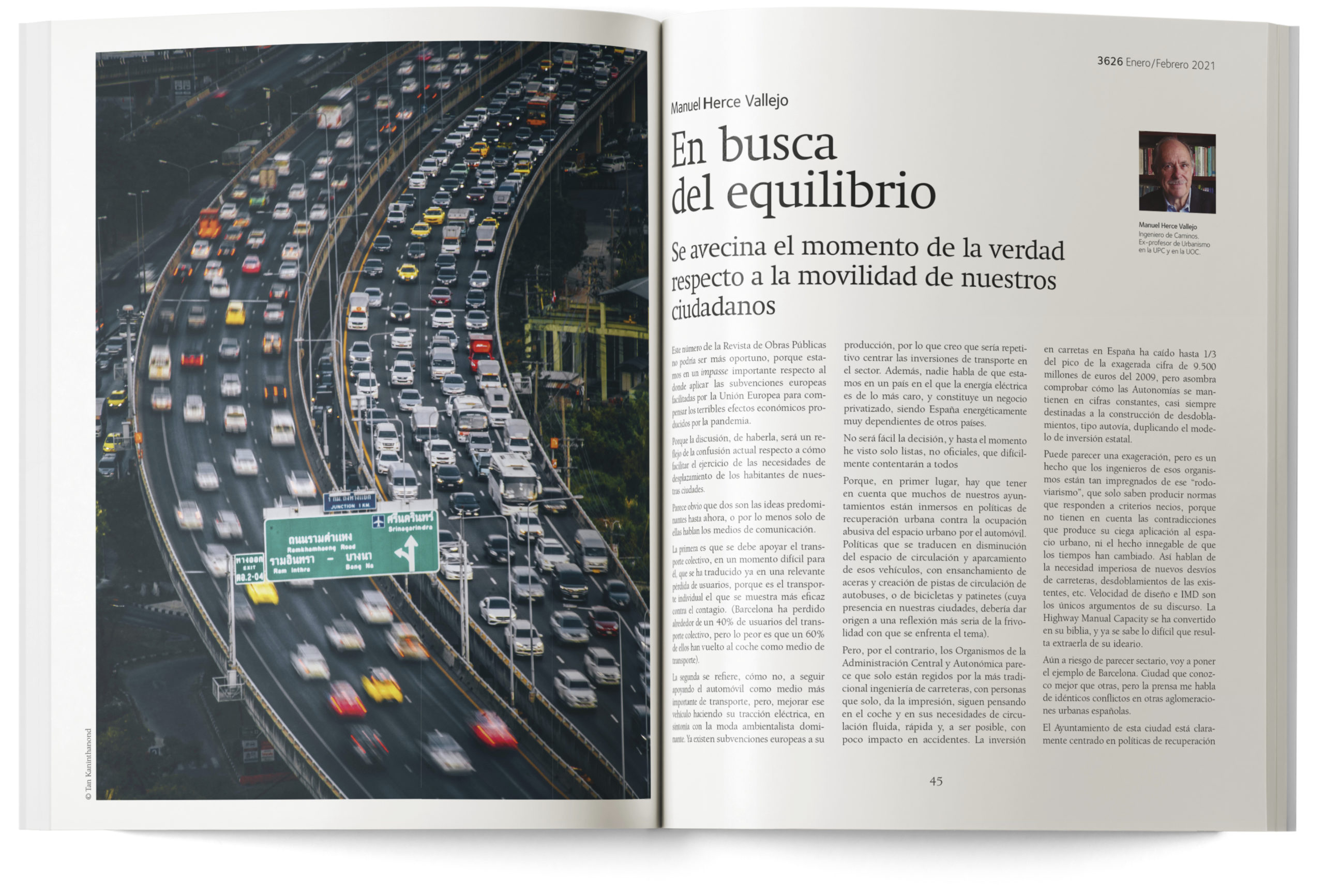
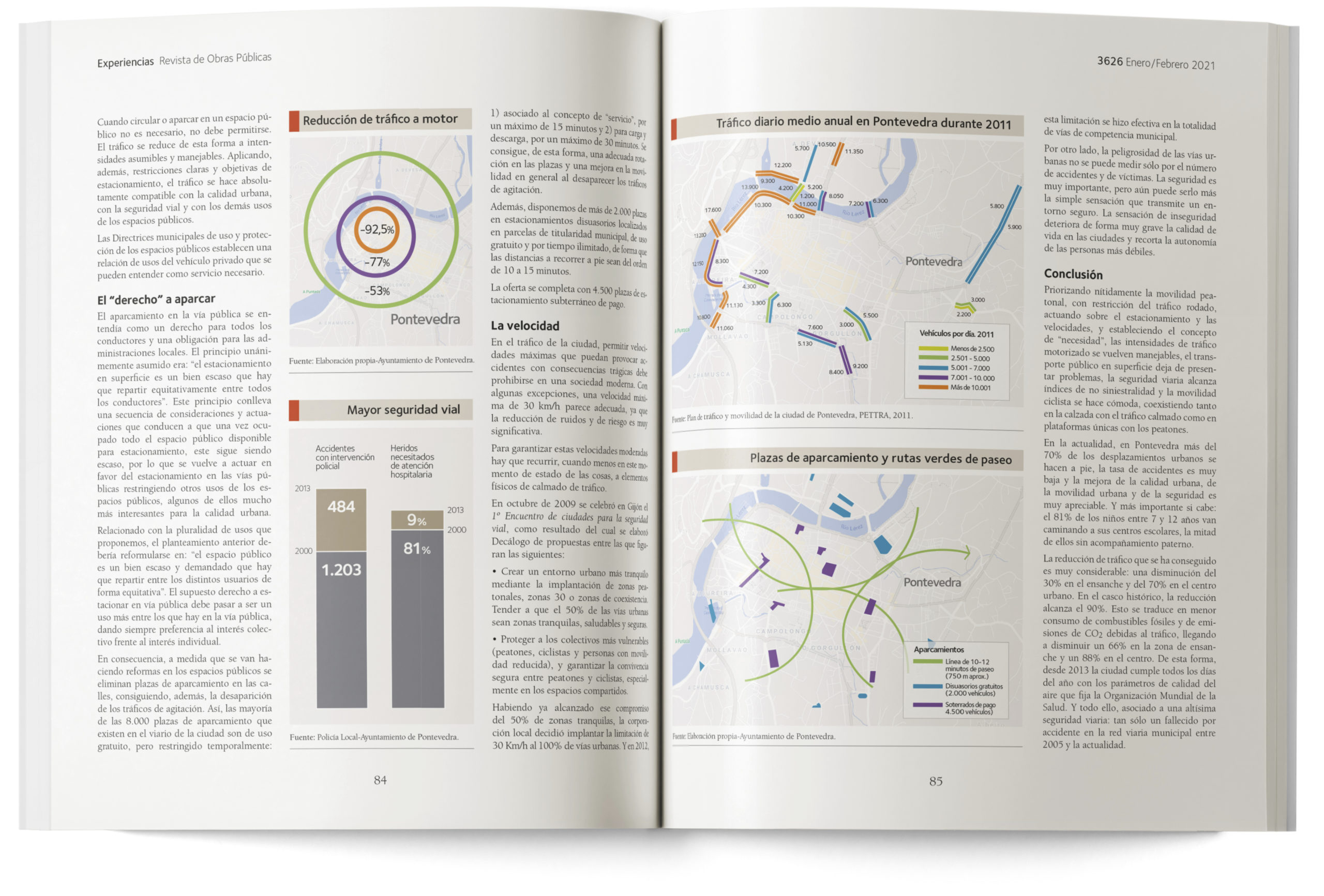
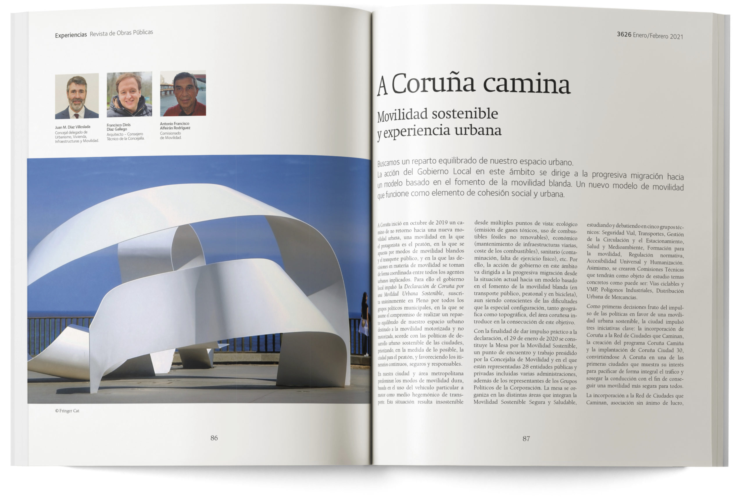
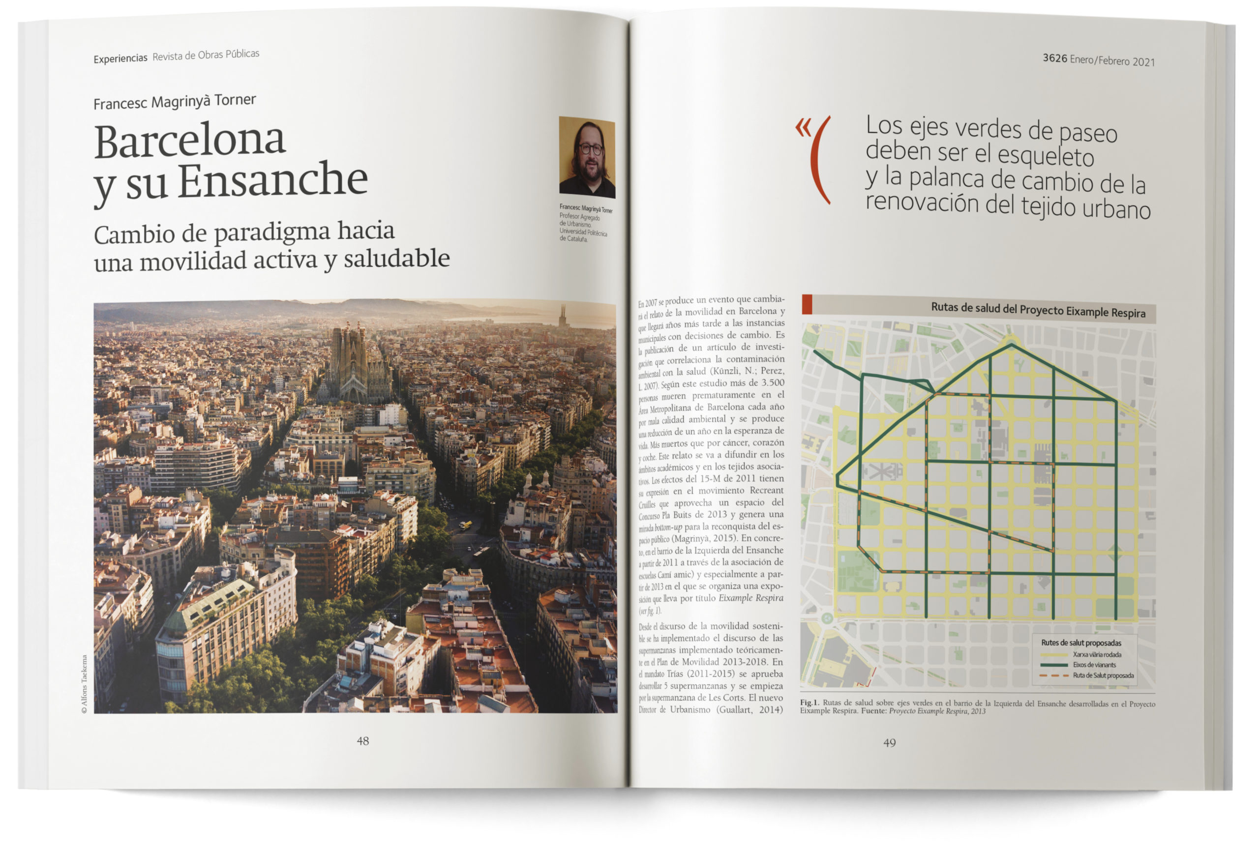
When we were commissioned with the new design of the Public Works Journal, published since 1992 by the Association of Civil Engineers, it was a surprise to discover that its publication had begun in 1853. In other words, it is one of the oldest journals in Spain. A fact that, on its own, shows the fundamental importance of Civil Engineering in the building and modernisation of Spain in the 19th and 20th centuries.
A masthead retrieved from the past
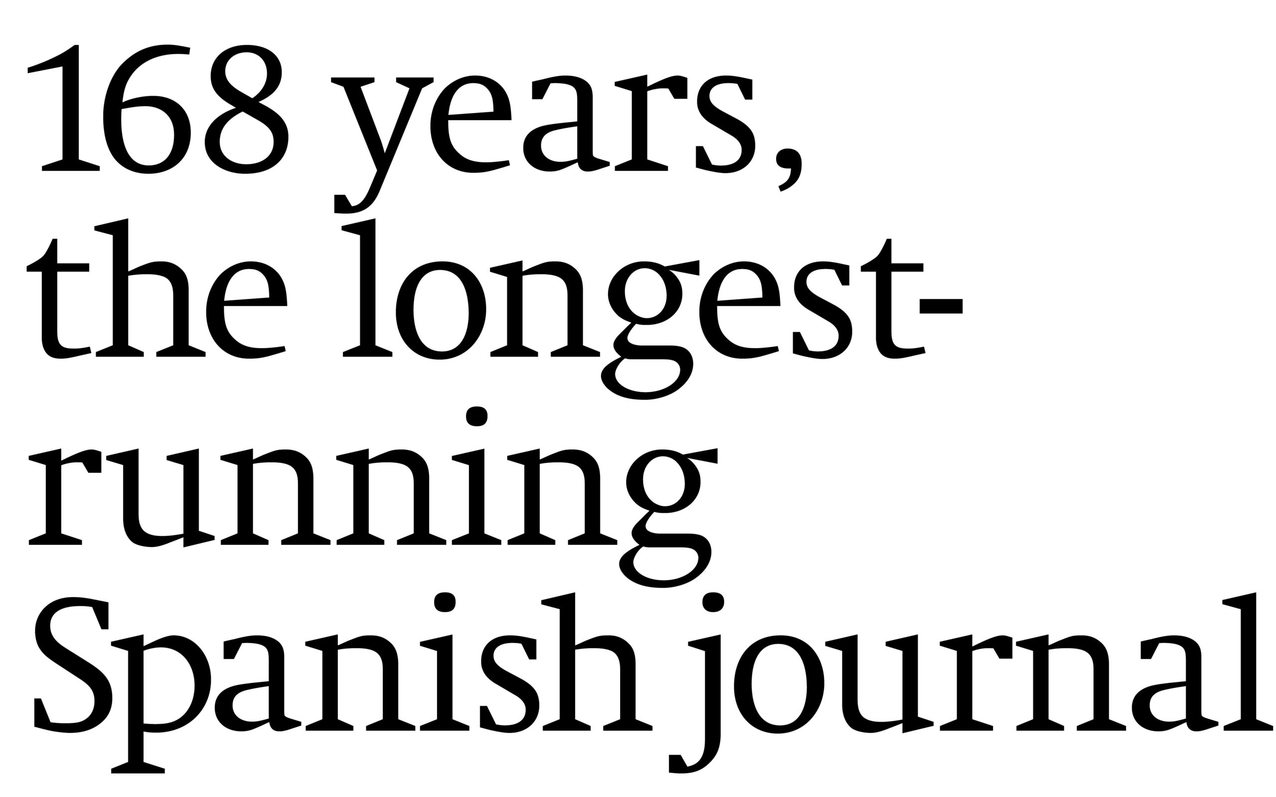
The Public Works Journal is one of the oldest journals in Spain. Founded in 1853, it is celebrating its 168th anniversary in 2021. It was essential to showcase once again the full name of the publication in the masthead, and to do it distinctly.
This number, displayed prominently in large figures in the masthead of the journal, is destined to become its symbol. Because it explains the tradition and continuity of the project.
And because it is associated with the technical vocation of Civil Engineering itself.
The Neue Swift font, designed
in 2009, has contemporary tendencies,
even though it maintains
the features of the classical
Roman serif typefaces.


























Recent Comments