by f8c898fb93 | Jun 29, 2023
Transport Research Centre
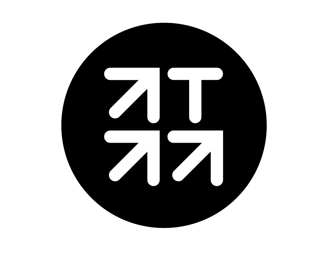
Transyt is a Transport Research Centre working under the Technical University of Madrid (UPM). Its new identity was created by Estrada Design and is based on its symbol, consisting of four ascending arrows and the initial T, for Transport. They are grouped within a blue circle, the centre that drives, promotes and develops research and analysis processes on issues that arise from Transport, involving the Centre’s own resources or with the collaboration of other institutions in Spain and worldwide.
by f8c898fb93 | Feb 27, 2023
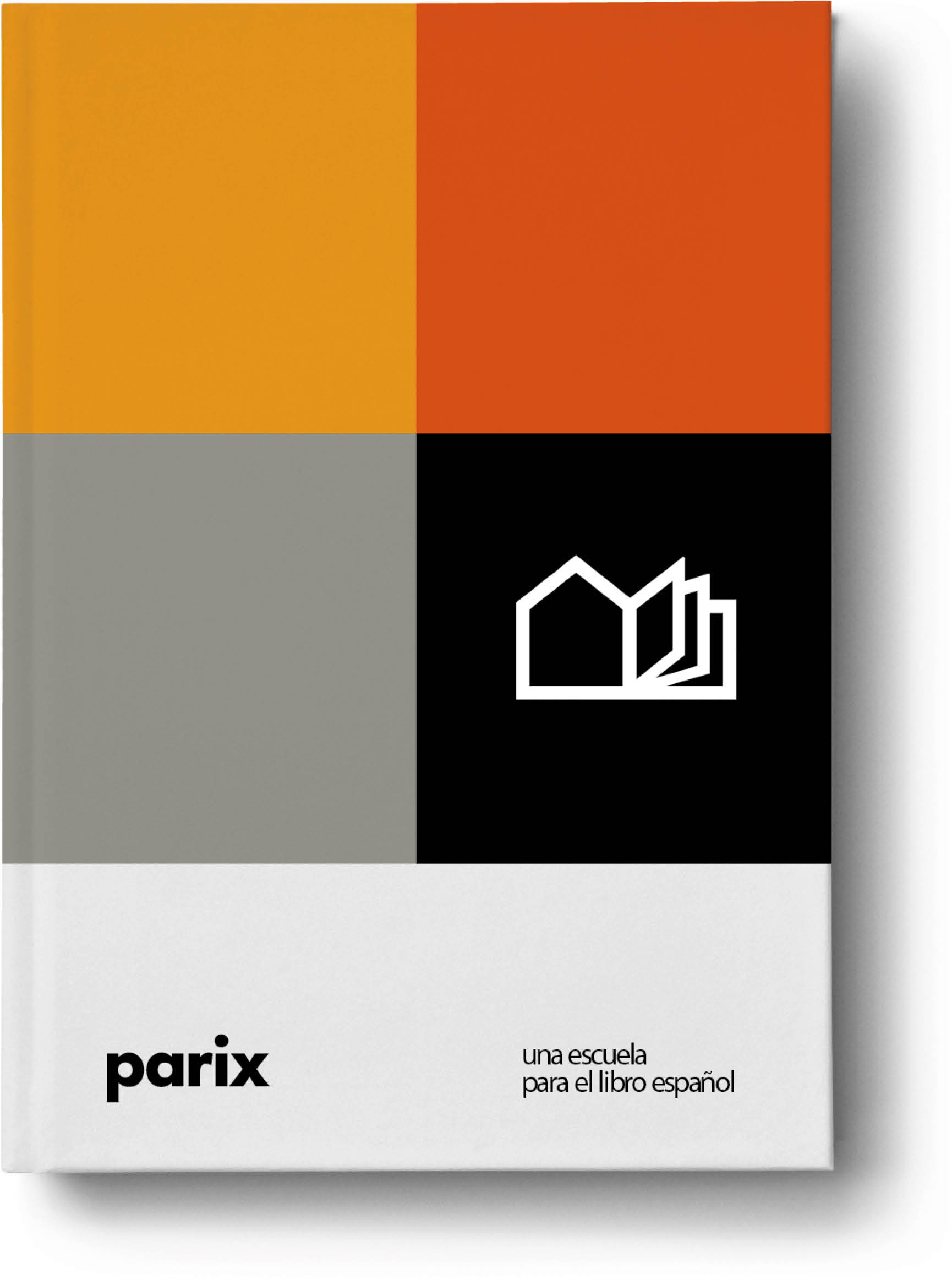
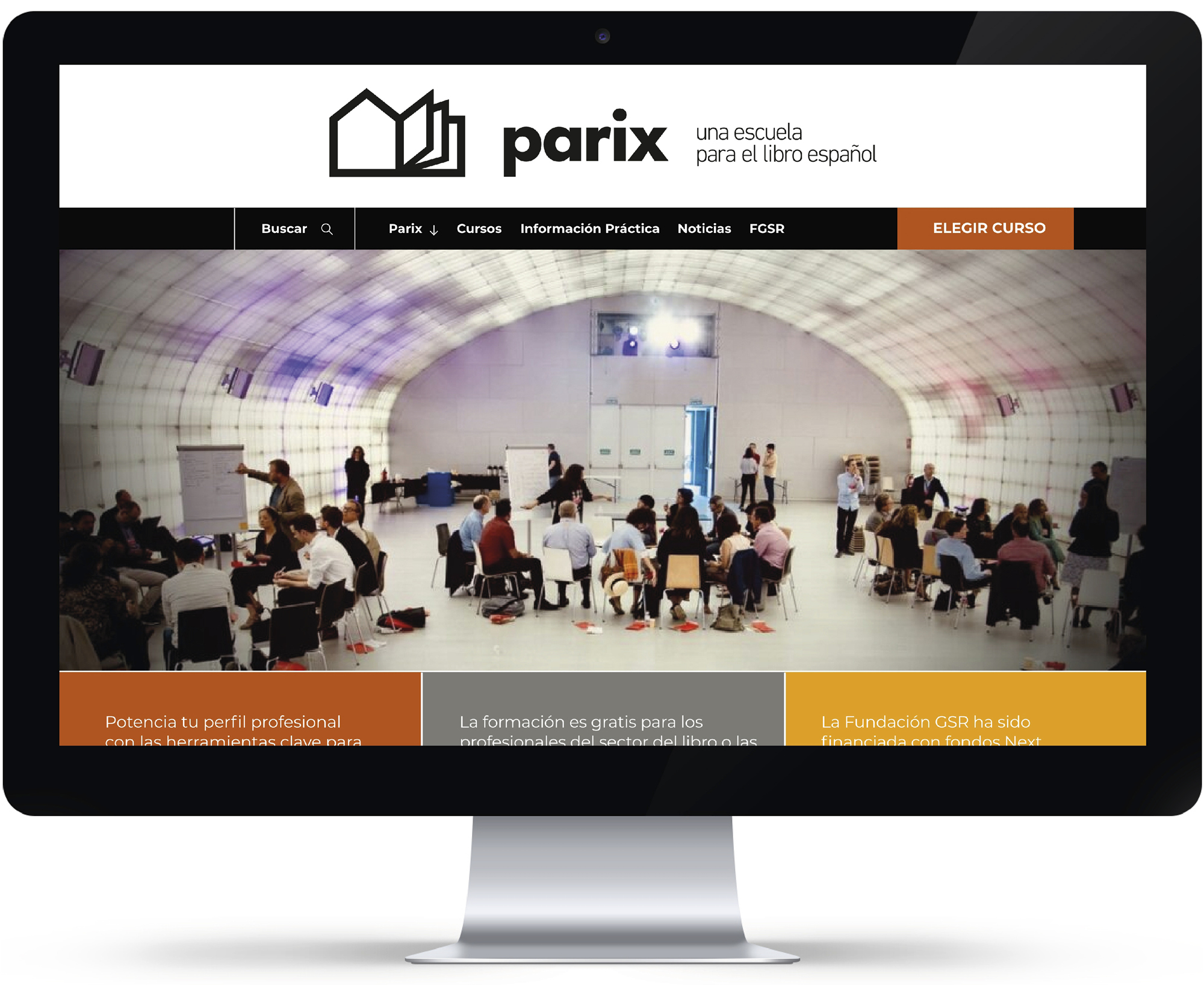
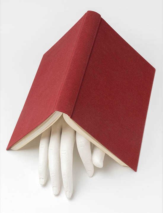
A New Brand for a newly opening school. A School for Spanish books. Promoted by the Germán Sánchez Ruipérez Foundation (FGSR) and the Casa del Lector. Targeted at all professionals in the book and publishing world, focusing especially on their digital skills. Financed with Next Generation funds.
by Florencia Schmidt | Feb 17, 2023
The Royal Collections Museum
Identity and Applications
The Royal Collections Gallery is Spain’s key museum initiative of recent years.
The gallery, boasting the outstanding, award-winning architecture of Emilio Tuñón and Luis Moreno Mansilla, stands next to the Royal Palace of Madrid and will house some of the treasures of Spanish National Heritage.
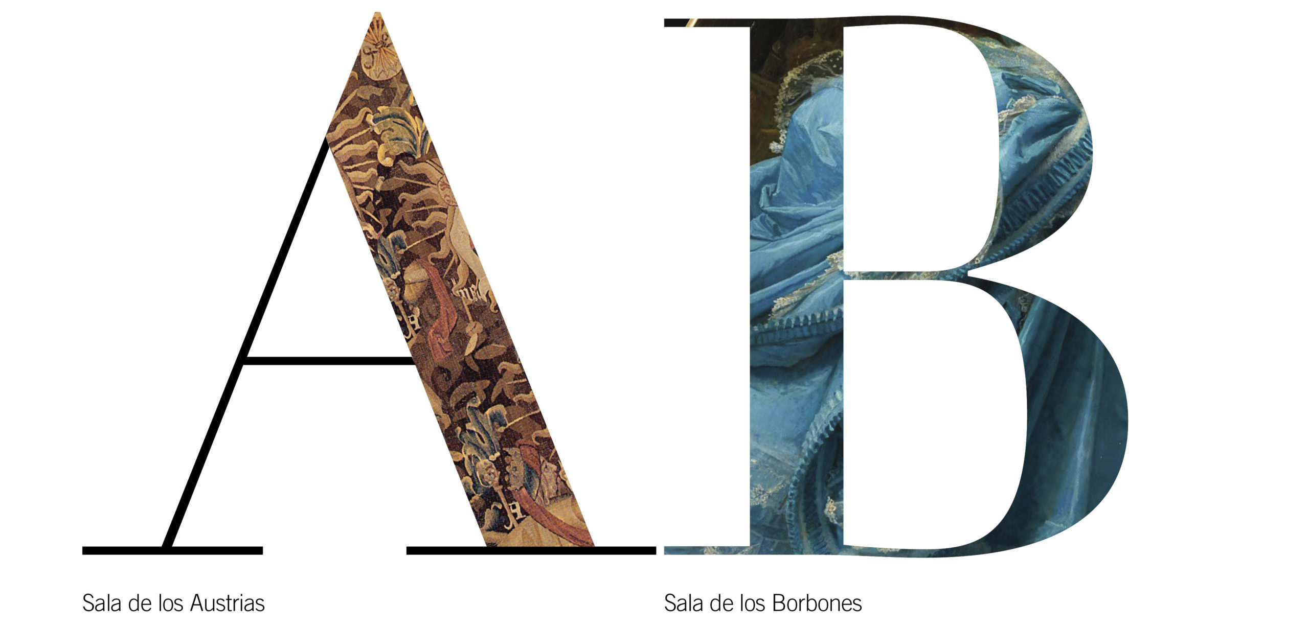
The gallery’s identity expresses its vocation for modernity and, at the same time, the nature and origin of its collections, works of art and articles from the old Royal Collections.
Its brand is a simplified crown together with an initial small ‘g’ that form a sign that is, at once, compact and open.
by Cristina Rodrigo Romero | Jan 4, 2023
by Cristina Rodrigo Romero | Feb 16, 2023
International Congress
on Longevity Economy
Identity and Applications
Longevity is a long, precise, graphic word in itself. It contains, in its 9 letters and its four syllables, its hopeful meaning. As if it were the conceptualisation of a good wish. That is why this preview of the graphic program on Longevity Economy is based on evidencing the potential of the word and the letter L it begins with.
It is used to generate a logo, which is actually a graphic generator that developed gradually as our work progressed.
It is often said that one way to measure a design is its ability to grow with a project.
We believe that this proposal has that quality.
We shall see.

















Recent Comments